- Home
- /
- SAS Viya
- /
- Visual Analytics
- /
- VA 8.3 Visualization
- RSS Feed
- Mark Topic as New
- Mark Topic as Read
- Float this Topic for Current User
- Bookmark
- Subscribe
- Mute
- Printer Friendly Page
- Mark as New
- Bookmark
- Subscribe
- Mute
- RSS Feed
- Permalink
- Report Inappropriate Content
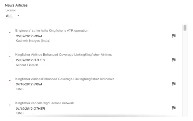
I want to show something like news ticker in SAS VA.
Which visualization can help me get below output:
Accepted Solutions
- Mark as New
- Bookmark
- Subscribe
- Mute
- RSS Feed
- Permalink
- Report Inappropriate Content
You could use a scrolling container and maybe use a list table to carry the actual news fields? You could style the table to hide things like borders etc - so it looks more like a flat list.
If you need something more fancy - you could also look into data-driven content object which allows you to embed any 3rd party HTML5 code. I'm sure there are plenty of open-source examples around. More information about these VA objects can be found in the users guide.
Hope this helps. Falko
See how to use one filter for multiple data sources by mapping your data from SAS’ Alexandria McCall.
Find more tutorials on the SAS Users YouTube channel.


