- Home
- /
- SAS Viya
- /
- Visual Analytics
- /
- Re: Using measures in list or dropdown controls.
- RSS Feed
- Mark Topic as New
- Mark Topic as Read
- Float this Topic for Current User
- Bookmark
- Subscribe
- Mute
- Printer Friendly Page

- Mark as New
- Bookmark
- Subscribe
- Mute
- RSS Feed
- Permalink
- Report Inappropriate Content
iHi ,
We have recently started working with sas va and thus we are new to it.We have a
requirement where we need to populate the controls such as dropdown or list with measure
names rather than category values.
For example if the category is CONTINENTS then values are Asia,North america etc which can
be populated in dropdown/list by dragging the CONTINENT category in the dropdown/list.And
we can have few measures such as profit,cost etc.So in the dropdown/list we need to display
profit,cost as selection options.Based on the selected measure(s) name,the graph should
change.
Thanks.
Accepted Solutions

- Mark as New
- Bookmark
- Subscribe
- Mute
- RSS Feed
- Permalink
- Report Inappropriate Content
Hi Mahraz,
To accomplish what you want, just define two dropdown lists, two parameters, and two calculated items and assign each one to an axis of a Dual Axis Line Chart or Dual Axis Time Series Plot. The calculated items would look something like this:
Measure1:
IF 'selected measure1'p Missing
RETURN .
ELSE IF 'selected measure1'p = 'Profit'
RETURN Profit
ELSE IF 'selected measure1'p = 'Cost'
RETURN Cost
ELSE .
Measure2:
IF 'selected measure2'p Missing
RETURN .
ELSE IF 'selected measure2'p = 'Profit'
RETURN Profit
ELSE IF 'selected measure2'p = 'Cost'
RETURN Cost
ELSE .
You can make the selection of Measure1 (the one that goes on the left axis) required from the dropdown list, and Measure2 don't need to be selected. If not selected, it won't display, giving you a single line chart.
The first "IF 'selected measure2'p Missing RETURN ." statement is redundant with the last one and it may not be necessary depending on the version you are running, but I think this is what you need to do in VA 7.3.
Best,
Renato

- Mark as New
- Bookmark
- Subscribe
- Mute
- RSS Feed
- Permalink
- Report Inappropriate Content
Hi, Ashwani,
As your requirement you have to change the table structure. If you drag and drop the Profit (measure) in list tab or drop down list, values will appear which are present in profit. it is not possible to select Profit, Cost (Measures) in drop down list, list tab etc........ You must have to change the structure of the table.
Regards,
Teja Surapaneni.

- Mark as New
- Bookmark
- Subscribe
- Mute
- RSS Feed
- Permalink
- Report Inappropriate Content
Hi,
A good question!
Unfortunately control objects in the latest SAS Visual Analytics 7.1 version can only be populated with data item values rather than data item names. This concept you're asking about is similar to a variable prompt in SAS Enterprise Guide as described at http://analytics.ncsu.edu/sesug/2007/HW02.pdf
I know of a few people who have asked for this feature. It would be good to know if this feature will be available in a future release.
As a work around, I'd suggest using a stacked container, containing the different types of graphs using the measures required (Continent & Profit, Continent & Cost etc) and the user can then scroll to the graph of interest using the container navigation control. See SAS(R) Visual Analytics 7.1: User's Guide - Using Container Object Types in Reports
Kind Regards,
Michelle

- Mark as New
- Bookmark
- Subscribe
- Mute
- RSS Feed
- Permalink
- Report Inappropriate Content
Currently we do not support Measures as prompt values. I can use a measure in a range slider to select a specific range of data, but currently categories or text strings are what drive prompts. As Shawn showed there are ways around this, but currently you can not do measures as prompt values. This is an item we would like to add in a release soon.
Ted Werner

- Mark as New
- Bookmark
- Subscribe
- Mute
- RSS Feed
- Permalink
- Report Inappropriate Content
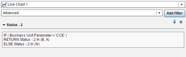
Just a couple of ideas that may help:
You can get close to interactivity of the line chart with the drop down list object, with a mild workaround using parameters. Note that the values in the graph should be consistent. If you want to see profit/cost you can duplicate the measure, and make the duplicated value a category. From there you could create a custom category
In this example I have the line chart show different groups based on what is selected.
For the drop down, I created a parameter on the value Business Unit (Possibly Continents in your case):

For the line chart, I created an advanced filter using the parameter from the drop down list:
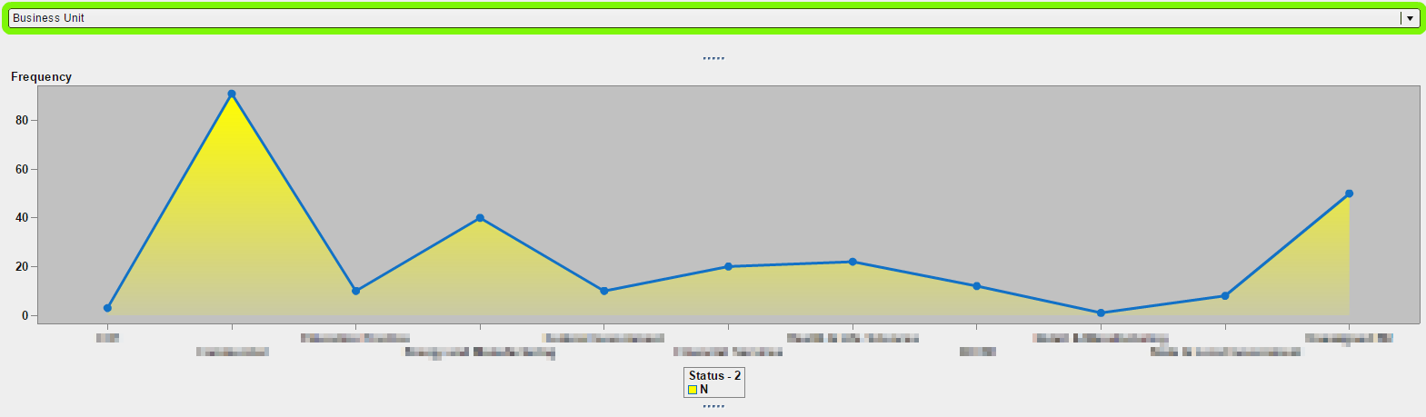
Default view with no value selected in the drop down list:
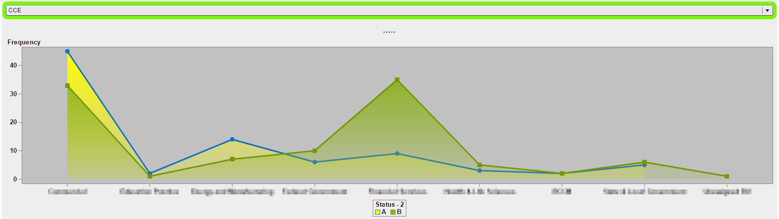
Now, when I select 'CCE' I will see two measures in the line chart:
Your specific advanced filter would be need to also modified to show profit/cost (other measure) depending on which continent was selected. The profit/cost indicator could be determined by created a calculated item.
-shawn
- Mark as New
- Bookmark
- Subscribe
- Mute
- RSS Feed
- Permalink
- Report Inappropriate Content
Hi skillman,
Thanks for the response.We were able to create custom categoris for the corresponding measures but we could not proceed after that.Please elaborate the advance filter part as in why exactly we need to have the filters?
Once again to be specific about our requirement,we need to display the measure names such as profit/cost in a list box.Checking the measure name,the chart should change.We need to also achieve multiselection as in if we select multiple measure names,both should be reflected in the chart.
Thanks.
- Mark as New
- Bookmark
- Subscribe
- Mute
- RSS Feed
- Permalink
- Report Inappropriate Content
Ashwani,
The filters allow you to use the list box (which only supports categories) and translates your selection in the list box to a measure that would appear in a report object. In my example, I have a drop-down list which depending on the value selected pushes different categories to a line chart. Choosing Business Unit of 'CCE' forces the line chart to show status 'B' & 'A', otherwise if nothing is chosen, default the list chart to show status 'N'.
You can setup your filter and line chart the same way. If Profit is selected, show 'Profit' in the line chart. If Cost is selected show only 'Cost' in the line chart. If both 'Profit' and 'Cost' are chosen then begin adding multiple categories based on the selection to the line chart.
If you have data you can share I can replicate this in VA for you.
Thanks,
-shawn

- Mark as New
- Bookmark
- Subscribe
- Mute
- RSS Feed
- Permalink
- Report Inappropriate Content
@Ashwani_4 Did you possibly find an answer to your question? I am facing the same challenge.
Thanks!

- Mark as New
- Bookmark
- Subscribe
- Mute
- RSS Feed
- Permalink
- Report Inappropriate Content
- Mark as New
- Bookmark
- Subscribe
- Mute
- RSS Feed
- Permalink
- Report Inappropriate Content
I think I have a couple of ideas to solve this problem.
My understanding is that you want to be able to select what measure to use in a chart, so that you could use a control, such as a dropdown list, to select things like Profit, Cost, etc. and the chart would aggregate the selected measure for you, based on whatever other category item has been selected. For example, you have a bar chart that displays Profit by Country, but if you select Cost from the dropdown list you would see Cost by Country.
Here is what could be done, using the bar chart example from above:
1. Stacked container solution
- Create multiple bar charts for each measure you want: Profit by Country, Cost by Country, etc.
- Add them all into a stacked container.
- You wil not have the dropdown to change the measure, but instead you will do that by selecting the buttons that show up when content is added to a stacked container. If you name your bar chart objects with the measure names, this is what you see as those button labels.
2. Parameter solution
- First you will need to create a small table that has only one character column and as many rows as measure names you need. In our example, this would be a table with one column (let's call this column "Measure Name") and two rows with values "Profit" and "Cost". Load this table in memory.
- In your VA report, add a dropdown list and populate it with the "Measure Name" column.
- Create a character parameter (let's call it "selected measure") and assign it in the parameter role in the dropdown object.
- Create a numeric calculated item (let's call it "Measure") containing the following expression: IF 'selected measure'p = 'Profit' RETURN Profit ELSE IF 'selected measure'p = 'Cost' RETURN Cost ELSE .
- Note that there is a dot representing missing value in the last ELSE statement above to indicate an invalid selection. This should never happen, unless you the values from your small table don't match any possible values in the expression caused by typos for example.
- Create a bar chart with that uses Country as the category and the calculated item "Measure" as the measure.
You need to be aware that the calculated item from solution #2 has its own format. In my example, I've used Profit and Cost, both accepting the same format (e.g. currency), but if you have mixed mesaures that are formatted differently, you need to assing a generic format to this calculated item. Also if you are adding measures that are percentages in the mix, you may want to transform them a little bit in the IF-THEN-ELSE statement so that 0.27593 shows up as 27.6 for example.
I hope one of those two suggestions may be helpful.
- Mark as New
- Bookmark
- Subscribe
- Mute
- RSS Feed
- Permalink
- Report Inappropriate Content
@Renato_sas Thank you for your step by step and clear answer. The solution with parameter is the one I was looking for and it is working for me. Now I am able to choose between the measures on a Drop-Down List or a Button Bar. However I would like to be able to choose mutiple measures on one gragh. For example being able to choose only "Cost", only "Profit" but also being able to choose "Profit" line on top of "Cost" line. I thought to use List instead of Drop-Down List but then List does not support using parameters. Do you possibly have any solution about it?
Thanks!
Mahraz
- Mark as New
- Bookmark
- Subscribe
- Mute
- RSS Feed
- Permalink
- Report Inappropriate Content
Hi Mahraz,
To accomplish what you want, just define two dropdown lists, two parameters, and two calculated items and assign each one to an axis of a Dual Axis Line Chart or Dual Axis Time Series Plot. The calculated items would look something like this:
Measure1:
IF 'selected measure1'p Missing
RETURN .
ELSE IF 'selected measure1'p = 'Profit'
RETURN Profit
ELSE IF 'selected measure1'p = 'Cost'
RETURN Cost
ELSE .
Measure2:
IF 'selected measure2'p Missing
RETURN .
ELSE IF 'selected measure2'p = 'Profit'
RETURN Profit
ELSE IF 'selected measure2'p = 'Cost'
RETURN Cost
ELSE .
You can make the selection of Measure1 (the one that goes on the left axis) required from the dropdown list, and Measure2 don't need to be selected. If not selected, it won't display, giving you a single line chart.
The first "IF 'selected measure2'p Missing RETURN ." statement is redundant with the last one and it may not be necessary depending on the version you are running, but I think this is what you need to do in VA 7.3.
Best,
Renato
- Mark as New
- Bookmark
- Subscribe
- Mute
- RSS Feed
- Permalink
- Report Inappropriate Content
Hi Renato,
Thank you for your reply. It was very helpful. I used the idea in Custom Graph and it worked for me.
Regards,
Mahraz
- Mark as New
- Bookmark
- Subscribe
- Mute
- RSS Feed
- Permalink
- Report Inappropriate Content
Hi @MahRaz,
I'm glad to hear it worked for you. Youd you mind marking the post as the solution to help other users find answers more quickly?
Thank you,
Renato
- Mark as New
- Bookmark
- Subscribe
- Mute
- RSS Feed
- Permalink
- Report Inappropriate Content
Hi @Renato_sas,
I am wondering if the Parameter solution is also applicable to return an Aggregated measure instead of a raw measure or a calculated measure.
Thank you in advance!
.jpg")
Catch up on SAS Innovate 2026
Nearly 200 sessions are now available on demand with the SAS Innovate Digital Pass.
Explore Now →See how to use one filter for multiple data sources by mapping your data from SAS’ Alexandria McCall.

Find more tutorials on the SAS Users YouTube channel.
-
16 replies
-
03-23-2015 02:08 AM
-
18075 views
-
6 likes
-
9 in conversation
-
