- Home
- /
- SAS Viya
- /
- Visual Analytics
- /
- Re: Scatter Plot with selectable points
- RSS Feed
- Mark Topic as New
- Mark Topic as Read
- Float this Topic for Current User
- Bookmark
- Subscribe
- Mute
- Printer Friendly Page
- Mark as New
- Bookmark
- Subscribe
- Mute
- RSS Feed
- Permalink
- Report Inappropriate Content
I have a dataset that 4 fields:
.. Vessel Name (Text)
.. Vessel Class (Text)
.. Current Condition (0-100%)
.. Condition Trend (6-month slope, -1 to +1)
Sample:
Vessel Name, Vessel Class, Current Condition, Condition Trend
AAA, Large, 75, -.12
BBB, Large, 60, +.27
CCC, Small, 80, +.01
DDD, Small, 95, -.11
EEE, Small, 88, +.19
Each Vessel Name is unique. Vessels are grouped into Class. Measures are of individual Vessel, and are easily summarized by formula for a Class.
Have the data. Can create simple Scatter Plot that I can see/use. But names for each point don’t display nicely.
Need to create a scatter plot with each point representing one vessel or one class (summary values):
.. x-axis = Current Condition
.. y-axis = Condition Trend
Screen display needs to provide user capability to:
.. Select “by Name” or “by Class” to change plot (All individual Vessels or Class groups)
.. See Vessel Name or Vessel Class when curser hovers over individual point
.. Go to additional data (new data display) when user clicks on point
.. New data displayed from other, larger datasets
I don’t see how to get names to pop up when curser hovers on a point. Also need to make available for others to see and use (view chart, select points, bring up data detail). This would be intended as a starting point into a tree of data visualizations.
How to start? Where to look? Any examples or samples I can see/copy/learn from?
Somewhat new to SAS and VA. Have SAS Enterprise Guide, SAS Visual Analytics, SAS Microsoft Office (add ins), and access to a portal site run on Oracle Web Center. If this is posting to wrong forum, please send to correct resource (first time post).
Thank You for your advice and time.
- Mark as New
- Bookmark
- Subscribe
- Mute
- RSS Feed
- Permalink
- Report Inappropriate Content
Hi @Vern_Leach,
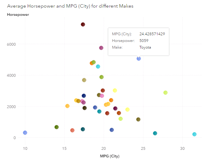
You can accomplish what you've described with a Bubble Plot, instead of a Scatter Plot.
In the example below I've used a fixed number for the bubble size to look like a scatter plot.
Best,
Renato
- Mark as New
- Bookmark
- Subscribe
- Mute
- RSS Feed
- Permalink
- Report Inappropriate Content
If you want other variable values to show up when you hover over the dots then you can add them to the Data Tip Values under Roles.
Melanie
Catch up on SAS Innovate 2026
Dive into keynotes, announcements and breakthroughs on demand.
Explore Now →See how to use one filter for multiple data sources by mapping your data from SAS’ Alexandria McCall.
Find more tutorials on the SAS Users YouTube channel.


