- Home
- /
- SAS Viya
- /
- Visual Analytics
- /
- SAS Visual Analytics - Location Analytics - explore, analyze, discover...
- RSS Feed
- Mark Topic as New
- Mark Topic as Read
- Float this Topic for Current User
- Bookmark
- Subscribe
- Mute
- Printer Friendly Page
- Mark as New
- Bookmark
- Subscribe
- Mute
- RSS Feed
- Permalink
- Report Inappropriate Content
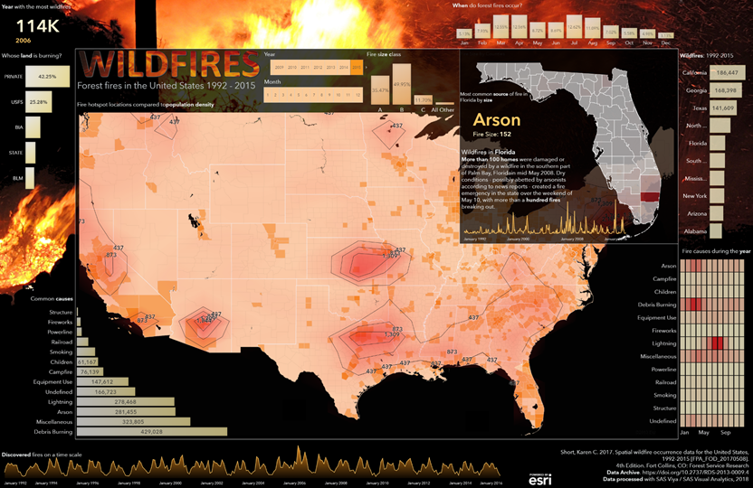
Despite our best efforts, large-scale natural disasters are going to occur. It is critical that we learn from past experiences, so we can educate impacted communities and be prepared for when future disasters happen.
Infographic Dashboards are an effective way to tell the story and convey the magnitude of these events - resulting in meaningful action.

In this video SAS Visual Analytics is used to explore California fire data (from a previous year) from NASA. Using Location Analytics in SAS Visual Analytics, the data is explored to:
- Uncover fire trends,
- Determine locations to allocate resources for future fire shelters,
- Analyze why fires occur where they do and consider educational programs for prevention,
- Understand how counties can combine resources to assist one another to rapidly address wildfires.
#WebMapWednesday
- Mark as New
- Bookmark
- Subscribe
- Mute
- RSS Feed
- Permalink
- Report Inappropriate Content
Very cool, thanks!
See how to use one filter for multiple data sources by mapping your data from SAS’ Alexandria McCall.
Find more tutorials on the SAS Users YouTube channel.


