- Home
- /
- SAS Viya
- /
- Visual Analytics
- /
- SAS VA
- RSS Feed
- Mark Topic as New
- Mark Topic as Read
- Float this Topic for Current User
- Bookmark
- Subscribe
- Mute
- Printer Friendly Page
- Mark as New
- Bookmark
- Subscribe
- Mute
- RSS Feed
- Permalink
- Report Inappropriate Content
Hi All,
I have 3 Bar charts in designer and I want to add total label in each bar chart to display a total of all measure in bar,
Is there any workaround?
Please suggest.
Accepted Solutions
- Mark as New
- Bookmark
- Subscribe
- Mute
- RSS Feed
- Permalink
- Report Inappropriate Content
Hi @Akas_wankha,
Sorry for the late Reply...![]()
Steps for Custom Graph:
1) Drag and drop Two Bar Charts into canvas area (Not Side by Side).
2) Create a shared Role.
3) assign/share the created Shared Role with Bar charts Measure. (Right Click on Bar Measures you will get an option USE SHARED ROLE)
Then Save it.
In your Designer Create a Calculated (Character)/Custom Category and Name it as Total (as per my Exmple: IF Region in (EAST, West, North, South) Return Total else ' ')
after that assign the roles for Custom Graph.
Category 1 : Region
Category 2: Total
Shared Measure : Budget/Measure.
Let me know if you found any difficulties while doing.
Thanks,
Teja Surapaneni
- Mark as New
- Bookmark
- Subscribe
- Mute
- RSS Feed
- Permalink
- Report Inappropriate Content
Hi @Akas_wankha,
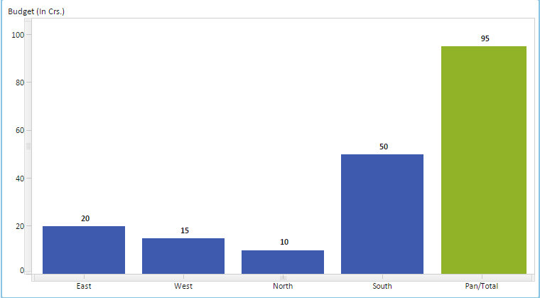
is this your requirement?
There are two ways to show the TOTAL Value in Bar Chart.
Thanks,
Teja Surapaneni
- Mark as New
- Bookmark
- Subscribe
- Mute
- RSS Feed
- Permalink
- Report Inappropriate Content
I want label like above image in Bar chart which will show total of bar values in it..
like above label should contain 190..
Please suggest.
- Mark as New
- Bookmark
- Subscribe
- Mute
- RSS Feed
- Permalink
- Report Inappropriate Content
Hi,
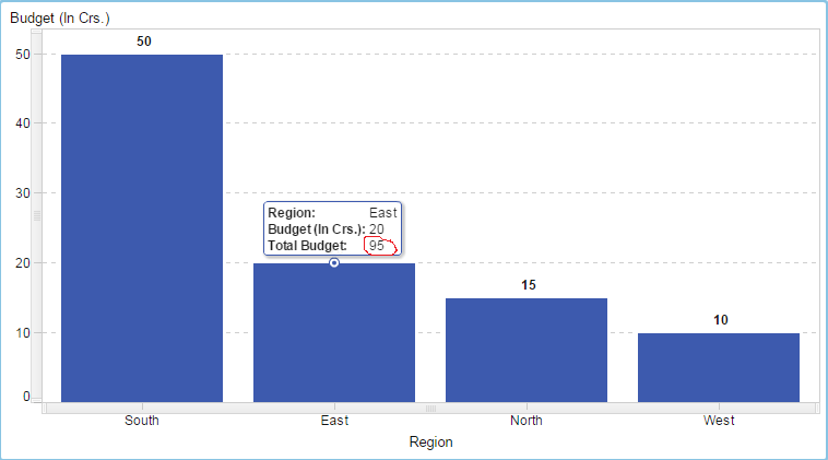
In my knowledge... option is not available to show Label value (TOTAL) in Bar Chart Instead of that you can use Data tip value (which is available Bar Graph roles) to show Total Value.
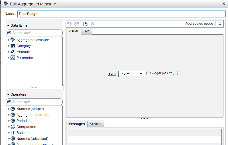
create an Aggregated Measure and Name it as Total Budget/your Measure name.
Then assign this Agg. Measure to Date tip value.
The Previous Graph (In my last post) is done through Custom Graph builder.
If you want I will share the steps.
Thanks,
Teja Surapaneni
- Mark as New
- Bookmark
- Subscribe
- Mute
- RSS Feed
- Permalink
- Report Inappropriate Content
- Mark as New
- Bookmark
- Subscribe
- Mute
- RSS Feed
- Permalink
- Report Inappropriate Content
Hi @Akas_wankha,
Sorry for the late Reply...![]()
Steps for Custom Graph:
1) Drag and drop Two Bar Charts into canvas area (Not Side by Side).
2) Create a shared Role.
3) assign/share the created Shared Role with Bar charts Measure. (Right Click on Bar Measures you will get an option USE SHARED ROLE)
Then Save it.
In your Designer Create a Calculated (Character)/Custom Category and Name it as Total (as per my Exmple: IF Region in (EAST, West, North, South) Return Total else ' ')
after that assign the roles for Custom Graph.
Category 1 : Region
Category 2: Total
Shared Measure : Budget/Measure.
Let me know if you found any difficulties while doing.
Thanks,
Teja Surapaneni
- Mark as New
- Bookmark
- Subscribe
- Mute
- RSS Feed
- Permalink
- Report Inappropriate Content
Hi Teja,
I have created shared rule and assigned required measures and categories to Role. The problem I am facing is with mandatory category value.
Please find attached screenshot 1 after assigning roles and
screenshot 2 for roles available after creation of custom bar chart.
- Mark as New
- Bookmark
- Subscribe
- Mute
- RSS Feed
- Permalink
- Report Inappropriate Content
- Mark as New
- Bookmark
- Subscribe
- Mute
- RSS Feed
- Permalink
- Report Inappropriate Content
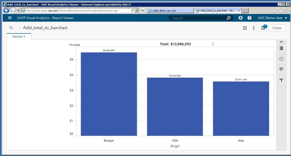
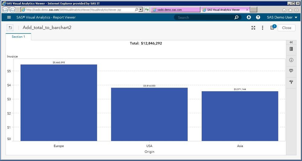
I was able to accomplish this in VA 7.4 by simply using a precision layout and centering a Text Object that uses a dynamic measure.
- Mark as New
- Bookmark
- Subscribe
- Mute
- RSS Feed
- Permalink
- Report Inappropriate Content
A more graceful approach is to use tiled layout and simple center the Dynamic text above the bar chart. See above
Catch up on SAS Innovate 2026
Dive into keynotes, announcements and breakthroughs on demand.
Explore Now →See how to use one filter for multiple data sources by mapping your data from SAS’ Alexandria McCall.
Find more tutorials on the SAS Users YouTube channel.

