Turn on suggestions
Auto-suggest helps you quickly narrow down your search results by suggesting possible matches as you type.
Showing results for
- Home
- /
- SAS Viya
- /
- Visual Analytics
- /
- SAS VA line chart y-axis thickmarks
Options
- RSS Feed
- Mark Topic as New
- Mark Topic as Read
- Float this Topic for Current User
- Bookmark
- Subscribe
- Mute
- Printer Friendly Page
- Mark as New
- Bookmark
- Subscribe
- Mute
- RSS Feed
- Permalink
- Report Inappropriate Content
Posted 09-07-2016 05:07 AM
(1496 views)
Hello,
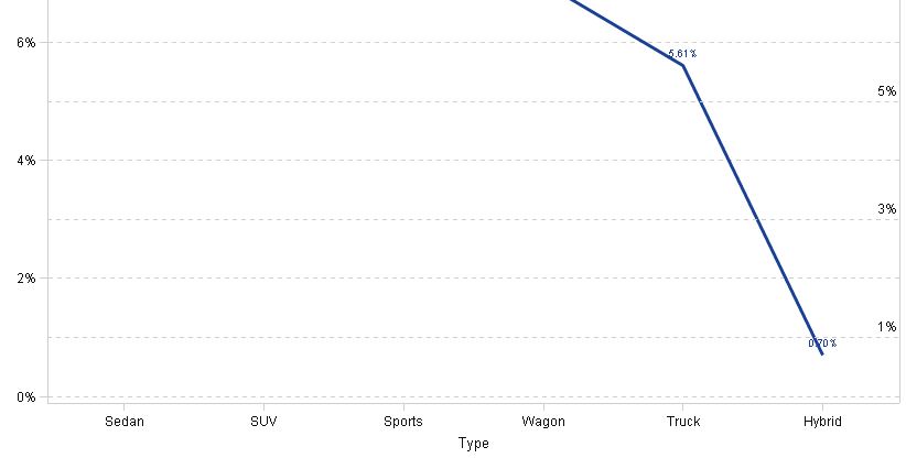
I now have a line chart with on the y axis 6 tickmarks: 0%, 2%,4%, 6%, 8%, 10%.
I have set a minimum (0) and a maximum(10%) for my y axis.
But the customer wants more tickmarks. I tried to build a customgraph but did not manage it.
Is their a way to show tickmarks at each % with a corresponding dashed line?
THx,
Filip
1 REPLY 1
- Mark as New
- Bookmark
- Subscribe
- Mute
- RSS Feed
- Permalink
- Report Inappropriate Content
You could use reference lines for the additional points. However, the label for the reference line appears on the right and you cannot specify to place it on the left.

-------------------------------------------------------------------------
Four tips to remember when you contact SAS Technical Support
Tricks for SAS Visual Analytics Report Builders
SAS Visual Analytics Learning Center
Catch up on SAS Innovate 2026
Nearly 200 sessions are now available on demand with the SAS Innovate Digital Pass.
Explore Now →Tips for filtering data sources in SAS Visual Analytics
See how to use one filter for multiple data sources by mapping your data from SAS’ Alexandria McCall.
Find more tutorials on the SAS Users YouTube channel.


