- Home
- /
- SAS Viya
- /
- Visual Analytics
- /
- Re: Hybrid Network Analysis Object
- RSS Feed
- Mark Topic as New
- Mark Topic as Read
- Float this Topic for Current User
- Bookmark
- Subscribe
- Mute
- Printer Friendly Page
- Mark as New
- Bookmark
- Subscribe
- Mute
- RSS Feed
- Permalink
- Report Inappropriate Content
In Visual Analysis, is there any way to create to a network analysis object which is a hybrid of a Hierarchical network analysis object and an Ungrouped network analysis object that allows both nodes displayed in a hierarchical arrangement and nodes directly linked in a source-target arrangement that does not follow the hierarchy?
Why do I need this? What am I trying to do?
I am trying to create an interactive network analysis object that visualizes a thesaurus. Hierarchical relationships are used to visualize the relationships between broader terms and narrower terms (along the lines of a family tree). This creates several tree-like structures. Source-target relationships are used to visualize the relationships between related terms that do not have a hierarchical relationship (in some cases linking the trees).
Is there any way to accomplish this?
- Mark as New
- Bookmark
- Subscribe
- Mute
- RSS Feed
- Permalink
- Report Inappropriate Content
Hi,
Unfortunately the network graph in network analysis only supports a force-directed layout algorithm which means nodes are positioned dependent on their place in the network and how well-connected they are. I guess - what you need is some sort of org-chart diagram which is something on the list of visuals to be added to VA but not currently available.
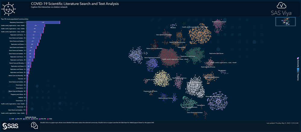
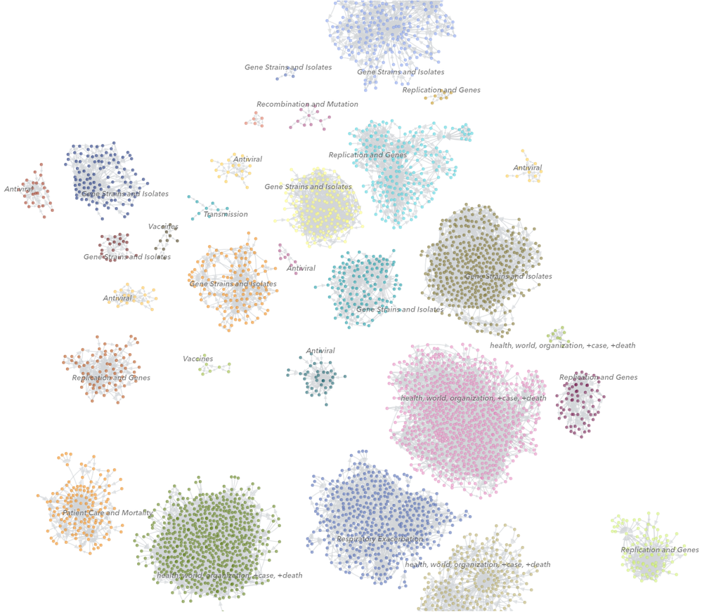
I had a similar challenge not too long ago when visualizing scientific papers around COVID19. The idea was to use SAS visual-text analytics to determine three-levels of topics and then group papers by that as well as link papers together if they reference each other. I ended up creating separate disconnected graphs for each topic as shown here:


Not ideal as a hierarchical view/structure may be easier for the audience but it did work out quite ok in the end. I combined the network plot with other visuals in the report to allow easier filtering / drill operations.
Sorry - I don't have the easy answer but maybe some of that helps.
Regards, Falko
- Mark as New
- Bookmark
- Subscribe
- Mute
- RSS Feed
- Permalink
- Report Inappropriate Content
What is "the list of visuals to be added to VA but not currently available" ?
Is it publicly available?
Does the list show where each visual to be added is in the roadmap?
- Mark as New
- Bookmark
- Subscribe
- Mute
- RSS Feed
- Permalink
- Report Inappropriate Content
No, that is not published as far as I know. You may be able to get in touch with your local SAS contacts who may have more details around road maps, new features coming, etc.
- Mark as New
- Bookmark
- Subscribe
- Mute
- RSS Feed
- Permalink
- Report Inappropriate Content
Do you know any third-party tools that can do this until this feature is added?
- Mark as New
- Bookmark
- Subscribe
- Mute
- RSS Feed
- Permalink
- Report Inappropriate Content
You could use the Visual Analytics data-driven content object (doc is here https://go.documentation.sas.com/doc/en/vacdc/8.2/vaobj/p0ppd5f6rdubvbn18zlirr9xshy3.htm) and use any available D3-org chart visualization. There is also an example using Google Org Chart at https://github.com/sassoftware/sas-visualanalytics-thirdpartyvisualizations if you need code snippets to get started. Data-driven content objects require some basic JavaScript development but a great option to include any special data viz into your existing reporting environment. Hope this helps! Falko
Catch up on SAS Innovate 2026
Nearly 200 sessions are now available on demand with the SAS Innovate Digital Pass.
Explore Now →See how to use one filter for multiple data sources by mapping your data from SAS’ Alexandria McCall.
Find more tutorials on the SAS Users YouTube channel.


