- Home
- /
- SAS Viya
- /
- Visual Analytics
- /
- Re: How to create a Pareto Chart
- RSS Feed
- Mark Topic as New
- Mark Topic as Read
- Float this Topic for Current User
- Bookmark
- Subscribe
- Mute
- Printer Friendly Page

- Mark as New
- Bookmark
- Subscribe
- Mute
- RSS Feed
- Permalink
- Report Inappropriate Content
Hello SAS-Community,
would you have any idea how to create a Pareto Chart in SAS Visual Analytics. I'm interested to create 2 Pareto Chart.
The first one using a category and the frequency.
The second one using a category and a measure.
Those are the type of charts I can use in our SAS VA version.
Thanks a lot for your support
Best Regards,
Markus

- Mark as New
- Bookmark
- Subscribe
- Mute
- RSS Feed
- Permalink
- Report Inappropriate Content
Markus,
you must have already selected a non numberic variable, so the histogram (Pareto) is greyed out. (Historgam can not deal with a non numberic value).
Please start with an enpty screen and directly select the Historgrom before you select anay data fields.
If you did not yet select any variable, I have no idea why the Histogram icon is greyed out. (and thats the one you need....![]() )
)
Good luck. ![]()
- Mark as New
- Bookmark
- Subscribe
- Mute
- RSS Feed
- Permalink
- Report Inappropriate Content
Hi Peter,
creating the histogramm is fine for me, but how can I create a cumulative measure and cumulative percentage measure based on the used measure in the graph like e.g. frequency or kg and having a category on the x-axis, so that I can build the pareto?
Thanks for your help
- Mark as New
- Bookmark
- Subscribe
- Mute
- RSS Feed
- Permalink
- Report Inappropriate Content
Hi Marcus,
At first my mistake to mix up capability chart with Pareto. Sorry for that.
A very simple presentation would be to select Bar-Chart and drag fill the category. Now the bar chart will automatically sort in large to small freq order.
This looks like a Pareto but has no cumulative line.
Seems to be you have VA 6.3 installed, I am running on 6.2 (To be updated soon)
Other option would be to use a Bar-Line report and create calculated fields on group level for this. (I will check later if this also can be done in 6.2
I know that VA 6.3 has new functionality here, but I do not have it available yet.
Thats it for now......waiting on the upgrade to 6.3.
Greetings

- Mark as New
- Bookmark
- Subscribe
- Mute
- RSS Feed
- Permalink
- Report Inappropriate Content
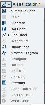
Hi Markus,
From the UI screenshot I can tell you are using the VA Explorer. Peter's suggestion of using a Bar-Line would require you to switch to the VA Designer.
The missing piece to get a Pareto chart is to calculate the cumulative totals. As of the current release, VA can't do this calculation for generic categories; only for dates. This is something we are likely to add in a future version though.

- Mark as New
- Bookmark
- Subscribe
- Mute
- RSS Feed
- Permalink
- Report Inappropriate Content
For the benefit of new users like me, here is how I created my first Pareto Chart using SASUE Sudio:
I have used example given in the book - Statistical Methods for Quality Improvement by Hitoshi Kume. Table 3.2, Page 20.
Step1: Created XL file with the following columns: Type of Defects|Number of Defects|Percentage of Defects|Cumulative Percentage

Step 2: Sort the table in ascending order of Number of defects (As shown in the picture)
Step 3: Import the xl to SASUE. From the table select the column names for graph as shown:
As you see, I have chosen, Type_of_Defect| Number_of_Defects|Cumulative_Percentage column names.

Step 4: Go to Tasks and Utilities
Step 5: Select Bar-Line Chart
Step 6: Select Category variable as Type_of_Defect field
Step 7: Select Bar Response variable as Number_of_Defects field
Step 8: Select Line Response variable as Cumulative_Percentage
Run the program. With little tweaking of chart options, we get Pareto chart output.

For your use, data file enclosed.
Since I am also a new user of SAS University, I welcome comments, suggestions for improvements from experienced forum members.
I will require some help in changing "Number of defects" axis, where I want to show total number of defects. Here is the output from XL chart:

Hope this helps!
Kind regards,
Niranjana
.jpg")
Catch up on SAS Innovate 2026
Nearly 200 sessions are now available on demand in the Innovate Hub.
Watch Now →See how to use one filter for multiple data sources by mapping your data from SAS’ Alexandria McCall.

Find more tutorials on the SAS Users YouTube channel.
-
5 replies
-
01-21-2014 03:36 AM
-
7879 views
-
2 likes
-
4 in conversation
-
