- Home
- /
- SAS Viya
- /
- Visual Analytics
- /
- Fun with SAS Visual Analytics Graphics: Challenge accepted!
- RSS Feed
- Mark Topic as New
- Mark Topic as Read
- Float this Topic for Current User
- Bookmark
- Subscribe
- Mute
- Printer Friendly Page
- Mark as New
- Bookmark
- Subscribe
- Mute
- RSS Feed
- Permalink
- Report Inappropriate Content
A few days ago, @tc, a frequent contributor of the SAS/GRAPH and ODS Graphics Community, shared a post where he used ODS Graphics and PROC SGPANEL to reproduce a chart first created by Robert Allison in his blog, Trends in U.S. refugee admissions. At the end of his post, @tc suggested someone try the same chart in SAS Visual Analytics (VA) - I saw it more as a challenge, so challenge accepted. 🙂
Using VA 8.1, I went to the SAS Visual Data Builder component and imported the source data, an Excel spreadsheet. The data was in a specific worksheet and due to the layout, only a range of cells contained the actual data and the column names spanned across multiple rows, so they could not be imported.

SAS Visual Data Builder offered all the flexibility needed to import the data in such conditions: I specified the sheet name, the cell range, and choose not to include column names.

The next step in getting the data ready was to rename the columns and remove column D (a column that contained asterisks in the Excel file). I’ve also removed columns PSI and Total, not used in the final chart. All easily done with SAS Visual Data Builder.
At that point I had to make a decision: should I transpose the data or not? Well, I ended up saving the table as it was and a second version of the table, I transposed. I’ve decided to do that to show different ways to create the chart. In order to transpose the table, I had to create a new character column that returned a fixed string “Refugees” to be used as the ID column in the transpose.

For the transpose step I’ve selected the new column ID as the ID column, Fiscal Year as the Group By column, and each one of the regions (Africa, Asia, Europe, etc.) as the Transpose columns. The output table is below. I only had to rename _NAME_ to Region and then save the final transposed table.

Now, let’s create the charts!
Solution #1 – Using transposed table
The transposed table allows for a “quick and dirty” chart, meaning that I can leverage the lattice rows role and get the chart done in no time. All I needed to do is use a bar chart with Fiscal Year as the category, Refugees as the Measure, and Region as the lattice row:

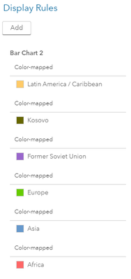
To make the chart look better, I added a color-mapped display rule for each region. I have not created a display rule for Near East / South Asia because I’ve used the default color for this region.

A title and footnote with a hyperlink to the source Web page (Text objects), smaller font size, sorting by Fiscal Year, and changing other minor axis attributes gave the final touch.

Observe that Allison’s original chart in ODS Graphics that we are trying to reproduce displayed the regions in a different order. Also, unlike the original chart, all regions from my chart have the same max value in the Y axis. Custom sort, coming in the next SAS Visual Analytics release (8.2) later this year, will allow us to change the order of the regions.
Solution #2 – Using original (non-transposed) table
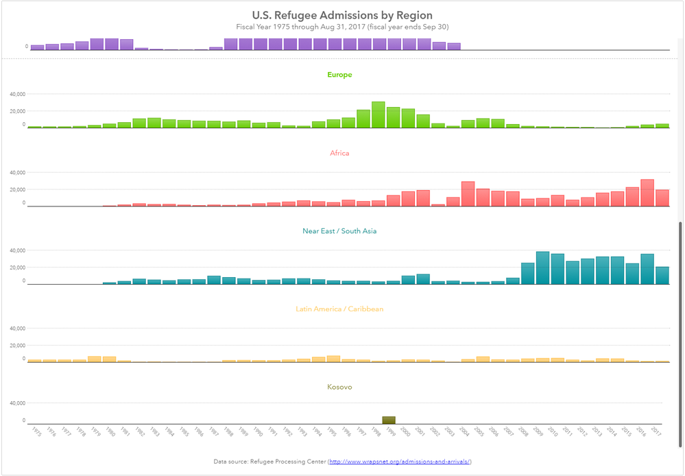
With this type of table, each region is in a different column, so I’ve added one bar chart of each one, where Fiscal Year was assigned to the category role and the corresponding region to the measure. Like in the Solution #1 chart, I’ve added a title and footnote, sorted by Fiscal Year, changed font size and other minor cosmetic attributes, and changed colors by assigning a display rule where the expression tested for the corresponding measure not missing.

I’ve also set the Y axis fixed maximum to be the same in all bar charts to keep them consistent and in the same scale, but that caused the bars of some of the regions to almost disappear. This new report allowed me to set individual titles for each region, like in the original ODS Graphics chart, but the titles consumed more vertical space so VA automatically removed the tick values from the Y axis.

To bring the tick values and the little bars back, I’ve used the same technique that Robert Allison used in the original chart: set different maximum values in the Y axis but keep the bar chart height proportional with the max value on each bar chart. By doing that I would practically make the bar charts taller, which would cause problems to fit all bar charts vertically on the screen and make it even harder to display the tick values.
The solution was to use containers: two containers in tile mode (default) inside a container in precision mode. Because part of the content falls outside of the screen, a scroll bar is automatically added to the outer container. Observe that the container sizes were chosen proportionally to keep the individual bar chart heights proportional to each other. Handling situations like that will be a lot simpler in VA 8.2, where you will be able to set the report size and if your computer screen is smaller, scrollbars get added automatically without the need of containers.

This is the final report (two screenshots: before and after scrolling).

To wrap up, the report in solution #1 was easier and quicker to create (one bar chart for all regions), but it required a few more steps to transpose the data, which is ok. I didn’t like the tiny bars. Well, VA is interactive, and you can zoom in the chart if needed, so this solution may be good enough. Solution #2 didn’t require the table to be transposed, but I had to create one bar chart for each region and use containers (more objects to manage and more time to design), but the end result was comparable with the original chart. So if this is what you want, the extra work may worth it.
Overall, it was a nice exercise and showed that all the steps from data access, data transformation, and reporting can be done in SAS Visual Analytics.
I hope you’ve learned a few tricks.
Mission accomplished!
- Tags:
- SAS Challenge
- Mark as New
- Bookmark
- Subscribe
- Mute
- RSS Feed
- Permalink
- Report Inappropriate Content
This seems like a good start. I look forward to your updating the solution as it could use 8.2 ( not 8.1 ). I had planed to restructure my data so that I could generate one set of lattice plots for each of the filtered subsets. But I have just not gotten this to work properly ( at least yet ).
Here's one way to describe the problem:
First, I think William Cleveland would say that you don't want to try to put too many points on individual plots, and instead use systems of lattice plots ( "trellis plots" ) and other kinds of graphic techniques. These techniques are apt to be used together with filtering and dimensionality reduction on the back end where now one would be apt to make effective use of server clusters to do that work. Having said that, it's not clear that all the pieces are in place for SAS Studio / SAS VA this at this point to take this approach in general.
My guess is that a general solution would be to be use SAS VA to call macros written in SAS Studio from SAS. The macros written in SAS Studio would do some additional filtering, sampling/ stratified sampling), or dimensionality reduction in other ways. But I don't see how to do that now, that is use SAS DS2 code to create data subsets on the fly that can then plotted in SAS VA.
So at this point I still plan to do this in SAS Studio, using SGPANEL/SGPLOT functions wrapped by macros. Using this kind of approach would essentially give you the "R" approach to programming things using the "lattice" and "ggplot2" packages of R. And, that would be okay. But I think a more general solution making greater use of SAS VA would be more helpful.
But if you could continue to evolve your current approach, a document it using SAS VA 8.2, perhaps that gives another way to make use of SAS VA rather than SAS Studio. So if you can continue to document your own approach so far, that would be quite good.
Thanks, rh
- Mark as New
- Bookmark
- Subscribe
- Mute
- RSS Feed
- Permalink
- Report Inappropriate Content
Thanks for your comment, @RichHaney. You raise some good ideas on ways to iterate this example. I’ll take a look at new possibilities to deliver the bar charts in VA 8.2, like using the Data-Driven Content object for example.
Catch up on SAS Innovate 2026
Dive into keynotes, announcements and breakthroughs on demand.
Explore Now →See how to use one filter for multiple data sources by mapping your data from SAS’ Alexandria McCall.
Find more tutorials on the SAS Users YouTube channel.


