- Home
- /
- SAS Viya
- /
- Visual Analytics
- /
- Re: Dynamic Dimensions in VA
- RSS Feed
- Mark Topic as New
- Mark Topic as Read
- Float this Topic for Current User
- Bookmark
- Subscribe
- Mute
- Printer Friendly Page
- Mark as New
- Bookmark
- Subscribe
- Mute
- RSS Feed
- Permalink
- Report Inappropriate Content
Hello All,
There are multiple examples of what I am trying to do here - create dynamic dimensions within VA, to illustrate how a numeric field is broken by different categorical variables:
http://support.sas.com/resources/papers/proceedings15/SAS1854-2015.pdf
but I'm not quite getting the results I want - in step 1: creating a custom category, the field used as a source for the custom category does matter, it subsets the resulting dashboard (whereas the walk-throughs say the source field should not matter so long as the cardinality is large enough to accommodate the results). So I'm going to create a basic example to illustrate my problem... I'm goign to follow the SAS paper, though the blog example is quite similar.
Prelims: Create dummy data... and put it on AUTOLOAD / LASR etc...
Dummy Data:
data que;
input cat1 $ cat2 $ cat3 $ cat4 $ num1 ;
cards;
Z S B C 0.296545295
F X I Q 0.555111915
D R M V 0.257882082
C B W R 0.820439665
L L F J 0.653780736
F C K K 0.405469842
O N Y J 0.756141762
N C K B 0.069636594
Y R H B 0.166439445
Z N M Q 0.726950181
;
run;
1. Create a custom Category
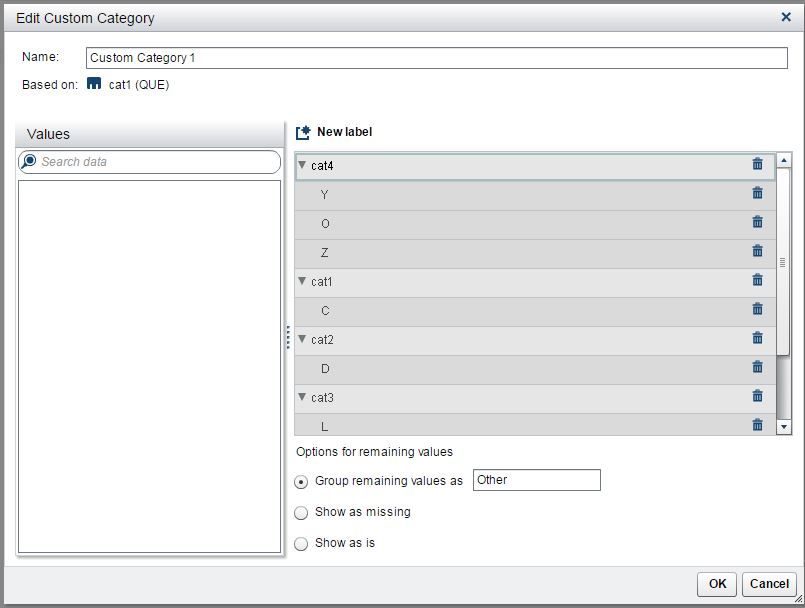
I'll use cat1. Since it has more than 4 levels, this should be appropriate. The two walk-throughs differ as to whether or not to use "Group remaining values as Other"...I will follow the paper and bin all levels of cat1 to avoid "Group remaining values as Other". (See Custom_Category_VA).
2. Create button bar, drag Custom_Category_VA on to it (e.g. Roles: Category: "Custom_Category_1"), remove Role:Frequency for aesthetics.
3. Create a parameter, Type=Character. Click OK.
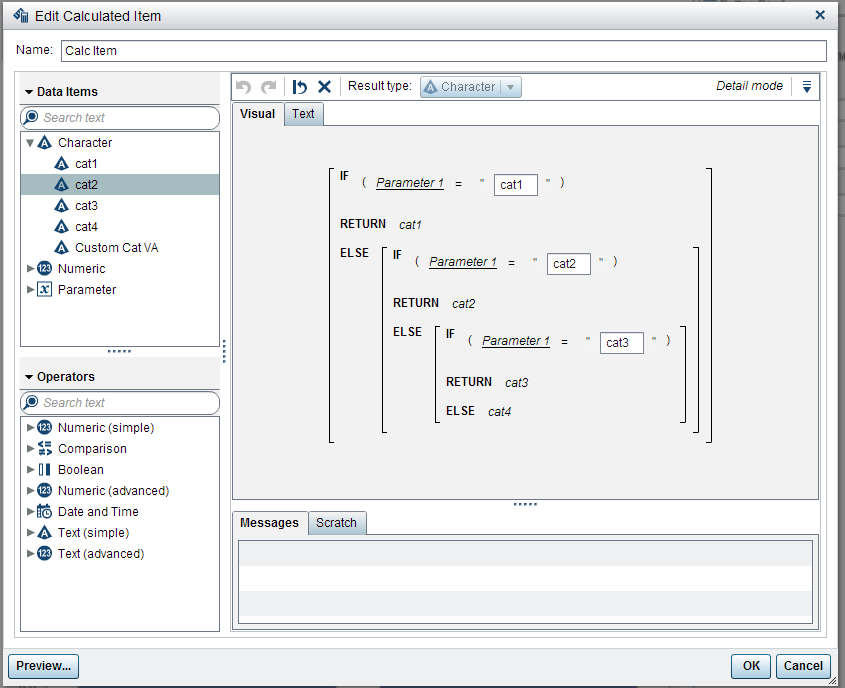
4. Create a Calculated Item. This is the hard part and likely where I've made a mistake. The paper provides several pages of interacting with the drag/drop Expression builder. Here, I will use the "Text" option and share the code (following the blog example).
IF ('Parameter 1'p = 'cat1' ) RETURN 'cat1'n ELSE (
IF ( 'Parameter 1'p = 'cat2' ) RETURN 'cat2'n ELSE (
IF ( 'Parameter 1'p = 'cat3' ) RETURN 'cat3'n ELSE (
'cat4'n)))
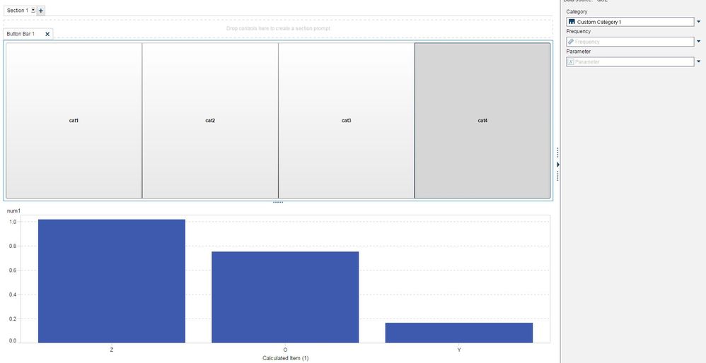
4. Putting it all together: Put a barchart in the report, so we have something to look at. Create an interaction from the button bar to the barchart. Barchart: Roles: Category: "Calculated Item (1)" and Measures: "num1"... however, this does not work. The bar chart displays the values contingent on the original Step 1 Custom Category...
* clicking the button bar cat4 gives a bar chart with categories of Z,O,Y (cat1 has 8 distinct levels C,D,F,L,N,O,Y,Z)
* clicking the button bar cat3 gives a bar chart with categories of F,L,N
* clicking the button bar cat2 gives a bar chart with categories of D
* clicking the button bar cat1 gives a bar chart with categories of C
I'm using SAS Visual Analytics Designer Version: 7.3 Hotfix 03
Thank-you for any help you might provide,
Wes
Accepted Solutions
- Mark as New
- Bookmark
- Subscribe
- Mute
- RSS Feed
- Permalink
- Report Inappropriate Content
Hi Wes
I recreated your example - but I'm not sure I understand the issue.
I * think* you wanted to see the catgories change when you clicked the button bar for it and this was what you meant by dynamic dimensions.
Here's what I did ... you can let me know if this is what you were expecting to happen instead.
Changed your data so it would be more clear what row and variable was being displayed.
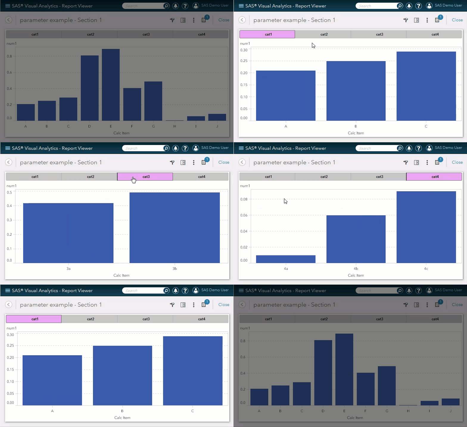
Basically - if you see an X on the x-axis - it's not pulling the dynamic category. It display a letter with number unless its cat1 - then it's just A, B, or C. I changed the number value but it doesn't matter - yours worked just as well.
/*Dummy Data: */

data que;
input cat1 $ cat2 $ cat3 $ cat4 $ num1 ;
cards;
A X  X  X  0.21
B X  X  X  0.25
C X  X  X  0.29
D 2a X  X  0.81
E 2b X  X  0.89
F X  3a X  0.41
G X  3b X  0.49
H X  X  4a 0.01
I X  X  4b 0.06
J X  X  4c 0.09
;
run;
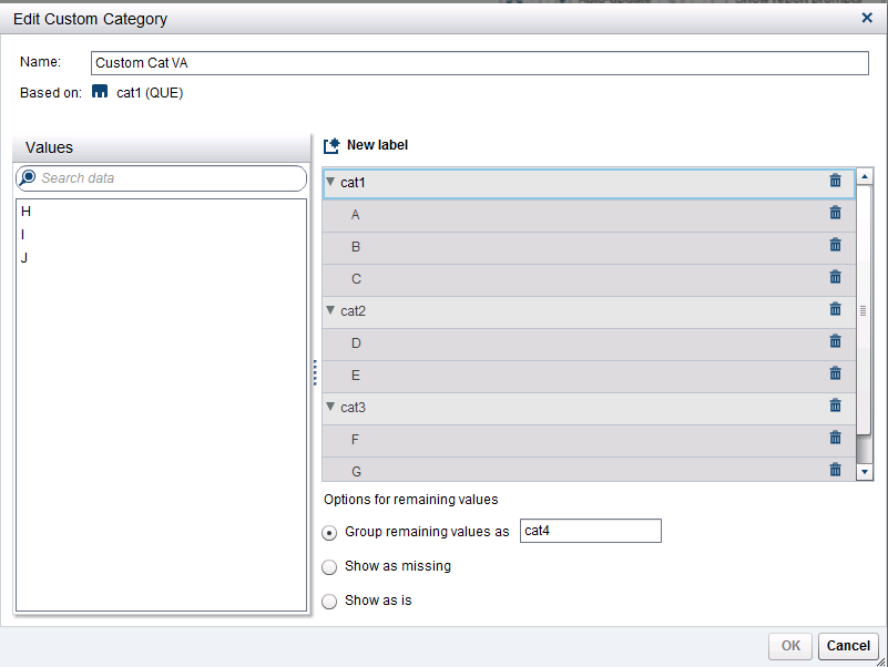
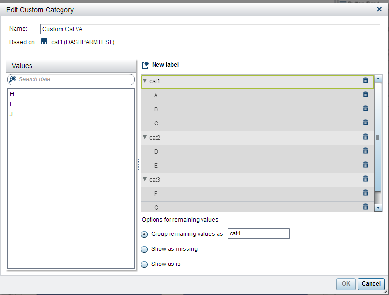
- Here's my Custom Category assignment based on cat1 data item:
- Created a parameter called Parameter 1. Then created a calculated item called Calc Item. Here's what it looked like:
- Here's my report layout:
- Add Button bar to the section area.
Assign Category = Custom Cat VA; Frequency = Empty; Parameter = Parameter 1
-Add bar chart to the design area:
Assign Category = Calc Item Measures = num1
Here's the results when you select each button. Notice that the labels change on the X-Axis. You may need to study the dat to understand what is happening.
Tricia Aanderud
Twitter: @taanderud - Follow me!
- Mark as New
- Bookmark
- Subscribe
- Mute
- RSS Feed
- Permalink
- Report Inappropriate Content
Thank-you for your time and sorry I was unclear - I ran low on time as I did the write-up. I think you have recreated what I have done (and wrote it up quite nicely!) but this still won't get me where I need to go unless I create a table just for this purpose (which perhaps is the only way to make it work). Each of the tabs you click on only displays a subset of the data. Each "X" in your dataset would be a valid value in a typical dataset. What I would like is to create a *dynamic dimension* and use it as the "Group" variable in a barchart which already has "Category" of Year. Clicking on the button bar would then show the one-way frequencies of a single measure using multiple categorical variables. The numerical measure remains the same, but is broken down by different dimensions, hopefully making the data quite clear. Similarly, if the technique holds, I can include a crosstab with a dynamic dimension. The examples in the links do numeric variables (swap one measure for another), but mention that it should be possible with categorical variables as well.
It's easy enough to do this for separate "Sections" but I'd like to reduce clutter / increase clarity:
"cat1" as Group
"cat2" as Group
...etc...
- Mark as New
- Bookmark
- Subscribe
- Mute
- RSS Feed
- Permalink
- Report Inappropriate Content
You are correct - that's exactly what is happening. When you add the cat1 custom category to the button bar - you are essentially asking for filter on the data. Even with the parameter - it's still part of a filter. It's what I'm trying illustrate here.
To implement your idea - you have to have some way to filter the dataset that doesn't change the data results.
You could stack the data multiple times. Essentially it is what I'm showing above but it would just be a column of categories and a measure.Based on how your data looks - it might create duplicate values. You would just have to be aware that everything has to be filtered when you want to show the data (to avoid the dups).
If the data was pre-summarized it could work.
Let us know what you work out. 🙂
Tricia Aanderud
Twitter: @taanderud - Follow me!
- Tags:
- parameters
- Mark as New
- Bookmark
- Subscribe
- Mute
- RSS Feed
- Permalink
- Report Inappropriate Content
After watching the youtube video (available through the links above) I found my mistake. I was using interactions between the button bar and the barplot and I may not have assigned the parameter to the button bar. At any rate, the video provides a very good overview if anyone is interested. Problem solved.
- Mark as New
- Bookmark
- Subscribe
- Mute
- RSS Feed
- Permalink
- Report Inappropriate Content
Hi Tricia ,
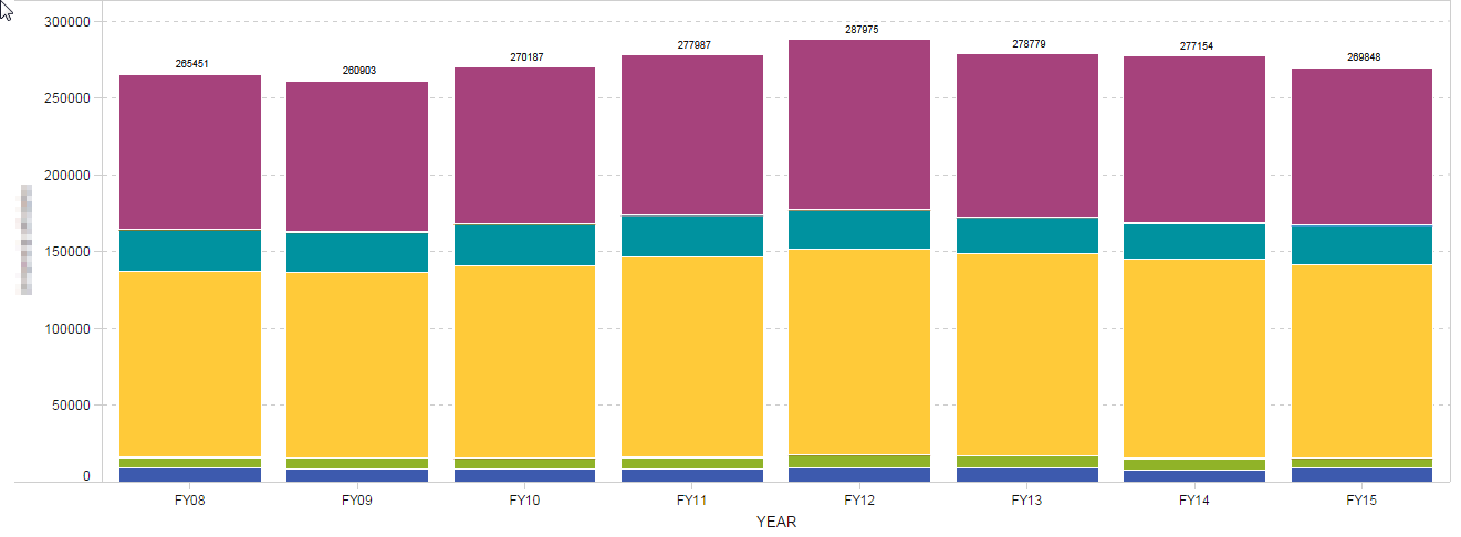
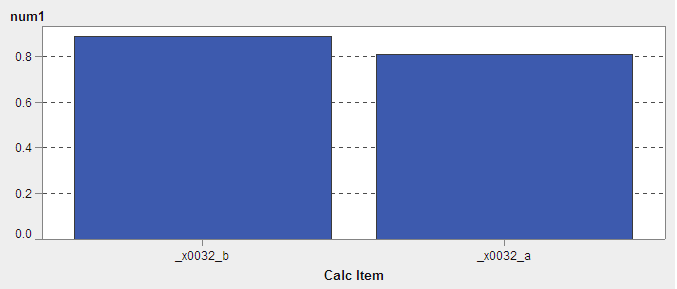
I tried replicating the scenario but the Bar Chart is not displaying properly. I check with all aspect but could not find the reason. Can you help. Please find the attached screens and let me know if anything else is required.
- Mark as New
- Bookmark
- Subscribe
- Mute
- RSS Feed
- Permalink
- Report Inappropriate Content
Hi ,
I hope the issue is that while importing from xlsx 2a is getting converted to _x0032_a
- Mark as New
- Bookmark
- Subscribe
- Mute
- RSS Feed
- Permalink
- Report Inappropriate Content
Hi
I think you are correct - looks like the import wasn't clean.
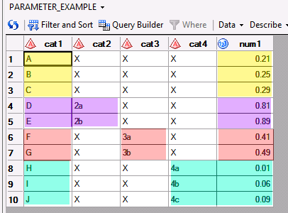
Your resulting data set should resemble this one (without the colors).
See you are close to genius already today!
Tricia Aanderud
Twitter: @taanderud - Follow me!
- Mark as New
- Bookmark
- Subscribe
- Mute
- RSS Feed
- Permalink
- Report Inappropriate Content
Catch up on SAS Innovate 2026
Dive into keynotes, announcements and breakthroughs on demand.
Explore Now →See how to use one filter for multiple data sources by mapping your data from SAS’ Alexandria McCall.
Find more tutorials on the SAS Users YouTube channel.

