- Home
- /
- SAS Viya
- /
- Visual Analytics
- /
- Re: Data visualization
- RSS Feed
- Mark Topic as New
- Mark Topic as Read
- Float this Topic for Current User
- Bookmark
- Subscribe
- Mute
- Printer Friendly Page
- Mark as New
- Bookmark
- Subscribe
- Mute
- RSS Feed
- Permalink
- Report Inappropriate Content
I want to do a data visualization for a data set, including variables: age, gender, sub_department and profit. I tried so many times using boxplot, bar_char and even facet graph, but all method doesn't work. My goal is: how does the profit distribute among different sub_department for each combination of age and gender(like group 20-29F, 20-29M). The question is kind of tricky, because I want to analyze those 4 variables in one graph. Could you please help me solve this problem? The following is the data file. Thanks so much
- Mark as New
- Bookmark
- Subscribe
- Mute
- RSS Feed
- Permalink
- Report Inappropriate Content
- Mark as New
- Bookmark
- Subscribe
- Mute
- RSS Feed
- Permalink
- Report Inappropriate Content
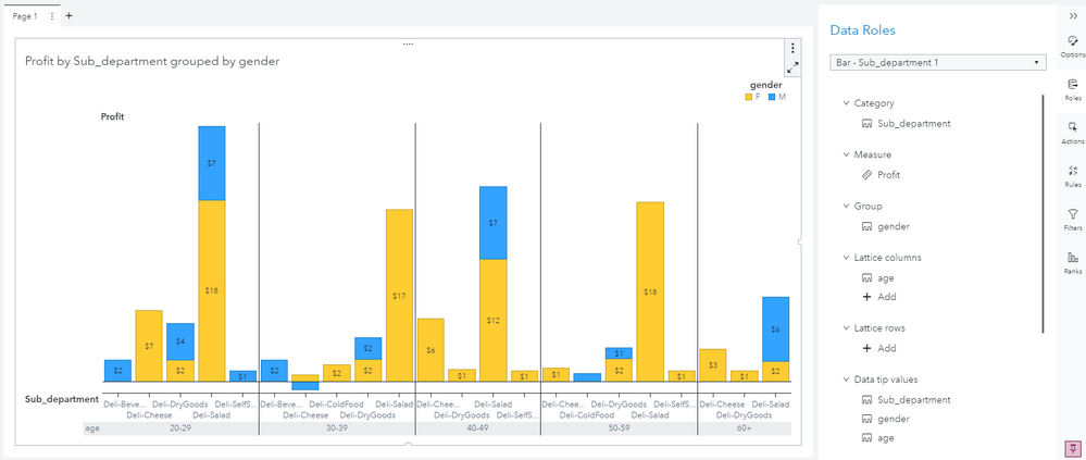
you could also try grouping the bars (e.g. by gender) along with lattice (either columns or rows) to further compress the information. Similar what @PetriRoine showed - just with additional stacked grouped bars. So something like the following:
Hope this helps. Falko
- Mark as New
- Bookmark
- Subscribe
- Mute
- RSS Feed
- Permalink
- Report Inappropriate Content
- Mark as New
- Bookmark
- Subscribe
- Mute
- RSS Feed
- Permalink
- Report Inappropriate Content
Hello @Jianan_luna
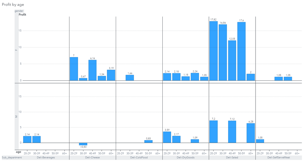
Both, @FalkoSchulz and I use the the Bar chart as basis. Look at Falco's image how he applied the roles - you can see them on the right side of his image. He used Gender in Group role. I used Gender in Lattice rows role.
Best regards,
Petri
- Mark as New
- Bookmark
- Subscribe
- Mute
- RSS Feed
- Permalink
- Report Inappropriate Content
- Mark as New
- Bookmark
- Subscribe
- Mute
- RSS Feed
- Permalink
- Report Inappropriate Content
- Mark as New
- Bookmark
- Subscribe
- Mute
- RSS Feed
- Permalink
- Report Inappropriate Content
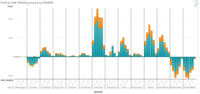
Thanks so much Sir, I got it, but the sample size is too big, and the age_range is so crowded, so it cannot show the whole range. Is there any way can make the x-axis much longer? or separate the graph to two part? Thanks so much!
- Mark as New
- Bookmark
- Subscribe
- Mute
- RSS Feed
- Permalink
- Report Inappropriate Content
Well rendering depends on the cardinality of your data items. You can play around with lattice rows vs columns and also related group role assignments. Lattice rows may work better as you would provide more horizontal room for each group segment. See what works best.
In the end - the overall size of the visualization decides how much real estate is available for rendering. The graph automatically removes things like labels, tick values or legends if there isn't enough room for rendering. You can try 'maximizing' (top right menu), opening view mode or increasing report size to provide more room if required.
Hope this helps. Falko
- Mark as New
- Bookmark
- Subscribe
- Mute
- RSS Feed
- Permalink
- Report Inappropriate Content
- Mark as New
- Bookmark
- Subscribe
- Mute
- RSS Feed
- Permalink
- Report Inappropriate Content
@Jianan_luna, one thing that you could maybe do is to offer report viewers possibility to narrow down uninteresting sub_departments. F.ex. add a List control object and assign sub_department to it. Then create an action from the List to Bar chart.
Best regards,
Petri
Catch up on SAS Innovate 2026
Dive into keynotes, announcements and breakthroughs on demand.
Explore Now →See how to use one filter for multiple data sources by mapping your data from SAS’ Alexandria McCall.
Find more tutorials on the SAS Users YouTube channel.


