- Home
- /
- SAS Viya
- /
- Visual Analytics
- /
- Re: Custom Stacked bar (normalised to 100%) / Line Graph
- RSS Feed
- Mark Topic as New
- Mark Topic as Read
- Float this Topic for Current User
- Bookmark
- Subscribe
- Mute
- Printer Friendly Page
- Mark as New
- Bookmark
- Subscribe
- Mute
- RSS Feed
- Permalink
- Report Inappropriate Content
Hi Forum,
I've had a couple of goes at creating this Stacked Bar (with 2 values) and Line combo graph but am having the following issues.
Attempt 1. I use the Customer graph builder & drag in a Bar graph & a Line Graph,
Then I try to add another measure for the bar graph so I can add the second measure to the bar stack.
Issue - I can't change the Stack to normalise to 100%
Attempt 2. I drag 2 bar graphs into the design plus a Line graph,
Then I format the 2 bar graphs as I need & find that I can't use a stacked bar.
Can someone give me a step by step way to achieve this?
I've looked at the User Guide but m still stuck.
Thanks
Accepted Solutions
- Mark as New
- Bookmark
- Subscribe
- Mute
- RSS Feed
- Permalink
- Report Inappropriate Content
Thanks Bruno,
That worked perfectly!
Next step is to change the colours of the Stacked bar for the 2 categories I have.
In the design of the Custom graph, I have selected black as mthat is one of the colours needed,
My attempts to get the other colour (Red) haven't succeeded.
How can I select a part of the stack & apply a colour?
Thanks again!
Peter
- Mark as New
- Bookmark
- Subscribe
- Mute
- RSS Feed
- Permalink
- Report Inappropriate Content
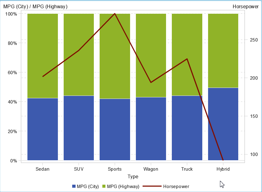
Bar charts support more than one measure by default. so there is no need to add another measure.
The grouping scale "normalize groups to 100%" can be set once you use your custom graph.
Should it look like this?
- Mark as New
- Bookmark
- Subscribe
- Mute
- RSS Feed
- Permalink
- Report Inappropriate Content
Thanks Bruno, that's exactly what I'm after!
I found that if I used 1 Bar Graph & then added a Line I got the message like "Layering another chart would make the chart unable to normalise to 100%"
So, if I follow you, these are the steps you took.
1. Go to Custom Cart, right click & select edit custom graph
2. Add a Bar graph to the design area
3. Add a Line graph to the design area
4. Save the chart & use in the report builder as normal.
Is this correct & do I need to change any other settings?
Thanks for your help.
Peter
- Mark as New
- Bookmark
- Subscribe
- Mute
- RSS Feed
- Permalink
- Report Inappropriate Content
Yes these are the steps
- create new custom graph
- add bar chart, set grouping style to stacked
- add line chart, set y axis to be on the right
- save
- use in the report, set grouping scale accordingly
- Mark as New
- Bookmark
- Subscribe
- Mute
- RSS Feed
- Permalink
- Report Inappropriate Content
Thanks Bruno,
I'll try this on Monday, so in 2 days time I'll come back tp you.
Appreciate your time.
Peter
- Mark as New
- Bookmark
- Subscribe
- Mute
- RSS Feed
- Permalink
- Report Inappropriate Content
Thanks Bruno,
That worked perfectly!
Next step is to change the colours of the Stacked bar for the 2 categories I have.
In the design of the Custom graph, I have selected black as mthat is one of the colours needed,
My attempts to get the other colour (Red) haven't succeeded.
How can I select a part of the stack & apply a colour?
Thanks again!
Peter
- Mark as New
- Bookmark
- Subscribe
- Mute
- RSS Feed
- Permalink
- Report Inappropriate Content
Catch up on SAS Innovate 2026
Nearly 200 sessions are now available on demand with the SAS Innovate Digital Pass.
Explore Now →See how to use one filter for multiple data sources by mapping your data from SAS’ Alexandria McCall.
Find more tutorials on the SAS Users YouTube channel.


