- Home
- /
- SAS Viya
- /
- Visual Analytics
- /
- Re: Combining two bar charts
- RSS Feed
- Mark Topic as New
- Mark Topic as Read
- Float this Topic for Current User
- Bookmark
- Subscribe
- Mute
- Printer Friendly Page
- Mark as New
- Bookmark
- Subscribe
- Mute
- RSS Feed
- Permalink
- Report Inappropriate Content
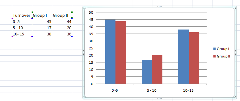
I am new to SAS VA. I am trying to create a bar chart showing comparison of two groups. Data for the 2 groups are in separate files (data sources). I want the chart to be displayed as shown below. Since data for the 2 groups are in separate data sources, i am able to create two bar charts but unable to combine them in a single bar chart showing 2 bars for each of the groups.
Any help would be highly appreciated. Thanks!
- Mark as New
- Bookmark
- Subscribe
- Mute
- RSS Feed
- Permalink
- Report Inappropriate Content
I'm new, as well, so I'm taking this as a challenge: If you reorganize your data a little, this will give the closest I can get to your picture. The bars are next to each other.
data example;
   infile datalines delimiter=',';
   input turnover $ value group;
   datalines;
0-5,45,1
0-5,44,2
5-10,17,1
5-10,20,2
10-15,38,1
10-15,36,2
;

/* general routine:
    http://blogs.sas.com/content/sascom/2011/08/22/how-to-make-a-cluster-grouped-bar-chart-graph-using-sas-sg-procedures/ */
proc sgplot data=example;
  vbar turnover / response=value group=group stat=sum nostatlabel
         groupdisplay=cluster barwidth=0.9 transparency=0;
  xaxis display=(nolabel);
  yaxis grid;
  run;
Otherwise, a different method will get the bars on top of each other. you can play around with barwidth and transparency to see what you like:
data example;
   infile datalines delimiter=',';
   input turnover $ group1 group2;
   datalines;
0-5,45,44
5-10,17,20
10-15,38,36
;

/* general routine:
    http://blogs.sas.com/content/sascom/2011/08/22/how-to-make-a-cluster-grouped-bar-chart-graph-using-sas-sg-procedures/ */
proc sgplot data=example;
  vbar turnover / response=group1 stat=sum nostatlabel
         groupdisplay=cluster barwidth=0.5 transparency=0.2;
  vbar turnover / response=group2 stat=sum nostatlabel
         groupdisplay=cluster barwidth=0.7 transparency=0.2;
  xaxis display=(nolabel);
  yaxis grid;
run;- Mark as New
- Bookmark
- Subscribe
- Mute
- RSS Feed
- Permalink
- Report Inappropriate Content
- Mark as New
- Bookmark
- Subscribe
- Mute
- RSS Feed
- Permalink
- Report Inappropriate Content
As you've discovered the data needs to be in the same data source for a single visualization/report object. When you are working with a visualization/report object only 1 data source can be selected and therefore you will need to bring your groups together in the same data source if you want a clustered bar chart.
- Mark as New
- Bookmark
- Subscribe
- Mute
- RSS Feed
- Permalink
- Report Inappropriate Content
Note that your Excel example does not have the data in two different workbooks.
See how to use one filter for multiple data sources by mapping your data from SAS’ Alexandria McCall.
Find more tutorials on the SAS Users YouTube channel.


