- Home
- /
- SAS Viya
- /
- Visual Analytics
- /
- Re: Color for bar line chart
- RSS Feed
- Mark Topic as New
- Mark Topic as Read
- Float this Topic for Current User
- Bookmark
- Subscribe
- Mute
- Printer Friendly Page
- Mark as New
- Bookmark
- Subscribe
- Mute
- RSS Feed
- Permalink
- Report Inappropriate Content
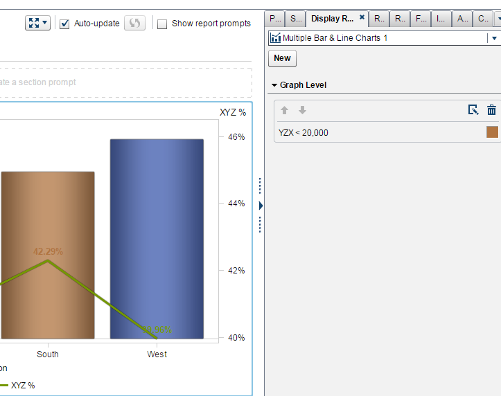
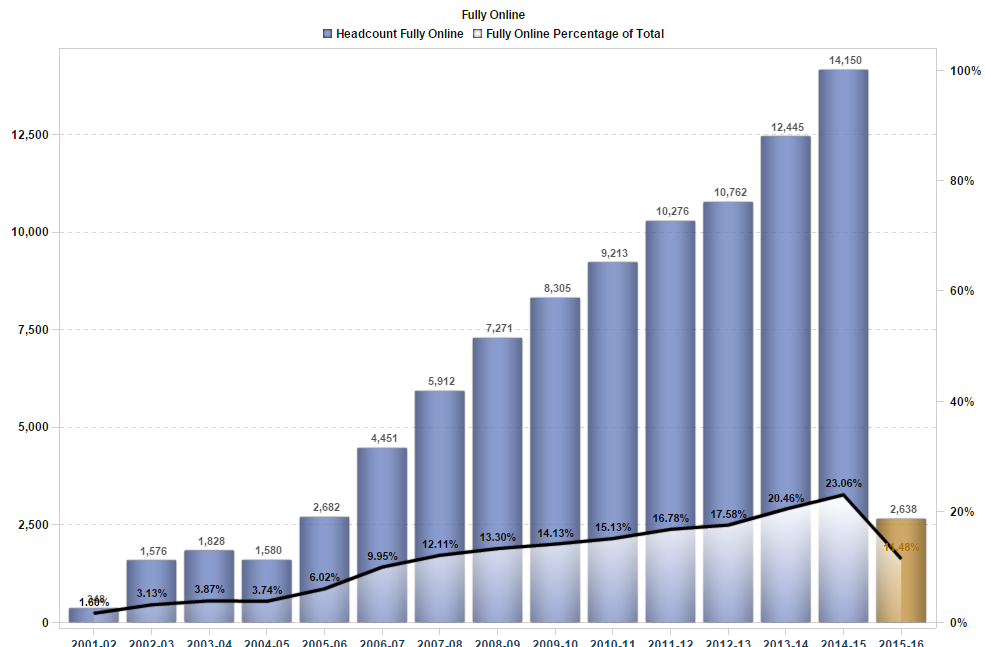
I created a bar line chart for 14 different term also I created called current term. Current term bar color is different. Also line shows percentages, that color is same as bar color . Bar color and percentahge color is same, so it is hard too see, is there any way that i can change the colors. chekc the attachment.
Accepted Solutions
- Mark as New
- Bookmark
- Subscribe
- Mute
- RSS Feed
- Permalink
- Report Inappropriate Content
Hello user24,
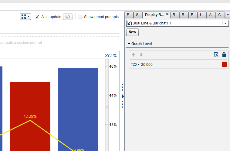
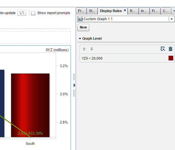
It seems you have applied Display rule on Bars, right...!!!
I've tried some stuff........
If this is useful,
I will share the steps.....
Thanks & Regards,
Teja Surapaneni.
- Mark as New
- Bookmark
- Subscribe
- Mute
- RSS Feed
- Permalink
- Report Inappropriate Content
Hi there,
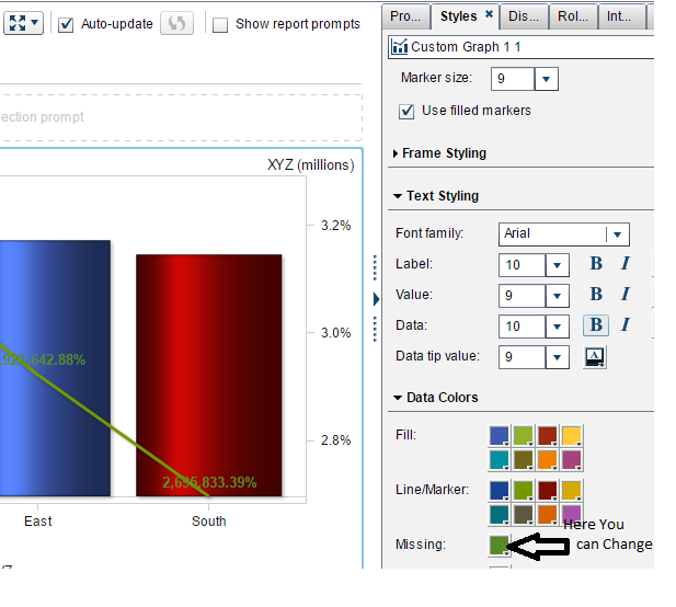
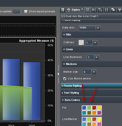
please check out attached png. Just change the second color in DataColors.
Greetings Peter
- Mark as New
- Bookmark
- Subscribe
- Mute
- RSS Feed
- Permalink
- Report Inappropriate Content
Hello user24,
It seems you have applied Display rule on Bars, right...!!!
I've tried some stuff........
If this is useful,
I will share the steps.....
Thanks & Regards,
Teja Surapaneni.
- Mark as New
- Bookmark
- Subscribe
- Mute
- RSS Feed
- Permalink
- Report Inappropriate Content
Yes, that's what i want. Can you share the steps. Thank you so much!
- Mark as New
- Bookmark
- Subscribe
- Mute
- RSS Feed
- Permalink
- Report Inappropriate Content
Please share your steps, thank you
- Mark as New
- Bookmark
- Subscribe
- Mute
- RSS Feed
- Permalink
- Report Inappropriate Content
Hello user24,
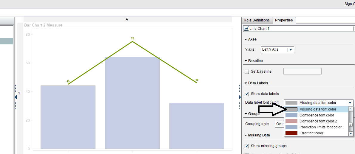
I hope that, You know how to build new graphs using Custom Graph Builder....!!!!
Hope this will help you,
If you have any doubts on Custom Graph Builders, Let me know...
Note : Don't use markers.
Thanks & Regards,
Teja Surapaneni.
See how to use one filter for multiple data sources by mapping your data from SAS’ Alexandria McCall.
Find more tutorials on the SAS Users YouTube channel.

