- Home
- /
- SAS Viya
- /
- Visual Analytics
- /
- Re: Bar Chart- Stacked+ General
- RSS Feed
- Mark Topic as New
- Mark Topic as Read
- Float this Topic for Current User
- Bookmark
- Subscribe
- Mute
- Printer Friendly Page
- Mark as New
- Bookmark
- Subscribe
- Mute
- RSS Feed
- Permalink
- Report Inappropriate Content
Hi,
Is there a way to create a Stacked plus a general bar in SAS VA.
I have three capacities:
1. Budget Capacity
2. Available Capacity
3. Allocated Capacity
where, Budget Capacity= Allocated Capacity + Available Capacity
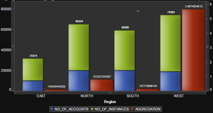
I wish to make a graph in which each category has two bars. One for budget capacity and the other stacked one for Allocated + Available.
Accepted Solutions
- Mark as New
- Bookmark
- Subscribe
- Mute
- RSS Feed
- Permalink
- Report Inappropriate Content
Hi SASEnthusiast,
You can create the graph you want with the Custom Graph Builder. You can put two bar charts on top of eachother and have them share the category (x-axis). Initially it looks like this:
Bar Chart 1 allows multiple data assignments by default, Bar Chart 2 doesn't. You can change this by editing the Role for Bar Chart 2 Measure if you like. For stacked charts you obviously need multiple assignments 🙂
Now to show them next to eachother, play around with the properties.
Under Plot Display, for bar chart 1 set the bar spacing to something like 65 and set the discrete offset to -20 negative. This makes a slimmer bar and pushes it to the left. Do the same for bar chart 2, but with a positive offset to push it to the right. You'll see that they are next to eachother.
Under Groups, set the grouping style to "Stack" for the bar chart you want to have stacked.

Now save it and use it in the report. Assign the budget capacity as the measure for the unstacked chart, and the Available and Allocated as the measures for the stacked chart.
- Mark as New
- Bookmark
- Subscribe
- Mute
- RSS Feed
- Permalink
- Report Inappropriate Content
Hello SAS Enthusiast,
I have some stuff for you,
Hope this will help,
Let me know...
Thanks & Regards,
Teja Surapaneni
- Mark as New
- Bookmark
- Subscribe
- Mute
- RSS Feed
- Permalink
- Report Inappropriate Content
Hi Teja,
This is really what I need. Could you guide me towards the steps for this?
Also, can the aggregation (as in yours) be a predefined column and not a calculated column?
- Mark as New
- Bookmark
- Subscribe
- Mute
- RSS Feed
- Permalink
- Report Inappropriate Content
Hi SASEnthusiast,
You can create the graph you want with the Custom Graph Builder. You can put two bar charts on top of eachother and have them share the category (x-axis). Initially it looks like this:
Bar Chart 1 allows multiple data assignments by default, Bar Chart 2 doesn't. You can change this by editing the Role for Bar Chart 2 Measure if you like. For stacked charts you obviously need multiple assignments 🙂
Now to show them next to eachother, play around with the properties.
Under Plot Display, for bar chart 1 set the bar spacing to something like 65 and set the discrete offset to -20 negative. This makes a slimmer bar and pushes it to the left. Do the same for bar chart 2, but with a positive offset to push it to the right. You'll see that they are next to eachother.
Under Groups, set the grouping style to "Stack" for the bar chart you want to have stacked.

Now save it and use it in the report. Assign the budget capacity as the measure for the unstacked chart, and the Available and Allocated as the measures for the stacked chart.
- Mark as New
- Bookmark
- Subscribe
- Mute
- RSS Feed
- Permalink
- Report Inappropriate Content
This works beautifully. Thank you so much.
- Mark as New
- Bookmark
- Subscribe
- Mute
- RSS Feed
- Permalink
- Report Inappropriate Content
I'm glad you found some useful info, SASEnthusiast! Can you highlight the exact solution to your problem by "Accepting it as a solution"? And if one was particularly helpful, feel free to "Like" it. This will help other community members who may run into the same issue know what worked.
Thanks!
Anna
- Mark as New
- Bookmark
- Subscribe
- Mute
- RSS Feed
- Permalink
- Report Inappropriate Content
For more information about SAS Visual Analytics Graph Builder, see Creating and Using Custom Graph Objects in the SAS Visual Analytics 7.3 User's Guide. (A similar chapter is available in the 7.2, 7.1, 6.4, and 6.3 user's guides.)
-Joy
April 27 – 30 | Gaylord Texan | Grapevine, Texas
Registration is open
Walk in ready to learn. Walk out ready to deliver. This is the data and AI conference you can't afford to miss.
Register now and save with the early bird rate—just $795!
See how to use one filter for multiple data sources by mapping your data from SAS’ Alexandria McCall.
Find more tutorials on the SAS Users YouTube channel.


