- Home
- /
- SAS Viya
- /
- VA Gallery
- /
- Pointillistic Art with SAS Visual Analytics
- RSS Feed
- Mark as New
- Mark as Read
- Bookmark
- Subscribe
- Printer Friendly Page
- Report Inappropriate Content
Pointillistic Art with SAS Visual Analytics
- Article History
- RSS Feed
- Mark as New
- Mark as Read
- Bookmark
- Subscribe
- Printer Friendly Page
- Report Inappropriate Content
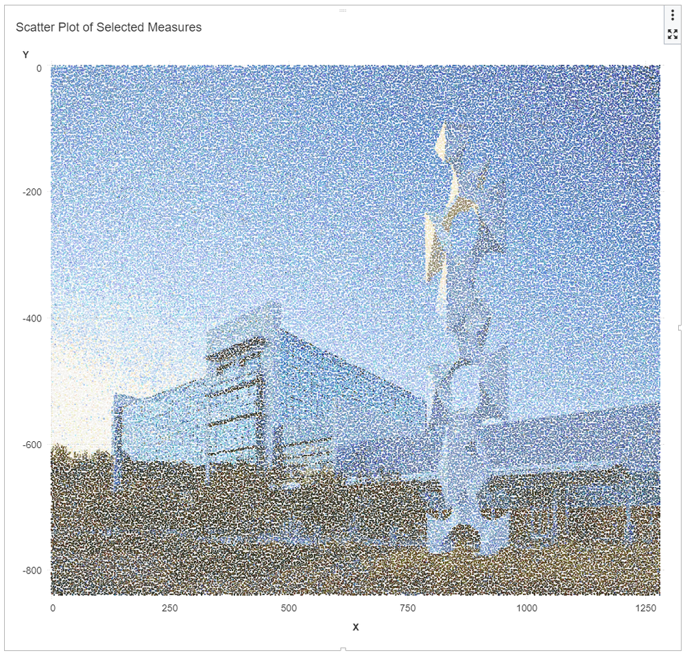
I've been creating some pointillistic art using SAS Visual Analytics and found that using visualizations such as scatter plots can produce surprisingly interesting results. Additional details how this data visualization was created can be found in the related blog post.
Thanks to Matteo Ronchetti's excellent work - I'm attaching a slightly modified version of the script which generates a data table as well as uploads related data into SAS Viya. Feel free to give this a try with your own images.
- Mark as Read
- Mark as New
- Bookmark
- Permalink
- Report Inappropriate Content
An artistic stroke of random order... love it! ![]()
- Mark as Read
- Mark as New
- Bookmark
- Permalink
- Report Inappropriate Content
Who says you have to use SAS for analytics only ![]()
- Mark as Read
- Mark as New
- Bookmark
- Permalink
- Report Inappropriate Content
A quick update - that I added a link to the related blog post with details how the visualization was created.
Catch up on SAS Innovate 2026
Dive into keynotes, announcements and breakthroughs on demand.
Explore Now →

