- Home
- /
- Programming
- /
- Programming
- /
- piechart: overlapping values
- RSS Feed
- Mark Topic as New
- Mark Topic as Read
- Float this Topic for Current User
- Bookmark
- Subscribe
- Mute
- Printer Friendly Page
- Mark as New
- Bookmark
- Subscribe
- Mute
- RSS Feed
- Permalink
- Report Inappropriate Content
Dear Community,
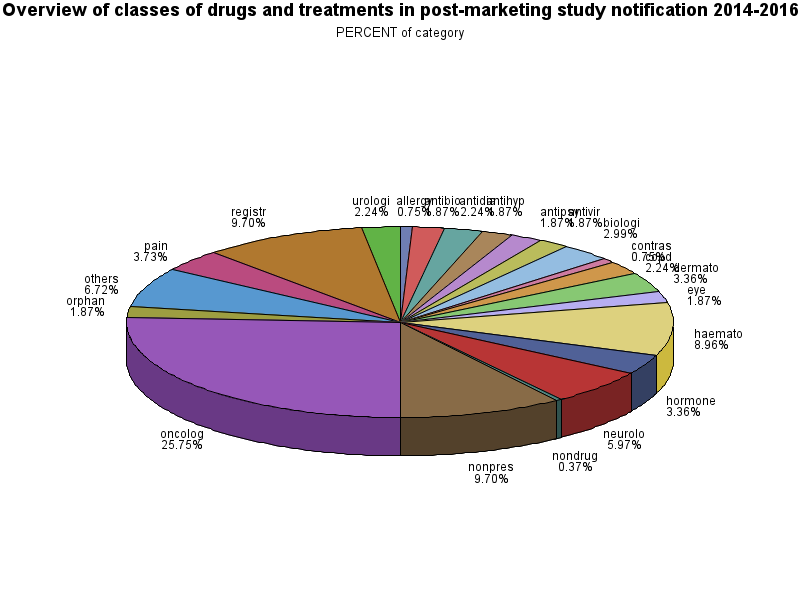
i just created a pie chart and have a lot of overlapping values. Do you know how to deal with it?
I also would like to have the whole Name of the categories, but its only the first 7 letters. What can i do about it?
Thank you in advance 🙂
data arzneimittelgruppen;
set arzneimittelgruppen;
if allergy=1 then category="allergy";
if antibiotics=1 then category="antibiotics";
if antidiabetic=1 then category="antidiabetic";
if antihypertensive=1 then category="antihypertensive";
if antipsychotic=1 then category="antipsychotic";
if antivirals=1 then category="antivirals";
if biologicals=1 then category="biologicals";
if contrast=1 then category="contrast";
if copd=1 then category="copd";
if dermatology=1 then category="dermatology";
if registry=1 then category="registry";
if eye=1 then category="eye";
if haematology=1 then category="haematology";
if hormone=1 then category="hormone";
if neurological=1 then category="neurological";
if nondrug=1 then category="nondrug";
if nonpres=1 then category="nonpres";
if oncology=1 then category="oncology";
if orphan=1 then category="orphan";
if others=1 then category="others";
if pain=1 then category="pain";
if urologics=1 then category="urologics";
run;

data arzneimittelgruppen;
set arzneimittelgruppen;
format category $20.;
run;

data arzneimittelgruppen;
  length category $ 20;
  set arzneimittelgruppen;
run;


PROC GCHART
DATA=arzneimittelgruppen;
PIE3d category / other=0 clockwise type= percent;
RUN;
QUIT;- Mark as New
- Bookmark
- Subscribe
- Mute
- RSS Feed
- Permalink
- Report Inappropriate Content
You can get the full value of your Category variable by adding a LENGTH statement prior to assigning a value.
Length category $ 20;
if allergy=1 then category="allergy";
If a length is not explicitly set then SAS default rules will assign a length. Since the first use you have is to assign "allergy" then the length gets set to 7 to hold that word. Everything longer then gets truncated.
Pie charts in general are hard to interpret the visual portion of contribution to a whole. The tilted 3d version is even worse.
If a Pie chart must be use then use PIE instead of pie3d and the option percent=arrow may help with displaying text of the smaller slices.
- Mark as New
- Bookmark
- Subscribe
- Mute
- RSS Feed
- Permalink
- Report Inappropriate Content
Learn how use the CAT functions in SAS to join values from multiple variables into a single value.
Find more tutorials on the SAS Users YouTube channel.
SAS Training: Just a Click Away
Ready to level-up your skills? Choose your own adventure.


