- Home
- /
- Programming
- /
- Programming
- /
- Understanding the PCA Plot from JMP
- RSS Feed
- Mark Topic as New
- Mark Topic as Read
- Float this Topic for Current User
- Bookmark
- Subscribe
- Mute
- Printer Friendly Page
- Mark as New
- Bookmark
- Subscribe
- Mute
- RSS Feed
- Permalink
- Report Inappropriate Content
Hi All,
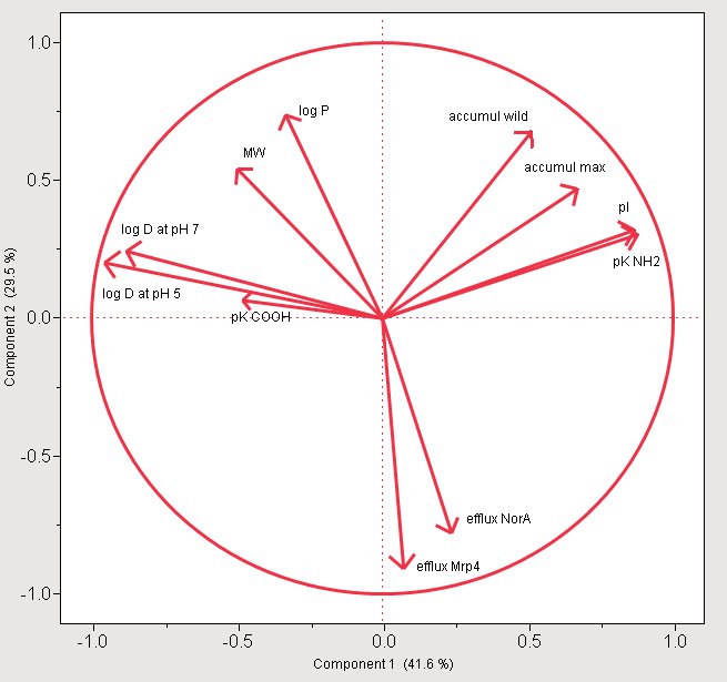
I am little confused understanding the PCA plot generated from JMP. In the plot below, products in the top-right quadrant are correlated positively, i.e. if one of them increases, all other increase ('am I right ?). What about the products in the lower-right quadrant and the upper left quadrant.
Thanks for your help
Cheers

- Mark as New
- Bookmark
- Subscribe
- Mute
- RSS Feed
- Permalink
- Report Inappropriate Content
I think this is loadings plot graph which indicates correlation between the variables and the components. The closer the value is to 1 the greater the effect of the component on the variable.
Catch up on SAS Innovate 2026
Nearly 200 sessions are now available on demand with the SAS Innovate Digital Pass.
Explore Now →Learn how use the CAT functions in SAS to join values from multiple variables into a single value.
Find more tutorials on the SAS Users YouTube channel.
SAS Training: Just a Click Away
Ready to level-up your skills? Choose your own adventure.


