- Home
- /
- Programming
- /
- Programming
- /
- Re: Spline with superimposed histogram
- RSS Feed
- Mark Topic as New
- Mark Topic as Read
- Float this Topic for Current User
- Bookmark
- Subscribe
- Mute
- Printer Friendly Page
- Mark as New
- Bookmark
- Subscribe
- Mute
- RSS Feed
- Permalink
- Report Inappropriate Content
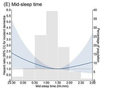
Is there a way to create a plot with histogram and natural cubic spline in one plot? An example downloaded from the net is given below.
The spline can be created using the ESTIMATE statement. I cannot share the data. I have a spline curve and would like to also show the histogram on the same plot. A sample downloaded is given below.
proc phreg data = want;
title "Colorectal-cancer incidence attempt";
effect resid_total_polys = spline(resid_total_poly / basis=tpf(noint) NATURALCUBIC details knotmethod=percentiles(4));
class categorical_covariate (ref="0");
model eof_age_CRC*Inc_CRC(0) = resid_total_polys
categorical_covariate continuous_covariate
/ entry=enrollment_agemonths rl=wald;
store work.coxr;
run;
%macro est(ref=212, start=0, end=3000, by=1);
%Do i = 1 %To %eval(%SysFunc( Ceil( %SysEvalF( ( &End - &Start ) / &By ) ) ) +1) ;
%Let value=%SysEvalF( ( &Start - &By ) + ( &By * &I ) ) ;
estimate "&value." resid_total_polys [-1, &ref] [1, &value] / exp cl;
%end;
%mend est;
ods exclude all;
ods dataset Estimates=Estimates;
proc plm restore=work.coxr;
%est(ref=212, start=0, end=3000, by=1);
run;
ods exclude none;
data estimates;
set estimates;
resid_total_poly=label*1;
run;
proc sgplot data=estimates NOAUTOLEGEND Noborder;
Series y=ExpEstimate x=resid_total_poly / LINEATTRS=(color=black thickness=3px);
Series y=LowerExp x=resid_total_poly / LINEATTRS=(pattern=ShortDash color=Black THICKNESS=1);
Series y=UpperExp x=resid_total_poly / LINEATTRS=(pattern=ShortDash color=Black THICKNESS=1);
band x=resid_total_poly upper=UpperExp lower=LowerExp / fillattrs=(color=graydd) transparency=.50;
REFLINE 1 / axis=y;
REFLINE 3000 / Axis=X LINEATTRS=(pattern=ThinDot color=Black THICKNESS=1);;
yaxis Values=(0.5 0.8 1 1.2 1.5) Label="Hazard ratio" Type=LOG LABELATTRS=(weight=BOLD);
xaxis min=0 VALUES=(0 to 3000 by 100) LABELATTRS=(weight=BOLD);
run;
Accepted Solutions
- Mark as New
- Bookmark
- Subscribe
- Mute
- RSS Feed
- Permalink
- Report Inappropriate Content
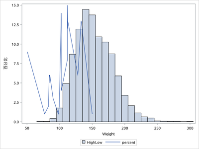
You could save this histogram firstly and after combine it with this spline series point and plot them all together.
ods output sgplot=sgplot(keep=BIN_WEIGHT____X BIN_WEIGHT____Y where=(BIN_WEIGHT____Y is not missing));
proc sgplot data=sashelp.heart;
histogram weight;
run;

proc sort data=sashelp.class out=class;by weight;run;
data have;
 set sgplot class(keep=weight in=inb);
 zero=0;
 call streaminit(123);
if inb then percent=rand('integer',1,15);
run;

proc sgplot data=have;
highlow x=BIN_WEIGHT____X low=zero high=BIN_WEIGHT____Y/type=bar barwidth=1;
series x=weight y=percent;
run;
- Mark as New
- Bookmark
- Subscribe
- Mute
- RSS Feed
- Permalink
- Report Inappropriate Content
As far as I know, you cannot overlay a histogram and curve in PROC SGPLOT because they are different graph types.
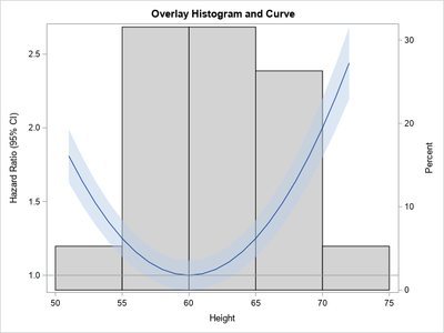
However, you can perform the overlay in GTL, and the basic ideas are presented in the article, "How to overlay a custom density curve on a histogram in SAS." For your use case, the curve is not a density curve, which means that you want the curve to be associated with the Y2 axis.
You can take the example from the "How to overlay..." article and apply it to your example. Since you did not supply data, I created some example data to illustrate the method:
/* create example data to use for the histogram and the curve/band */
data
 Have;
  set sashelp.class;
  keep Height;
run;
data Curve;
  do Height = 51 to 72;
     ratio = 1 + 0.01*(Height - 60)**2;
     lowerCL = ratio - ratio/10;
     upperCL = ratio + ratio/10;
     output;
  end;
run;

/* merge the data into one data set */
data All;
set Have
    Curve(rename=(Height=h));
run;

/* Use GTL to overlay a curve on a histogram.
   See https://blogs.sas.com/content/iml/2013/04/24/overlay-density-curve-on-a-histogram.html
*/
proc template;
define statgraph HistCurve;
dynamic _X _T _Y _YLower _YUpper _Title _HAlign _binstart _binstop _binwidth;
begingraph;
   entrytitle halign=center _Title;
   layout overlay /xaxisopts=(linearopts=(viewmax=_binstop));
      histogram _X / name='hist' SCALE=PERCENT binaxis=true YAXIS=Y2
         FillAttrs=GraphConfidence(Color=CXD3D3D3) /* gray bars */
         endlabels=true xvalues=leftpoints binstart=_binstart binwidth=_binwidth;
      BandPlot X=_T LimitUpper=_YUpper LimitLower=_YLower / DataTransparency=0.5 yaxis=Y;
      SeriesPlot X=_T Y=_Y / yaxis=Y;
      ReferenceLine y=1 / clip=true;
   endlayout;
endgraph;
end;
run;

proc sgrender data=All template=HistCurve;
label Ratio = "Hazard Ratio (95% CI)";
dynamic _X="Height" _T="H" _Y="Ratio" _YLower="lowerCL" _YUpper="upperCL" _HAlign="right"
        _binstart=50 _binstop=75 _binwidth=5
        _Title="Overlay Histogram and Curve";
run;
- Mark as New
- Bookmark
- Subscribe
- Mute
- RSS Feed
- Permalink
- Report Inappropriate Content
Thank you so much Rick! This works perfectly. And so does the response from KSharp below.
- Mark as New
- Bookmark
- Subscribe
- Mute
- RSS Feed
- Permalink
- Report Inappropriate Content
Looks like I can't pick two responses as 'Solutions'. I am a new user. Thanks.
- Mark as New
- Bookmark
- Subscribe
- Mute
- RSS Feed
- Permalink
- Report Inappropriate Content
You could save this histogram firstly and after combine it with this spline series point and plot them all together.
ods output sgplot=sgplot(keep=BIN_WEIGHT____X BIN_WEIGHT____Y where=(BIN_WEIGHT____Y is not missing));
proc sgplot data=sashelp.heart;
histogram weight;
run;

proc sort data=sashelp.class out=class;by weight;run;
data have;
 set sgplot class(keep=weight in=inb);
 zero=0;
 call streaminit(123);
if inb then percent=rand('integer',1,15);
run;

proc sgplot data=have;
highlow x=BIN_WEIGHT____X low=zero high=BIN_WEIGHT____Y/type=bar barwidth=1;
series x=weight y=percent;
run;
- Mark as New
- Bookmark
- Subscribe
- Mute
- RSS Feed
- Permalink
- Report Inappropriate Content
This works perfectly and so does the code given by Rick above. Thank you so much Ksharp!
Catch up on SAS Innovate 2026
Nearly 200 sessions are now available on demand with the SAS Innovate Digital Pass.
Explore Now →Learn how use the CAT functions in SAS to join values from multiple variables into a single value.
Find more tutorials on the SAS Users YouTube channel.
SAS Training: Just a Click Away
Ready to level-up your skills? Choose your own adventure.


