- Home
- /
- Programming
- /
- Programming
- /
- Re: SAS 9.4 Code help
- RSS Feed
- Mark Topic as New
- Mark Topic as Read
- Float this Topic for Current User
- Bookmark
- Subscribe
- Mute
- Printer Friendly Page
- Mark as New
- Bookmark
- Subscribe
- Mute
- RSS Feed
- Permalink
- Report Inappropriate Content
Greeting All
I need hand with SAS 9.4 code, which is related to annotate letters above each midpoint bar of confidence interval .In order to know change in weight loss between the three groups overtime (day)
Best Regards
Accepted Solutions
- Mark as New
- Bookmark
- Subscribe
- Mute
- RSS Feed
- Permalink
- Report Inappropriate Content
Greeting Sir
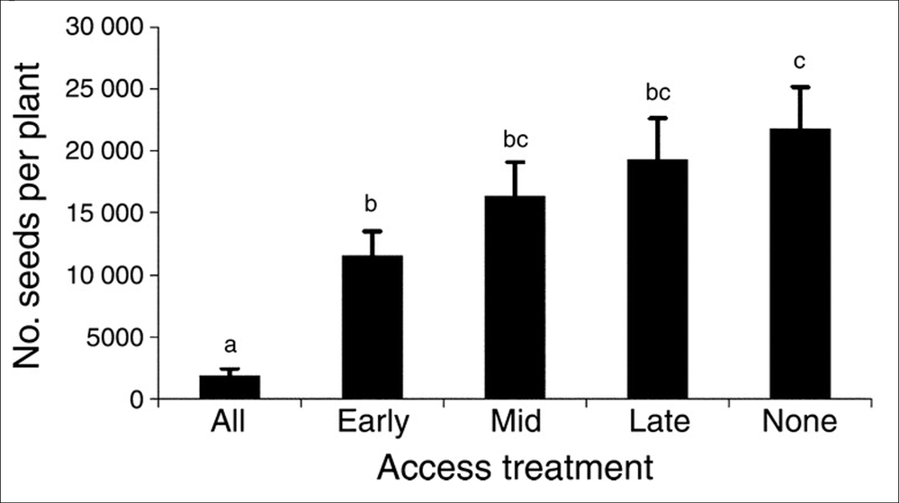
I like each bar look like this pic with the letters that show the differences.
This pic from the internet.
Best Regards
Samir
- Mark as New
- Bookmark
- Subscribe
- Mute
- RSS Feed
- Permalink
- Report Inappropriate Content
Many people don't like to open Excel files. What does your data look like and what program code have you tried? How are you creating your output? How to do what you want will depend on the code you have started with.
cynthia
- Mark as New
- Bookmark
- Subscribe
- Mute
- RSS Feed
- Permalink
- Report Inappropriate Content
Thanks for your quick replay
I used repeated measure SAS.9.4. I attached SAS code, yes I try it and want to change the graph to error bars with confidence interval to know the if there is sig different during the day.
So, I need hand if your can I will be grateful to you.
Thanks
Samir
- Mark as New
- Bookmark
- Subscribe
- Mute
- RSS Feed
- Permalink
- Report Inappropriate Content
I'm not sure exactly what you are trying to do, but search the Graphically Speaking Blog. Tons of examples of all thinkable graphs and code examples 🙂
- Mark as New
- Bookmark
- Subscribe
- Mute
- RSS Feed
- Permalink
- Report Inappropriate Content
Thanks for your help. I can't found what I need their.
I am trying to get error bars with letters to show the differences
- Mark as New
- Bookmark
- Subscribe
- Mute
- RSS Feed
- Permalink
- Report Inappropriate Content
Hi: You might also consider posting this in the ODS Graphics forum, where most of the graph related questions are posted and answered.
Cynthia
Also, in looking at the code you posted in the program 1.sas, I see that you have 2 PROC GPLOT steps and you have those 2 steps followed by a PROC GLM and a PROC MIXED. It does not appear that you have ODS GRAPHICS turned on for PROC GLM or PROC MIXED, although both of those procedures do work with ODS GRAPHICS and you can see examples of the kind of graphs they generate here: http://go.documentation.sas.com/?docsetId=statug&docsetVersion=14.3&docsetTarget=statug_glm_details7... for GLM and here: http://go.documentation.sas.com/?docsetId=statug&docsetVersion=14.3&docsetTarget=statug_mixed_detail... for MIXED. Scroll down to the bottom of the explanation and look for the table that says Graphs Produced by PROC xxx.
To change the GPLOT code, you would need to look at the ANNOTATE facility. If you switch to the SGPLOT procedure instead of GPLOT or use the ODS GRAPHICS capability within the Statistical procedures, you may be able to get closer to what you want with the graph.
- Mark as New
- Bookmark
- Subscribe
- Mute
- RSS Feed
- Permalink
- Report Inappropriate Content
Many thanks
I will try my best to do that but I am not sure if I can or not.
Thanks for help
- Mark as New
- Bookmark
- Subscribe
- Mute
- RSS Feed
- Permalink
- Report Inappropriate Content
- Mark as New
- Bookmark
- Subscribe
- Mute
- RSS Feed
- Permalink
- Report Inappropriate Content
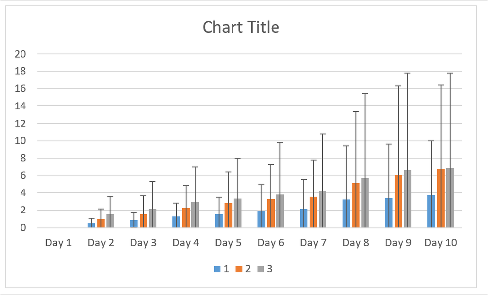
I upload Doc file with two pictures the color one under name data I my work and I want to show the later like the other picture on the bars.
Best Regards
- Mark as New
- Bookmark
- Subscribe
- Mute
- RSS Feed
- Permalink
- Report Inappropriate Content
You have posted those pictures and posted some code. But you do NOT explain how you have created the text strings of A, B, BC, and C that you show above the bars.
Cynthia
- Mark as New
- Bookmark
- Subscribe
- Mute
- RSS Feed
- Permalink
- Report Inappropriate Content
Greeting All
The pic for A,B, bc, bc, c Not for me I need my work to be similar to that picture
Thanks
- Mark as New
- Bookmark
- Subscribe
- Mute
- RSS Feed
- Permalink
- Report Inappropriate Content
Hi:
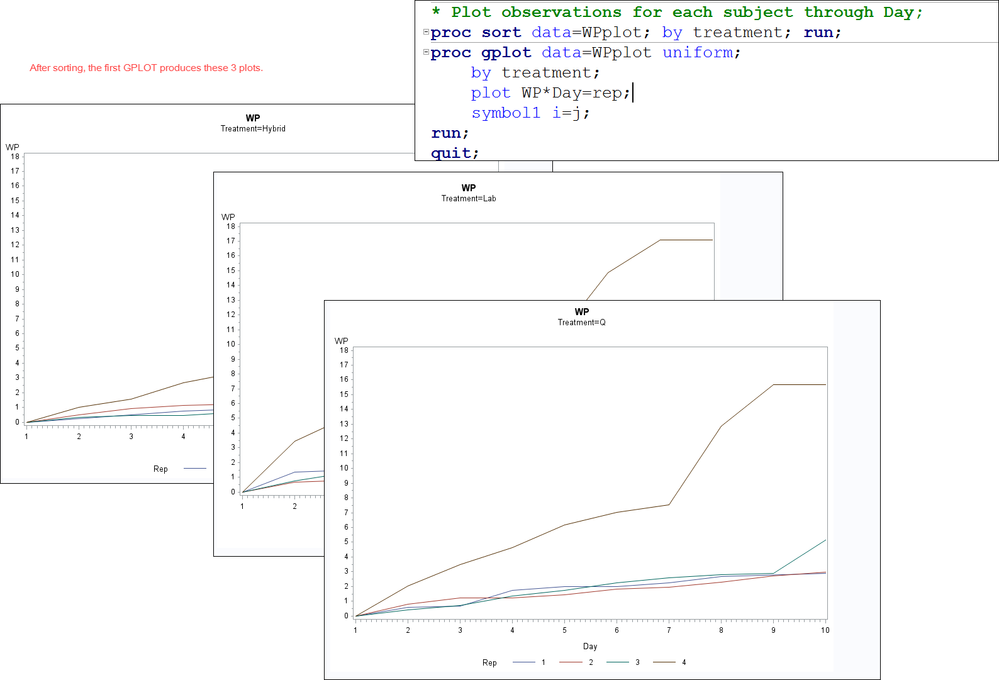
I still don't understand what you want. Your first GPLOT, when you add the PROC SORT step, produces this output:
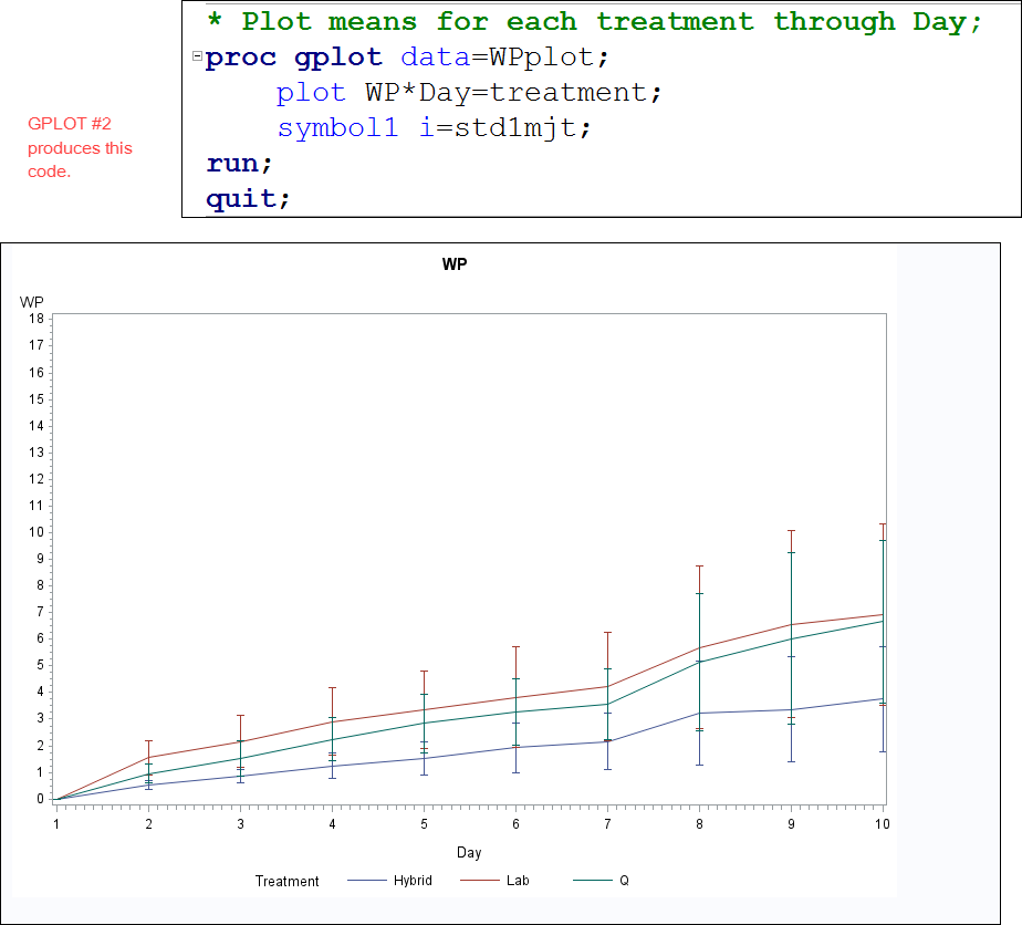
Your second GPLOT step produces this output:
Your GLM step and your MIXED steps are NOT producing any graphical output right now, only tabular results from the procedure.
I do not see anything in your code that calculates a "difference" variable that could be annotated. I do not know what values you would use to calculate the difference variable that you want to see. I don't even know whether the graphs you're producing with GPLOT even look like the graphs you want to create because you sent two different graphs in your original post and neither of those graphs look like what you are producing now.
Here's one chart:
and here's the other:

I wonder if perhaps you are looking for something more similar to this example: https://blogs.sas.com/content/graphicallyspeaking/2011/11/12/graphs-with-axis-aligned-statistics-tab...
cynthia
- Mark as New
- Bookmark
- Subscribe
- Mute
- RSS Feed
- Permalink
- Report Inappropriate Content
* WP;
title2"WP";
data WP;
	input Treatment$ Rep	Day1	Day2	Day3	Day4	Day5	Day6	Day7	Day8	Day9 Day10;
	datalines;
Ec	1.00	0.00	0.25	0.52	0.77	0.89	0.89	1.02	1.02	1.02	1.15
Ec	2.00	0.00	0.51	0.92	1.13	1.23	1.23	1.43	1.44	1.53	1.53
Ec	3.00	0.00	0.33	0.44	0.44	0.66	0.88	0.88	1.32	1.65	2.74
Ec	4.00	0.00	0.99	1.58	2.67	3.36	4.73	5.33	9.08	9.27	9.57
FB	    1.00	0.00	0.59	0.69	1.75	1.98	1.98	2.23	2.67	2.78	2.90
FB	    2.00	0.00	0.79	1.24	1.24	1.45	1.80	1.93	2.29	2.73	2.96
FB	    3.00	0.00	0.42	0.72	1.34	1.75	2.26	2.57	2.78	2.88	5.14
FB	    4.00	0.00	2.05	3.49	4.64	6.16	7.04	7.52	12.88	15.68	15.68
RES	    1.00	0.00	1.34	1.47	1.83	2.07	2.19	2.58	2.95	3.31	3.31
RES	    2.00	0.00	0.68	0.79	1.24	1.47	1.47	1.57	2.05	2.37	2.60
RES	    3.00	0.00	0.76	1.31	1.85	2.18	2.18	2.40	2.94	3.48	4.68
RES	    4.00	0.00	3.42	5.07	6.73	7.71	9.47	10.35	14.85	17.10	17.10

;
run;
* Convert columns of observations to rows - useful for plotting;
data WPplot;
	set WP;
	keep treatment rep Day WP;
	Day=1; WP=Day1; output;
	Day=2; WP=Day2; output;
	Day=3; WP=Day3; output;
	Day=4; WP=Day4; output;
	Day=5; WP=Day5; output;
	Day=6; WP=Day6; output;
	Day=7; WP=Day7; output;
	Day=8; WP=Day8; output;
	Day=9; WP=Day9; output;
	Day=10; WP=Day10; output;
run;
* Print column data set;
proc print data=WPplot;
run;
* Plot observations for each subject through Day;
proc gplot data=WPplot uniform;
	by treatment;
	plot WP*Day=rep;
	symbol1 i=j;
run;
* Plot means for each treatment through Day;
proc gplot data=WPplot;
	plot WP*Day=treatment;
	symbol1 i=std1mjt;
run;
* Profile analysis and repeated measures ANOVA;
proc glm data=WP;
	class treatment;
	model Day1	Day2	Day3	Day4	Day5	Day6	Day7	Day8	Day9 Day10= treatment / nouni;
	repeated Day profile;
run;
* Mixed models analysis;
proc mixed data=WPplot;
	class treatment Day rep;
	model WP = treatment Day treatment*Day / outp=resids;
	* Try type=cs, type=ar(1), or type=un and compare AIC or BIC values.
	  The model with smallest AIC or BIC is the best model;
	repeated / type=cs subject=rep(treatment) rcorr;
run;
quit;
proc sgplot data=resids;
   vbarparm category=day  response=pred /group=treatment
      groupdisplay=cluster
      limitlower=lower
      limitupper=upper
   ;
run;
proc means data=sashelp.cars noprint nway;
where origin='USA';
class make cylinders;
var mpg_city;
output out=have (where=(lclm ne . )) mean=vag lclm=lclm uclm=uclm;
run;
*creat graph;
ods html style=meadow;
vbarparm category=make response=avg /  /*set x axis and response variables*/
         group=cylinders /*specify how to group the variables*/
		 groupdisplay=cluster  /*make sure bars aren't stacked*/
		 limitlower=lclm /*error bar lower limit*/
		 limitupper=uclm /*error bar upper limit*/;
		 run;
Many thanks for your explanation, actually what I am looking for, I need the letter that show the differences on the bars.
I am try to run this program, but there is some thing wrongs. The code I add did not work.
I saw the example it look difference
Best Regards
Samir
- Mark as New
- Bookmark
- Subscribe
- Mute
- RSS Feed
- Permalink
- Report Inappropriate Content
In your original code, you have 3 datasets: WP, WPPlot and Resids. Let's start with these questions:
1) which of these datasets has the "difference" variable you want to plot
2) what is the name of the "difference" variable
No one can help you with your question until you provide ALL the data. saying you want the "difference" is meaningless, since at the present time, there does NOT seem to be a difference variable in any of the 3 datasets in your code.
As for why your added code did not work, I suggest you carefully compare what you copied in with the original suggested code that was supplied by Reeza here: https://communities.sas.com/t5/SAS-GRAPH-and-ODS-Graphics/Graphic-help/m-p/428640#M14819 -- in a quick comparison, I note that her post had a PROC SGPLOT statement and your pasted code is missing that statement.
cynthia
- Mark as New
- Bookmark
- Subscribe
- Mute
- RSS Feed
- Permalink
- Report Inappropriate Content
Hello
My treatment is EC, FB, and RES and my y axis is WP which is weight loss and my x axis is the day.
I want to know the difference between the day in each treatment.
I know for this data it was no sig but I have more data.
Thanks
Samir
April 27 – 30 | Gaylord Texan | Grapevine, Texas
Registration is open
Walk in ready to learn. Walk out ready to deliver. This is the data and AI conference you can't afford to miss.
Register now and lock in 2025 pricing—just $495!
Learn how use the CAT functions in SAS to join values from multiple variables into a single value.
Find more tutorials on the SAS Users YouTube channel.
SAS Training: Just a Click Away
Ready to level-up your skills? Choose your own adventure.


