- Home
- /
- Programming
- /
- Programming
- /
- Re: Plotting Multiple Time-Series While Shading in PROC GPLOT
- RSS Feed
- Mark Topic as New
- Mark Topic as Read
- Float this Topic for Current User
- Bookmark
- Subscribe
- Mute
- Printer Friendly Page
- Mark as New
- Bookmark
- Subscribe
- Mute
- RSS Feed
- Permalink
- Report Inappropriate Content
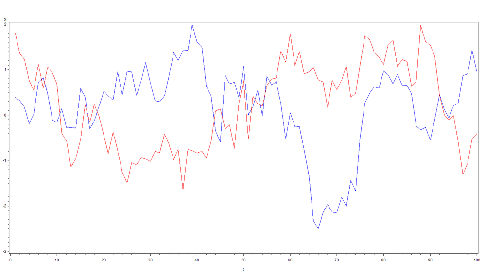
I have two time-series variables with similar scales and two indicator variables. I need to plot the two time-series using the first vertical axis and shade the plot using the two indicators. The following code creates a sample data set.
data _;
do t=1 to 100;
w=ifn(t=1,rannor(1),0.9*w+sqrt(1-0.9**2)*rannor(1));
x=ifn(t=1,rannor(1),0.9*x+sqrt(1-0.9**2)*rannor(1));
y=ifn(-1<x<=0,1,0);
z=ifn(x<=-1,1,0);
output;
end;
run;
The following is the resulting plot of x (blue) and w (red) from PROC GPLOT.
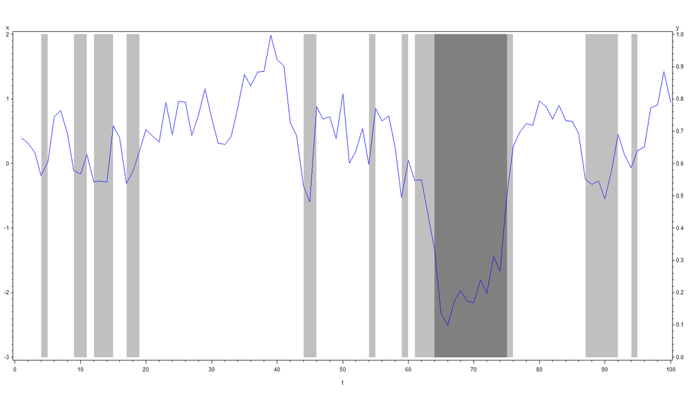
I need to shade this plot using the other variables y and z, so I can use PLOT1, PLOT2, and OVERLAY. The following is the code.
symbol1 i=join ci=blue;
symbol2 i=join ci=red;
symbol3 i=join ci=white;
pattern1 v=solid c=ltgray;
pattern2 v=solid c=gray;
pattern3 v=solid c=white;

proc gplot;
	plot1 x*t;
	plot2 (y z)*t/areas=3 overlay;
run;
And the following is the outcome with x (blue), y (ltgray), and z (gray)—w is excluded.
I thought that just adding w in PLOT1 works, but it failed with the following log.
2    symbol1 i=join ci=blue;
3    symbol2 i=join ci=red;
4    symbol3 i=join ci=white;
5    pattern1 v=solid c=ltgray;
6    pattern2 v=solid c=gray;
7    pattern3 v=solid c=white;
8
9    proc gplot;
10       plot1 (x w)*t;
11       plot2 (y z)*t/areas=3 overlay;
12   run;

ERROR: Number of plot requests on PLOT and PLOT2 statements must match.
NOTE: The SAS System stopped processing this step because of errors.
NOTE: PROCEDURE GPLOT used (Total process time):
      real time           0.01 seconds
      cpu time            0.01 seconds
How can I shade a plot with multiple time-series variables by multiple indicator variables? Thanks.
Accepted Solutions
- Mark as New
- Bookmark
- Subscribe
- Mute
- RSS Feed
- Permalink
- Report Inappropriate Content
Try
   proc gplot;
       plot1 (x w)*t/overlay;
       plot2 (y z)*t/areas=3 overlay;
   run;
- Mark as New
- Bookmark
- Subscribe
- Mute
- RSS Feed
- Permalink
- Report Inappropriate Content
- Mark as New
- Bookmark
- Subscribe
- Mute
- RSS Feed
- Permalink
- Report Inappropriate Content
- Mark as New
- Bookmark
- Subscribe
- Mute
- RSS Feed
- Permalink
- Report Inappropriate Content
Try
   proc gplot;
       plot1 (x w)*t/overlay;
       plot2 (y z)*t/areas=3 overlay;
   run;
- Mark as New
- Bookmark
- Subscribe
- Mute
- RSS Feed
- Permalink
- Report Inappropriate Content
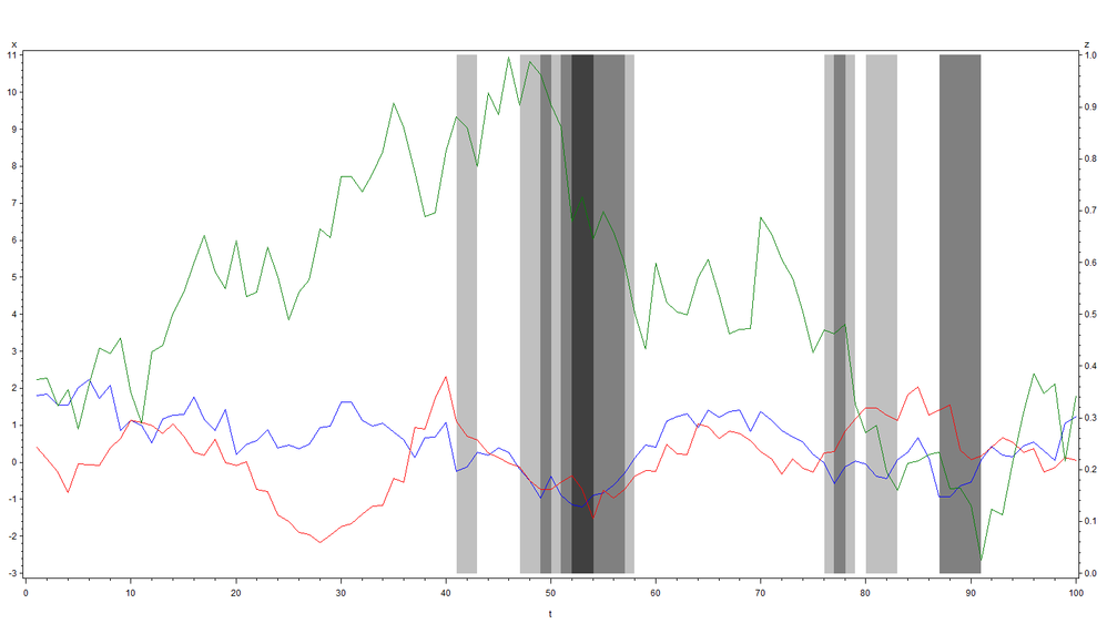
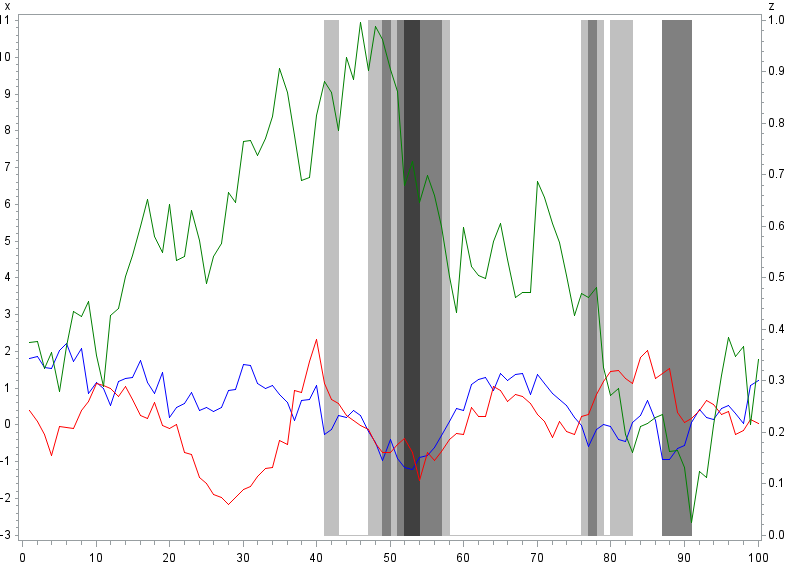
Much appreciate. When there are N time-series and M indicators, it seems N+M SYMBOLs and M+1 PATTERNs are needed. Here I attach the working example.
resetline;
dm"log;clear;output;clear;graph;end;odsresult;clear;";
option nodate nonumber nolabel ls=128 ps=max;
proc datasets kill nolist;
run;
data _;
do t=1 to 100;
x=ifn(t=1,rannor(1),0.9*x+sqrt(1-0.9**2)*rannor(1));
y=ifn(t=1,rannor(1),0.9*y+sqrt(1-0.9**2)*rannor(1));
z=ifn(-0.5<=x<0,1,0);
w=ifn(-1<=x<-0.5,1,0);
v=ifn(x<-1,1,0);
u+rannor(1);
output;
end;
run;
data _;
set _;
if abs(z-lag(z))=1 or abs(w-lag(w))=1 or abs(v-lag(v))=1 then output;
output;
run;
data _;
set _;
if abs(z-lag(z))=1 then z=1-z;
if abs(w-lag(w))=1 then w=1-w;
if abs(v-lag(v))=1 then v=1-v;
run;
symbol1 i=join ci=blue;
symbol2 i=join ci=red;
symbol3 i=join ci=green;
symbol4 i=join ci=white;
symbol5 i=join ci=white;
symbol6 i=join ci=white;
pattern1 v=solid c=ltgray;
pattern2 v=solid c=gray;
pattern3 v=solid c=dagray;
pattern4 v=solid c=white;
proc gplot;
plot1 (x y u)*t/overlay;
plot2 (z w v)*t/areas=4 overlay;
run;
quit;- Mark as New
- Bookmark
- Subscribe
- Mute
- RSS Feed
- Permalink
- Report Inappropriate Content
> it seems N+M SYMBOLs and M+1 PATTERNs are needed
Just N+1 symbols afaik, since the area plots are plots too. This yields the same plot:
goptions reset=all ;
symbol1 i=join ci=blue;
symbol2 i=join ci=red;
symbol3 i=join ci=green;
symbol4 i=join;
pattern1 v=solid c=ltgray;
pattern2 v=solid c=gray;
pattern3 v=solid c=dagray;
proc gplot;
  plot1 (X Y U) * T /overlay;
  plot2 (Z W V) * T /areas=3 overlay;
run;
- Mark as New
- Bookmark
- Subscribe
- Mute
- RSS Feed
- Permalink
- Report Inappropriate Content
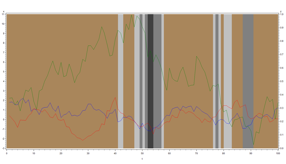
It seems they are necessary as the colors are changed. The following is the outcome from your code. Not the same.
- Mark as New
- Bookmark
- Subscribe
- Mute
- RSS Feed
- Permalink
- Report Inappropriate Content
> It seems they are necessary as the colors are changed. The following is the outcome from your code. Not the same.
That's odd. My code generates a white background. Anyways that's a detail for the task at hand. Glad you got the result you wanted.
data _;
do t=1 to 100;
x=ifn(t=1,rannor(1),0.9*x+sqrt(1-0.9**2)*rannor(1));
y=ifn(t=1,rannor(1),0.9*y+sqrt(1-0.9**2)*rannor(1));
z=ifn(-0.5<=x<0,1,0);
w=ifn(-1<=x<-0.5,1,0);
v=ifn(x<-1,1,0);
u+rannor(1);
if abs(z-lag(z))=1 or abs(w-lag(w))=1 or abs(v-lag(v))=1 then output;
output;
end;
run;
data _;
set _;
if abs(z-lag(z))=1 then z=1-z;
if abs(w-lag(w))=1 then w=1-w;
if abs(v-lag(v))=1 then v=1-v;
run;
goptions reset=all dev=png;
symbol1 i=join ci=blue;
symbol2 i=join ci=red;
symbol3 i=join ci=green;
symbol4 i=join;
pattern1 v=solid c=ltgray;
pattern2 v=solid c=gray;
pattern3 v=solid c=dagray;
proc gplot;
  plot1 (X Y U) * T /overlay;
  plot2 (Z W V) * T /areas=3 overlay;
run;- Mark as New
- Bookmark
- Subscribe
- Mute
- RSS Feed
- Permalink
- Report Inappropriate Content
Since we cannot actually duplicate your data set as the example relies heavily on random values, can you describe the rules in terms of eth variables as to how the width and color of those vertical bars is determined?
I have no clue as to why a light gray bar starts or ends on any specific position.
- Mark as New
- Bookmark
- Subscribe
- Mute
- RSS Feed
- Permalink
- Report Inappropriate Content
Learn how use the CAT functions in SAS to join values from multiple variables into a single value.
Find more tutorials on the SAS Users YouTube channel.
SAS Training: Just a Click Away
Ready to level-up your skills? Choose your own adventure.
