- Home
- /
- Programming
- /
- Programming
- /
- How to plot predicted values by groups?
- RSS Feed
- Mark Topic as New
- Mark Topic as Read
- Float this Topic for Current User
- Bookmark
- Subscribe
- Mute
- Printer Friendly Page
- Mark as New
- Bookmark
- Subscribe
- Mute
- RSS Feed
- Permalink
- Report Inappropriate Content
Dear all,
I am running an example with splines and some additional factors, I want to plot the predicted values by groups for a determined effect, my model looks like:
proc glimmix data=one outdesign(x)=Xmatrix;
class Tratamiento Tparto;
effect sp_DIM = spline(DIM/basis=bspline details);
model PL = sp_DIM Edad1L Tratamiento Dreto Tparto MS RS CS DS/solution;
output out=Out pred=Pred;
run;
I get the predicted values, but, then I want to get prediction by levels of "Tratamiento", how can I do that?
- Mark as New
- Bookmark
- Subscribe
- Mute
- RSS Feed
- Permalink
- Report Inappropriate Content
> I want to get prediction by levels of "Tratamiento", how can I do that?
Would using the BY statement do that?
- Mark as New
- Bookmark
- Subscribe
- Mute
- RSS Feed
- Permalink
- Report Inappropriate Content
Thanks a lot for the suggestion Chris, below is my code for the plot, please let me know how can I use this statement for plot another serie with the effect by level of "Tratamiento", I do have two levels.
proc sgplot data=Out;
scatter y=PL x=DIM/group=Tratamiento;
series y=Pred x=DIM/group=Vaca;
title "Milk Yield Modelation usin cubic splines";
title2 "Dairy Module";
run;
Many thanks
- Mark as New
- Bookmark
- Subscribe
- Mute
- RSS Feed
- Permalink
- Report Inappropriate Content
Try:
proc sgpanel data=Out;
panelby tratamiento / onepanel novarname;
scatter y=PL x=DIM;
series y=Pred x=DIM/group=Vaca;
run;
make sure your data is sorted by DIM.
- Mark as New
- Bookmark
- Subscribe
- Mute
- RSS Feed
- Permalink
- Report Inappropriate Content
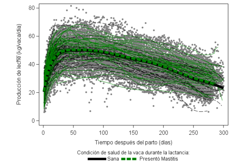
Thank PG, that was helpful, I will use this plot as well. However, I am trying to do something like the plot below.
I have the lactation curve per cow, but I want I lactation per group with predicted values per group also. In the below plot, the wider curves are the average curves by group. I did try my same code used but I got different results, my plot does not look good.
proc sgplot data=Out;
scatter y=PL x=DIM / group=Tratamiento;
series y=Pred x=DIM / group=Vaca;
*series y=Pred x=DIM/group=RS lineattrs=(Color="blue" Pattern=solid Thickness=5);
run;
- Mark as New
- Bookmark
- Subscribe
- Mute
- RSS Feed
- Permalink
- Report Inappropriate Content
> but I got different results, my plot does not look good.
Can you detail what's wrong?
Also provide some dummy data (in the form of a short data step) if you want us to replicate the issue and correct it.
- Mark as New
- Bookmark
- Subscribe
- Mute
- RSS Feed
- Permalink
- Report Inappropriate Content
Thank Chris, this is my code for the model:
proc glimmix data=one outdesign(x)=Xmatrix;
class Tratamiento Tparto;
effect sp_DIM = spline(DIM/basis=bspline details);
model PL = sp_DIM DIM Edad1L Tratamiento Dreto Tparto MS RS CS DS/solution noint;
random Vaca;
output out=Out pred=Pred;
lsmeans Tratamiento;
run;
I got the prediction and I did plot in this way without problem
proc sgpanel data=Out;
panelby Tratamiento / columns=2;
series x=DIM y=Pred/group=Vaca;
run;
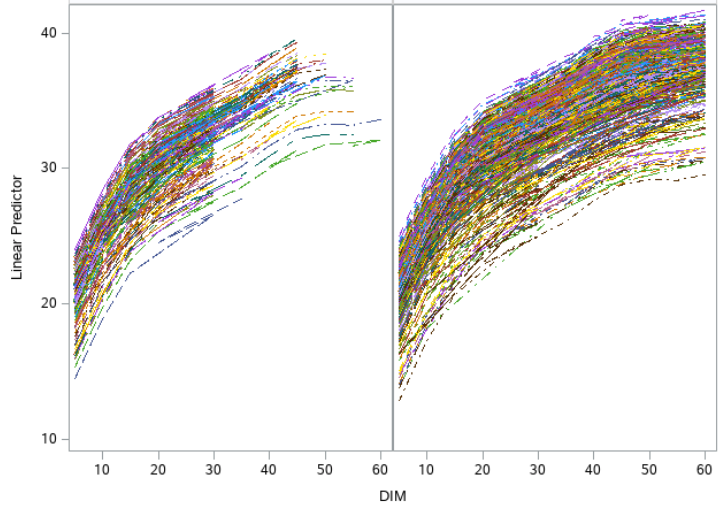
But, then I did use the next, I was expecting just one line, because I have just two "Tratamientos", just two leves in the group
What am I doin wrong?
Even when I did sort the output by "Tratamiento" it does not work
Thanks in advance
proc sgpanel data=Out;
panelby Tratamiento / columns=2;
series x=DIM y=Pred/group=Tratamiento;
run;
- Mark as New
- Bookmark
- Subscribe
- Mute
- RSS Feed
- Permalink
- Report Inappropriate Content
1. You need to sort by the X axis variable to avoid the line going back and forth
2. > I was expecting just one line, because I have just two "Tratamientos", just two leves in the group
Look at your data and see all the values for the variables DIM and PRED that you are plotting.
Since you plot all these points, that does not draw one line.
- Mark as New
- Bookmark
- Subscribe
- Mute
- RSS Feed
- Permalink
- Report Inappropriate Content
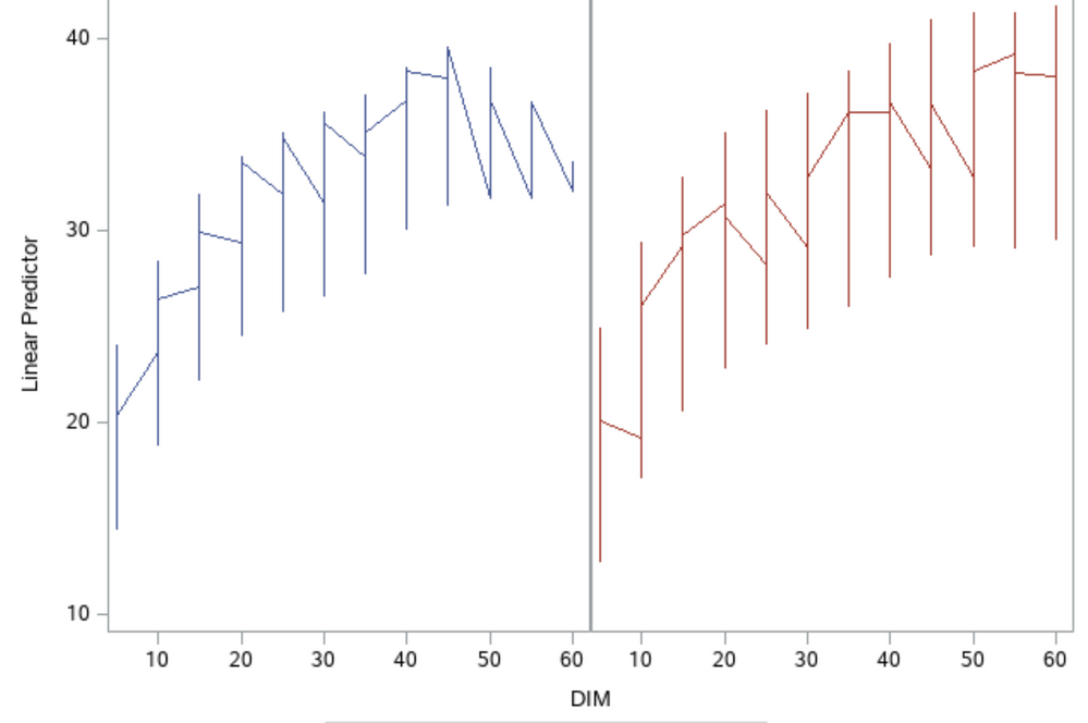
I appreciate your help Chris, now the plot looks like that, but I understood why.
Is there a way to get the average predicted values for level of effect?
I mean the average predicted value in each value of X for a determined level of a effect as if the rest of the effects were fixed or no changing. In other words, using lsmeans I got a significant difference between levels of "Tratamiento", Is possible to represent this with two curves?
I appreciate your patience, I promise the is the last question.
Thanks
- Mark as New
- Bookmark
- Subscribe
- Mute
- RSS Feed
- Permalink
- Report Inappropriate Content
You need to replace all the observations in the table for these 2 plots with just one data point for each DIM.
What statistical method you choose is left to you appreciation, but once you have the points, the code for plotting is the code you already have.
- Mark as New
- Bookmark
- Subscribe
- Mute
- RSS Feed
- Permalink
- Report Inappropriate Content
Or you could use the PBSPLINE statement instead of the SERIES statement.
- Mark as New
- Bookmark
- Subscribe
- Mute
- RSS Feed
- Permalink
- Report Inappropriate Content
Another possible option would be :
proc sgpanel data=Out;
panelby Tratamiento / columns=2;
vbox  pred / category=dim connect=mean ;
run;
Which still displays the dispersion of the predicted values but should show the means of predicted for each DIM
- Mark as New
- Bookmark
- Subscribe
- Mute
- RSS Feed
- Permalink
- Report Inappropriate Content
Thanks a lot to both, Chris and Ballardw, your comments really help.
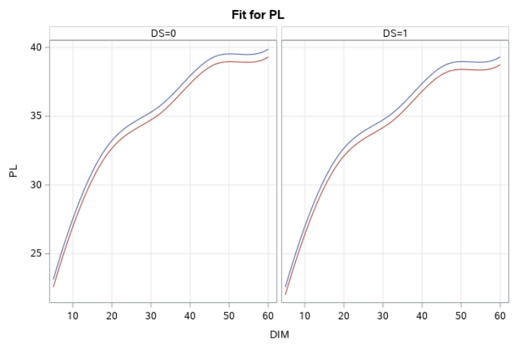
I found my perfect plot in effeplot
proc plm source=spMod;
effectplot slicefit(x=DIM sliceby=Tratamiento plotby=DS= 0 1);
run;
Now I am wondering if there are options to change the axis labels and the grid values, as well if I can put a specific title to this plots. I did look at the description for this statement but I could not get something related.
Thanks
- Mark as New
- Bookmark
- Subscribe
- Mute
- RSS Feed
- Permalink
- Report Inappropriate Content
Catch up on SAS Innovate 2026
Dive into keynotes, announcements and breakthroughs on demand.
Explore Now →Learn how use the CAT functions in SAS to join values from multiple variables into a single value.
Find more tutorials on the SAS Users YouTube channel.
SAS Training: Just a Click Away
Ready to level-up your skills? Choose your own adventure.


