- Home
- /
- Programming
- /
- Programming
- /
- How to deal with overlapping values pie chart?
- RSS Feed
- Mark Topic as New
- Mark Topic as Read
- Float this Topic for Current User
- Bookmark
- Subscribe
- Mute
- Printer Friendly Page
- Mark as New
- Bookmark
- Subscribe
- Mute
- RSS Feed
- Permalink
- Report Inappropriate Content
Hello 🙂
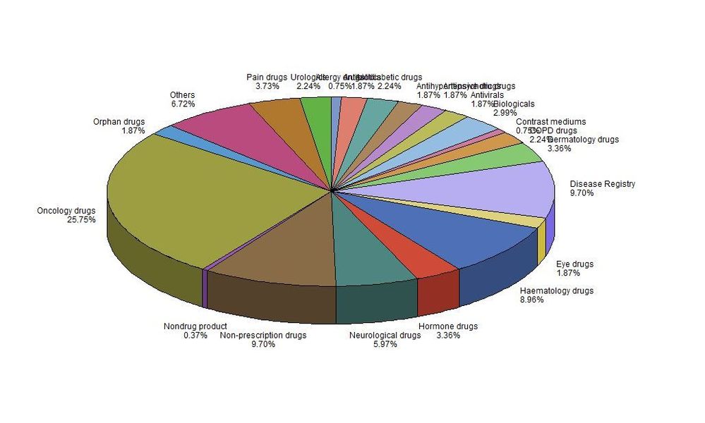
Is there any possibility to improve my piechart figure?
Its impossible to read the values, as they are overlapping.
Thank you 🙂
PROC GCHART
DATA=arzneimittelgruppen;
PIE category / other=0 clockwise percent=arrow;
title 'Overview of classes of drugs and treatments in post-marketing study notification 2014-2016';
RUN;
QUIT;- Mark as New
- Bookmark
- Subscribe
- Mute
- RSS Feed
- Permalink
- Report Inappropriate Content
Not sure what to suggest other than reduce the groupings, perhaps consider a grid of x number of pie charts rather than one big one. Also, I would highly recommend moving to sgplot/gtl.
- Mark as New
- Bookmark
- Subscribe
- Mute
- RSS Feed
- Permalink
- Report Inappropriate Content
Since your pie chart has too many slices, I don't think it make sense to use pie chart. Try alternate to Pie, descending bar chart would have better presentation for this kind of data.
If you want to stick with pie chart then try custom legend. Check this paper.
Suryakiran
- Mark as New
- Bookmark
- Subscribe
- Mute
- RSS Feed
- Permalink
- Report Inappropriate Content
Thanky for the paper
Catch up on SAS Innovate 2026
Dive into keynotes, announcements and breakthroughs on demand.
Explore Now →Learn how use the CAT functions in SAS to join values from multiple variables into a single value.
Find more tutorials on the SAS Users YouTube channel.
SAS Training: Just a Click Away
Ready to level-up your skills? Choose your own adventure.


