- Home
- /
- Programming
- /
- Programming
- /
- How to create a barchart without dataset?
- RSS Feed
- Mark Topic as New
- Mark Topic as Read
- Float this Topic for Current User
- Bookmark
- Subscribe
- Mute
- Printer Friendly Page
- Mark as New
- Bookmark
- Subscribe
- Mute
- RSS Feed
- Permalink
- Report Inappropriate Content
Hello 🙂
I need to create a bar chart without a proper dataset.
I only have a table with the aggregated value and need to make a bar chart.
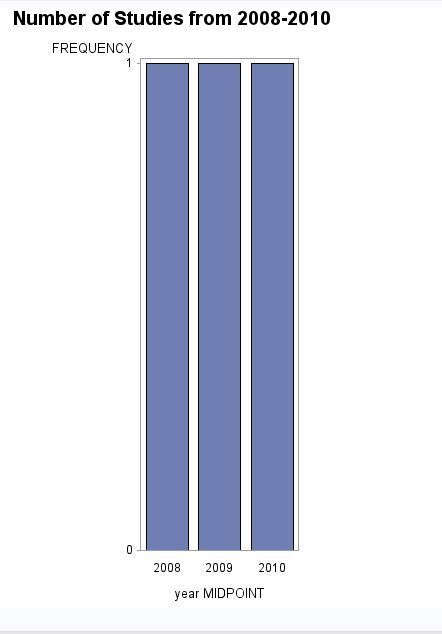
i tried to put those values into SAS but as I only have one obervation for each year the bar chart has a total frequency of 1 as you can see on the picture.
DATA datensatz_0810;
  INPUT year Numberofstudies Numberofphysicians Numberofpatients unique_drugs sponsor;
  DATALINES;
  2008 185 41834 368481 154 92
  2009 185 41961 349424 154 98
  2010 188 42967 359147 152 90
 ;
RUN;

itle 'Number of Studies from 2008-2010';

axis1 label=('Number of studies');
axis2 label=('year');

proc gchart data=datensatz_0810;
vbar year /midpoints=(2008 2009 2010);
run;
is this even possible?
2008 | 2009 | 2010 | |
No of studies | 150 | 190 | 130 |
No of doctors | 41 000 | 42 000 | 43 000 |
No of patients | 360 000 | 350 000 | 365 000 |
No of unique drugs | 154 | 154 | 152 |
No of Sponsors | 92 | 98 | 90 |
- Mark as New
- Bookmark
- Subscribe
- Mute
- RSS Feed
- Permalink
- Report Inappropriate Content
Its very hard to tell you how to do something if I don't know what it is you want at the end. I would highly recommend moving to sgplot/gtl:
data datensatz_0810;
  input year numberofstudies numberofphysicians numberofpatients unique_drugs sponsor;
datalines;
2008 185 41834 368481 154 92
2009 185 41961 349424 154 98
2010 188 42967 359147 152 90
;
run;

title 'Number of Studies from 2008-2010';

proc sgplot data=datensatz_0810;
  vbar year / response=numberofstudies;
  xaxis display=(nolabel);
  yaxis grid;
run;
Wherein you can find endless information at:
- Mark as New
- Bookmark
- Subscribe
- Mute
- RSS Feed
- Permalink
- Report Inappropriate Content
Thank you for your help
- Mark as New
- Bookmark
- Subscribe
- Mute
- RSS Feed
- Permalink
- Report Inappropriate Content
"I need to draw a bar chart with those data" - this does not tell me anything. What do you want the output to look like? Horizontal/vertical, grouped, stacked? There is half a million types of each graph. Check out the link i provided, there is source code for many thousands of graphs, its a great resource, for instance:
- Mark as New
- Bookmark
- Subscribe
- Mute
- RSS Feed
- Permalink
- Report Inappropriate Content
@marysmith wrote:
Hi thanky for your quick replay. I need to draw a bar chart with those data 🙂
Thank you for your help
One way for one of the variables:
data work.datensatz_0810;
  input year numberofstudies numberofphysicians numberofpatients unique_drugs sponsor;
datalines;
2008 185 41834 368481 154 92
2009 185 41961 349424 154 98
2010 188 42967 359147 152 90
;
run;

proc sgplot data=work.datensatz_0810;
   vbarparm category=year response=numberofphysicians;
run;
If that is not the type of bar chart you were expecting then you really need to describe more of what you actually want or investigate the link that @RW9 mentioned to find something you like.
Learn how use the CAT functions in SAS to join values from multiple variables into a single value.
Find more tutorials on the SAS Users YouTube channel.
SAS Training: Just a Click Away
Ready to level-up your skills? Choose your own adventure.


