- Home
- /
- Programming
- /
- Programming
- /
- How do I offset displays for mean values with standard error by group ...
- RSS Feed
- Mark Topic as New
- Mark Topic as Read
- Float this Topic for Current User
- Bookmark
- Subscribe
- Mute
- Printer Friendly Page
- Mark as New
- Bookmark
- Subscribe
- Mute
- RSS Feed
- Permalink
- Report Inappropriate Content
Greetings,
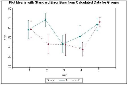
I am trying to plot means of three treatments over four time periods. I am have having trouble getting the means for each treatment to display side-by-side for each period, per the example shown here (minus the trend lines):
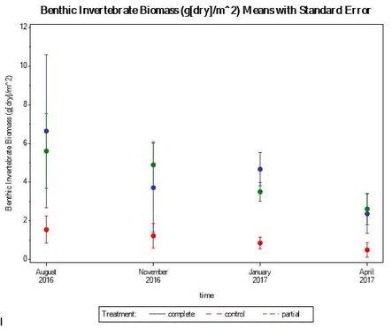
This is how my plot looks:
My code is as follows:
DATA ccinmass;
INPUT obs $ block $ unit $ time $ trt $ cinv sinv tinv sav wg sr abund coreh
depth pen temp sal ph;
run;
proc sort;
by trt time;
run;
proc means noprint;
by trt time;
var cinv;
output out=meansout mean=mean stderr=stderr;
run;
data reshape (keep=trt time cinv mean);
set meansout;
by trt time;
cinv=mean;
output;
cinv=mean-stderr;
output;
cinv=mean+stderr;
output;
run;
title1 'Benthic Invertebrate Biomass (g[dry]/m^2) Means with Standard Error';
axis1 offset=(5,5) minor=none value=(tick=1 'August' justify=c '2016'
tick=2 'November' justify=c '2016'
tick=3 'January' justify=c '2017'
tick=4 'April' justify=c '2017');
axis2 order=(0 to 12 by 2) minor=(n=1) label=(angle=90 'Benthic Invertebrate Biomass (g[dry]/m^2)');
symbol1 interpol=hiloct color=BIB line=1;
symbol2 interpol=hiloct color=RED line=2;
symbol3 interpol=hiloct color=GREEN line=3;
symbol4 interpol=none color=BIB value=dot height=1.5;
symbol5 interpol=none color=RED value=dot height=1.5;
symbol6 interpol=none color=GREEN value=dot height=1.5;
legend1 label=('Treatment:') frame;
proc gplot data=reshape;
plot cinv*time=trt/haxis=axis1 vaxis=axis2 legend=legend1;
plot2 mean*time=trt/vaxis=axis2 noaxis nolegend;
run;
Any help would be greatly appreciated!
Accepted Solutions
- Mark as New
- Bookmark
- Subscribe
- Mute
- RSS Feed
- Permalink
- Report Inappropriate Content
Add a bit to the time variable so one is July 31st and one is August 4th (random numbers I made up). Then explicitly set the values to show on the axis but the bars will be on either side slightly. You can also try moving to SGPLOT which has better graphical controls.
@bbauer0 wrote:
Greetings,
I am trying to plot means of three treatments over four time periods. I am have having trouble getting the means for each treatment to display side-by-side for each period, per the example shown here (minus the trend lines):
This is how my plot looks:
My code is as follows:
DATA ccinmass;
INPUT obs $ block $ unit $ time $ trt $ cinv sinv tinv sav wg sr abund coreh
depth pen temp sal ph;
run;
proc sort;
by trt time;
run;
proc means noprint;
by trt time;
var cinv;
output out=meansout mean=mean stderr=stderr;
run;
data reshape (keep=trt time cinv mean);
set meansout;
by trt time;
cinv=mean;
output;
cinv=mean-stderr;
output;
cinv=mean+stderr;
output;
run;
title1 'Benthic Invertebrate Biomass (g[dry]/m^2) Means with Standard Error';
axis1 offset=(5,5) minor=none value=(tick=1 'August' justify=c '2016'
tick=2 'November' justify=c '2016'
tick=3 'January' justify=c '2017'
tick=4 'April' justify=c '2017');
axis2 order=(0 to 12 by 2) minor=(n=1) label=(angle=90 'Benthic Invertebrate Biomass (g[dry]/m^2)');
symbol1 interpol=hiloct color=BIB line=1;
symbol2 interpol=hiloct color=RED line=2;
symbol3 interpol=hiloct color=GREEN line=3;
symbol4 interpol=none color=BIB value=dot height=1.5;
symbol5 interpol=none color=RED value=dot height=1.5;
symbol6 interpol=none color=GREEN value=dot height=1.5;
legend1 label=('Treatment:') frame;
proc gplot data=reshape;
plot cinv*time=trt/haxis=axis1 vaxis=axis2 legend=legend1;
plot2 mean*time=trt/vaxis=axis2 noaxis nolegend;
run;
Any help would be greatly appreciated!
Learn how use the CAT functions in SAS to join values from multiple variables into a single value.
Find more tutorials on the SAS Users YouTube channel.
SAS Training: Just a Click Away
Ready to level-up your skills? Choose your own adventure.


