- Home
- /
- Programming
- /
- Programming
- /
- Histogram by group with lines instead of bars
- RSS Feed
- Mark Topic as New
- Mark Topic as Read
- Float this Topic for Current User
- Bookmark
- Subscribe
- Mute
- Printer Friendly Page
- Mark as New
- Bookmark
- Subscribe
- Mute
- RSS Feed
- Permalink
- Report Inappropriate Content
Hello,
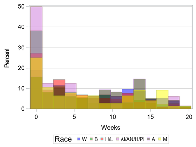
I've created a graph from my data that is an overlaid histogram (HISTOGRAM statement). Here is my code:
proc sgplot data=data;
styleattrs datacolors=(Blue Green Red VLIP DEYBR Yellow) backcolor=white wallcolor=white;
where race ~='';
format race $race.;histogram Week /
group=race transparency=0.5;
xaxis label='#Weeks' LABELATTRS=(size=14) VALUEATTRS=(size=13);
keylegend  /
title='Weeks by race' TITLEATTRS=(size=16) valueattrs=(size=12);
yaxis LABELATTRS=(size=14) VALUEATTRS=(size=13) grid GRIDATTRS=(color=LIGGR);
run;
Here is the graph that is produced:

I'd like to produce the same exact graph, except with lines instead of vertical bars (e.g., sgplot type "series"). I've tried a series graph, but a "y" variable is required, and there is only one variable in this graph (other than the "by" group) with the percent on the y-axis. I've Googled around and can't seem to find a solution. Can you help? Thanks.
Accepted Solutions
- Mark as New
- Bookmark
- Subscribe
- Mute
- RSS Feed
- Permalink
- Report Inappropriate Content
/*
You need calcualted it before plot it.
*/
data have;
 set sashelp.heart;
 if ageatstart>50;
run;

proc sort data=have;by ageatstart ;run;
proc freq data=have noprint;
by ageatstart;
table bp_status/ out=want;
run;

proc sgplot data=want;
series x=ageatstart y=PERCENT/group=bp_status;
xaxis type=discrete integer;
run;
- Mark as New
- Bookmark
- Subscribe
- Mute
- RSS Feed
- Permalink
- Report Inappropriate Content
Sometimes what you want just is not possible with the data that you have and it requires adding a variable or restructuring the data set.
So first step is to provide the data values to plot. Any other plot I can think of is going to require grouping. HISTOGRAM plots do that with parameters related to bid widths and such. If you want a similar grouped plot then you have to provide the "bins" or grouping values. Typically the easiest way to group values is with a format but without knowing the exact groups you want cannot suggest one.
You can try outputting the data that the current graph creates to plot with using ODS OUTPUT. But that will still require you to make decisions.
Since you did not supply any data here is an example of creating a data set with a HISTOGRAM plot that uses a data set that should have been installed with your SAS installation:
proc sgplot data=sashelp.heart;
   ods output sgplot=plotdata;
   histogram ageatstart/group=status ;
run;
And making a series graph from that output set:
proc sort data=plotdata;
   by status BIN_AGEATSTART_GROUP_STATUS___X;
run;

proc sgplot data=plotdata;
   series  x=BIN_AGEATSTART_GROUP_STATUS___X
           y=BIN_AGEATSTART_GROUP_STATUS___Y
           /group = status;
run;
You can skip the sort but I guarantee you won't like the result because of the way that Historgram summarized the result for this particular set.
If I had wanted a series graph I would almost certainly NOT used Histogram to create the data set but created my own summary based on the values of age I though were useful/important or had some existing impact on the data base on knowledge of the topic.
Then create a format for the Age group boundaries I wanted and summarize the data with that:
Note: I intentionally did not create an age grouping format for this data set because I don't need to, I don't really care what the plot might look like.
proc freq data=sashelp.heart noprint;
   tables status*ageatstart/ out=myplotdata;
   format ageatstart myageformat.;
run;

proc sgplot data=myplotdata;
   series x=ageatstart y=count/group=status;
run;
- Mark as New
- Bookmark
- Subscribe
- Mute
- RSS Feed
- Permalink
- Report Inappropriate Content
/*
You need calcualted it before plot it.
*/
data have;
 set sashelp.heart;
 if ageatstart>50;
run;

proc sort data=have;by ageatstart ;run;
proc freq data=have noprint;
by ageatstart;
table bp_status/ out=want;
run;

proc sgplot data=want;
series x=ageatstart y=PERCENT/group=bp_status;
xaxis type=discrete integer;
run;
Catch up on SAS Innovate 2026
Dive into keynotes, announcements and breakthroughs on demand.
Explore Now →Learn how use the CAT functions in SAS to join values from multiple variables into a single value.
Find more tutorials on the SAS Users YouTube channel.
SAS Training: Just a Click Away
Ready to level-up your skills? Choose your own adventure.


