Turn on suggestions
Auto-suggest helps you quickly narrow down your search results by suggesting possible matches as you type.
Showing results for
- Home
- /
- Programming
- /
- Programming
- /
- Assigning colors to histogram bars
Options
- RSS Feed
- Mark Topic as New
- Mark Topic as Read
- Float this Topic for Current User
- Bookmark
- Subscribe
- Mute
- Printer Friendly Page
☑ This topic is solved.
Need further help from the community? Please
sign in and ask a new question.
- Mark as New
- Bookmark
- Subscribe
- Mute
- RSS Feed
- Permalink
- Report Inappropriate Content
Posted 07-12-2022 06:06 AM
(1026 views)
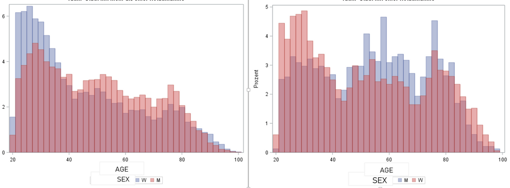
I want to overlay 2 histograms (age in men and women) for 2 groups (rural vs. urban population).
My code below works but the histogram bars are in reversed colors - in 1 figure, women are red, and in the other one, blue. How can I assign the same colors in both figures?
proc sgplot data = data;
histogram AGE / group = SEX;
by URBAN;
RUN;
1 ACCEPTED SOLUTION
Accepted Solutions
- Mark as New
- Bookmark
- Subscribe
- Mute
- RSS Feed
- Permalink
- Report Inappropriate Content
1 REPLY 1
- Mark as New
- Bookmark
- Subscribe
- Mute
- RSS Feed
- Permalink
- Report Inappropriate Content
Try sorting
proc sort data=data;
    by urban sex;
run;
--
Paige Miller
Paige Miller
Catch up on SAS Innovate 2026
Nearly 200 sessions are now available on demand with the SAS Innovate Digital Pass.
Explore Now →How to Concatenate Values
Learn how use the CAT functions in SAS to join values from multiple variables into a single value.
Find more tutorials on the SAS Users YouTube channel.
SAS Training: Just a Click Away
Ready to level-up your skills? Choose your own adventure.


