- Home
- /
- Programming
- /
- Programming
- /
- Re: Adding value labels to SGPLOT
- RSS Feed
- Mark Topic as New
- Mark Topic as Read
- Float this Topic for Current User
- Bookmark
- Subscribe
- Mute
- Printer Friendly Page
- Mark as New
- Bookmark
- Subscribe
- Mute
- RSS Feed
- Permalink
- Report Inappropriate Content
I have generated a graph used SGPLOT in SAS Studio, university edition, using the code below.
proc sgplot data=TABLE1;
	VBAR region;
	title 'Attacks by Region';
	footnote1 BOLD 'Codes';
	footnote3 'Region: MENA-Middle East/North Africa, WEUR-Western Europe, EEUR-Eastern Europe, NAME-North America, ASIA-Asia, OCEA-Oceana, SSAF-Sub Saharan Africa';
run;
While this works, the graph is difficult to read because one of the bars is so much larger than the others, which blows up the scale. Is there a way to add value labels and/or a grid to the plot?
- Mark as New
- Bookmark
- Subscribe
- Mute
- RSS Feed
- Permalink
- Report Inappropriate Content
Hi,
This should display the labels:
proc sgplot data=TABLE1;
	VBAR region / datalabel = <your variable containing labels>;
	title 'Attacks by Region';
	footnote1 BOLD 'Codes';
	footnote3 'Region: MENA-Middle East/North Africa, WEUR-Western Europe, EEUR-Eastern Europe, NAME-North America, ASIA-Asia, OCEA-Oceana, SSAF-Sub Saharan Africa';
run;
I hope this helps,
FloT
- Mark as New
- Bookmark
- Subscribe
- Mute
- RSS Feed
- Permalink
- Report Inappropriate Content
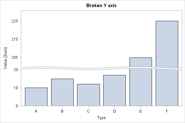
You could also consider a split axis.
http://support.sas.com/kb/55/683.html
data new;
   input Type $1 Value;
   datalines;
A 10
B 15
C 12
D 17
E 205
F 225
;
run;

proc sgplot data=new;
   vbar type / response=value;
   yaxis ranges=(0-20 200-230);
run;
April 27 – 30 | Gaylord Texan | Grapevine, Texas
Registration is open
Walk in ready to learn. Walk out ready to deliver. This is the data and AI conference you can't afford to miss.
Register now and save with the early bird rate—just $795!
Learn how use the CAT functions in SAS to join values from multiple variables into a single value.
Find more tutorials on the SAS Users YouTube channel.
SAS Training: Just a Click Away
Ready to level-up your skills? Choose your own adventure.


