- Home
- /
- Programming
- /
- SAS Procedures
- /
- Re: SGPlot formatting questions
- RSS Feed
- Mark Topic as New
- Mark Topic as Read
- Float this Topic for Current User
- Bookmark
- Subscribe
- Mute
- Printer Friendly Page

- Mark as New
- Bookmark
- Subscribe
- Mute
- RSS Feed
- Permalink
- Report Inappropriate Content
Hello, I am new to the SAS forum. I am looking for some assistance in formatting a couple of scatterplots for my M.Sc thesis. I am using SAS 9,3
I have created the scatterplot and trendlines in Proc SGPlot, however there are two minor issues that I need to resolve
1) The data is grouped, and in the legend that is created the group names (which are numbers) get truncated using scientific notation. Is there a way to get SG plot to show the entire number in the Legend? The entire number is needed for the legend to make sense.
2) For the Axis titles my units are in Square meters. Is it possible to incorporate superscripts into the axis titles?
I would appreciate any feedback I can get.
Accepted Solutions

- Mark as New
- Bookmark
- Subscribe
- Mute
- RSS Feed
- Permalink
- Report Inappropriate Content
Hi Dan,
The first part of my code was simply there to create example data for plotting, you can ignore it. All you need to do is :
proc sgplot data=Chapter2AspenNLinOut;
scatter x=LiDARGapArea y=ExpandedGapArea / group=Polygon;
series x=LiDARGapArea y=Pred / group=Polygon;
yaxis label='Expanded Gap Area (m²)';
xaxis label='LiDAR Gap Area (m²)';
format Polygon best20.;
run;
PG
- Mark as New
- Bookmark
- Subscribe
- Mute
- RSS Feed
- Permalink
- Report Inappropriate Content
1) Use an explicit format for your group variable
2) Use Unicode character '00B2' which represents superscript 2 (you might be able to cut and paste it from the code below)
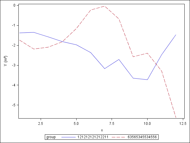
data test;
call streaminit(76576);
do group = 121212121212211, 63565345534556;
do x = 1 to 12;
y = sum(y, rand('Normal'));
output;
end;
end;
run;
title;
proc sgplot data=test;
format group best20.;
series x=x y=y / group=group;
yaxis label="Y (m²)";
run;
PG
- Mark as New
- Bookmark
- Subscribe
- Mute
- RSS Feed
- Permalink
- Report Inappropriate Content
Thanks for the prompt response,
I have attempted the "do" statement and I think my inexperience is showing. When I included a do statement the log stated that I needed an end statement as well. Here is the code I was using,
proc nlin data=Aspen NLINMEASURES plots(stats=all)=(diagnostics) ;
ods rtf file="D:\Chapter2DataTables\AspenPowerFunction.rtf";
parms a=30 b=0.4;
model Y=a*X**b;
by polygon;
do group = 6796103, 6886289; tried to add the do statement here...
Output Out=Chapter2.AspenNlinOut Predicted=pred;
run;
ods rtf close;
Title test;
proc sgplot data=Chapter2.AspenNLinOUt;
Scatter x=LiDARGapArea y=ExpandedGapArea / group=Polygon;
yaxis label='Expanded Gap Area (m²)';
xaxis label='LiDAR Gap Area (m²)';
series x=LiDARGapArea y=Pred / group=Polygon;
run;
- Mark as New
- Bookmark
- Subscribe
- Mute
- RSS Feed
- Permalink
- Report Inappropriate Content
Hi Dan,
The first part of my code was simply there to create example data for plotting, you can ignore it. All you need to do is :
proc sgplot data=Chapter2AspenNLinOut;
scatter x=LiDARGapArea y=ExpandedGapArea / group=Polygon;
series x=LiDARGapArea y=Pred / group=Polygon;
yaxis label='Expanded Gap Area (m²)';
xaxis label='LiDAR Gap Area (m²)';
format Polygon best20.;
run;
PG
- Mark as New
- Bookmark
- Subscribe
- Mute
- RSS Feed
- Permalink
- Report Inappropriate Content
The format statement solved it. Thanks very much for the assistance.
- Mark as New
- Bookmark
- Subscribe
- Mute
- RSS Feed
- Permalink
- Report Inappropriate Content
Thanks again for the assistance before.
I have been asked to modify the scatter plots a little more. The current plots create an output which is distinguished only by color. I have been asked to change up one set of data points so that the markers and series line are different (maybe change them to closed circles and a dashed line). With the data sets being separated using the group statements I am not sure how to modify them to change only one set of markers. Any ideas would be appreciated. I haven't seen anything in the other posts in this forum yet.
proc sgplot data=Chapter2.AspenNLinOUt;
Scatter x=LiDARGapArea y=ExpandedGapArea / group=Polygon;
yaxis label='Expanded Gap Area (m²)';
xaxis label='LiDAR Gap Area (m²)';
series x=LiDARGapArea y=Pred / group=Polygon markerattrs=;
format Polygon best20.;
run;
Thanks again for the assistance.
- Mark as New
- Bookmark
- Subscribe
- Mute
- RSS Feed
- Permalink
- Report Inappropriate Content
You should change the style associated with your ODS destination. By default the style is HTMLBLUE which only changes colors among the first 12 groups. The alternate style HTMLBLUECML (CML: Color-Marker-Line) changes every aspect from one group to the other. Add a statement such as
ODS HTML style=HTMLBLUECML;
before proc sgplot to request the alternate style. Also, remove the markerattrs= request from the series statement.
PG
.jpg")
Catch up on SAS Innovate 2026
Nearly 200 sessions are now available on demand with the SAS Innovate Digital Pass.
Explore Now →Learn the difference between classical and Bayesian statistical approaches and see a few PROC examples to perform Bayesian analysis in this video.

Find more tutorials on the SAS Users YouTube channel.
SAS Training: Just a Click Away
Ready to level-up your skills? Choose your own adventure.
-
6 replies
-
05-30-2014 11:34 AM
-
4874 views
-
3 likes
-
2 in conversation
-
