- Home
- /
- Programming
- /
- SAS Procedures
- /
- Re: Proc Gplot – left-skewed connected line
- RSS Feed
- Mark Topic as New
- Mark Topic as Read
- Float this Topic for Current User
- Bookmark
- Subscribe
- Mute
- Printer Friendly Page
- Mark as New
- Bookmark
- Subscribe
- Mute
- RSS Feed
- Permalink
- Report Inappropriate Content
Hi there,
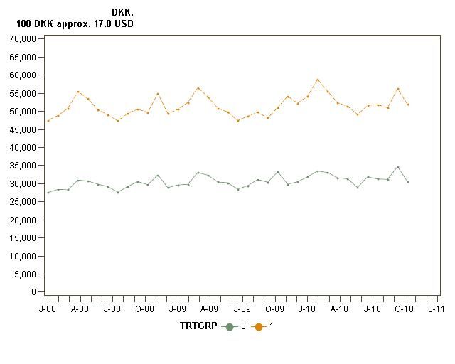
Im all new to proc gplot but decided to give it a shot since excel editing simply must be a worse option. So here goes. I have two groups of individuals and I am trying to plot their average monthly wages, see code below. However when I do, it seems the connected line in the figure gets skewed to the left. I have 37 months worth of observations and I think that might be related to the problem because when I plot the same figure for only 12 month it is okay. Could it be the font size maybe and if so how do I change that? All suggestions are much appreciated.
Thanks in advance,
JD
goptions reset=global gunit=pct border cback=white;
symbol interpol=join
value=dot
height=1;
axis1 label=none
value=("J-08" "F-08" "M-08" "A-08" "M-08" "J-08" "J-08" "A-08" "S-08" "O-08" "N-08" "D-08"
"J-09" "F-09" "M-09" "A-09" "M-09" "J-09" "J-09" "A-09" "S-09" "O-09" "N-09" "D-09"
"J-10" "F-10" "M-10" "A-10" "M-10" "J-10" "J-10" "A-10" "S-10" "O-10" "N-10" "D-10"
"J-11")
offset=(0)
width=1;
axis2 label=("DKK." justify=right "100 DKK approx. 17.8 USD")
order=(0 to 70000 by 5000)
width=2;
proc gplot data=data1_fig1;
plot avg_f200*m=trtgrp /haxis=axis1 hminor=0
vaxis=axis2 vminor=0;
FORMAT avg_f200 comma12.0;
run;

- Mark as New
- Bookmark
- Subscribe
- Mute
- RSS Feed
- Permalink
- Report Inappropriate Content
hi ... well there are 37 points plotted and 37 tick marks, so what are the values for the variable M (is that a SAS date or just 1 through 37)
did you try it without using the haxis=axis1 to see what happens
- Mark as New
- Bookmark
- Subscribe
- Mute
- RSS Feed
- Permalink
- Report Inappropriate Content
I'm not sure what you mean by skewed.
If you mean the labels on the axis, they aren't all showing because of space. You could slant or make the labels vertical by using the ANGLE= option
value=(angle=90 "J-08" <the rest of your list>)
- Mark as New
- Bookmark
- Subscribe
- Mute
- RSS Feed
- Permalink
- Report Inappropriate Content
Hi,
Thanks for the tips. @MikeZdeb: I have tried with both SAS dates and a simple counter from 1 through 37. The attached figure is based on a counter from 1 through 37. Neither approach seems to solve the problem tho...
@balardw: Have a look at hte figure, the 37 points do not align to 37 tick marks instead the line in the figure seems to be moved to the left - simply no making use of hte last few centimeters of the plotting area. The angle option is unfortunately not enough to solve my problem.
Thanks so far and if you can think of anything else pls just post away ![]()
- Mark as New
- Bookmark
- Subscribe
- Mute
- RSS Feed
- Permalink
- Report Inappropriate Content
I got a bad feeling about your data when you have 3 identical labels in each year.
With a SAS date value try an ORDER=("01JAN2008"d TO "01JAN2011"d by month) instead of value.
Then use a format to display labels similar to what you are useing, possibly MONYY5. or MMYYd5. or a custom picture format.
The above code will generate messages about unevenly spaced tickmarks because the intervals for the first of the month vary.
- Mark as New
- Bookmark
- Subscribe
- Mute
- RSS Feed
- Permalink
- Report Inappropriate Content
hi ... I'm using V9.3
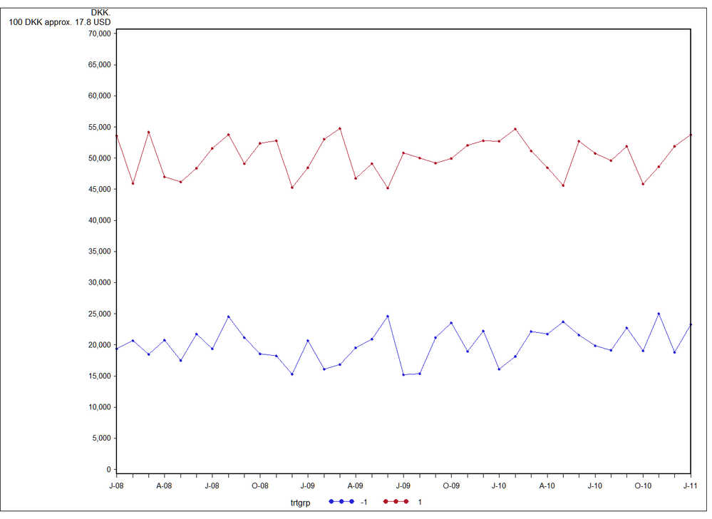
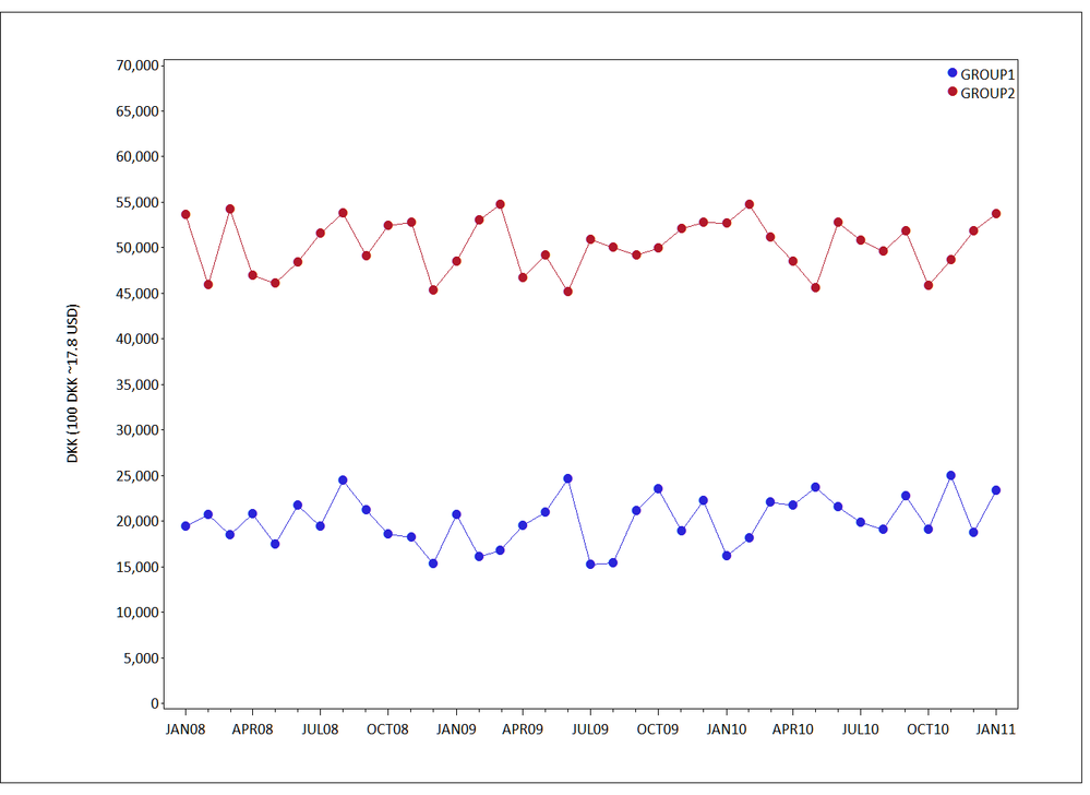
I made some data similar to what you posted in your plot then I tried your SAS code (PLOT1.PNG) and then mine (see below and PLOT2.PNG)
I don't get that skew (offset on the right) for either plot ... are you using EG to do your plots (have you tried SGPLOT ... surprised that no "SG advocates" are yet to contribute)
* data similar to yours;
data fig1;
start = 35000;
do trtgrp=-1 to 1 by 2;
do mm = 1 to 37;
m = intnx('month','01dec07'd,mm);
change = ifn(ranuni(999) le .5 ,1 ,-1);
avg_f200 = start + (trtgrp*15000) + (change*ceil(5000*ranuni(999)));
output;
end;
end;
drop change;
format m date9.;
run;
I just cut/pasted your posted SAS code here with this edited AXIS statement an got PLOT1 using the variable MM in the plot statement
axis1 label=none order=1 to 37 minor=none
value=("J-08" "" "" "A-08" "" "" "J-08" "" "" "O-08" "" ""
"J-09" "" "" "A-09" "" "" "J-09" "" "" "O-09" "" ""
"J-10" "" "" "A-10" "" "" "J-10" "" "" "O-10" "" "" "J-11") offset=(0) width=1;
* make PLOT2 ... I used M in the plot statement, a real SAS date;
goptions reset=all ftext='calibri' htext=2 gunit=pct border;
symbol i=join f='wingdings' v='6c'x height=2;
axis1 label=none minor=(n=2) offset=(2,2)pct;
axis2 label=(a=90 "DKK (100 DKK ~17.8 USD)") minor=none order=(0 to 70000 by 5000);
legend1 mode=protect position=(top inside right) across=1
label=none value=('GROUP1' 'GROUP2') shape=symbol(.0005,2)pct;
* white space between plot and border;
title1 ls=2;
title2 a=90 ls=2;
title3 a=-90 ls=2;
footnote1 ls=2;
proc gplot data=fig1;
plot avg_f200*m=trtgrp /haxis=axis1 vaxis=axis2 legend=legend1;
format avg_f200 comma12.0 m monyy.;
run;
quit;


- Mark as New
- Bookmark
- Subscribe
- Mute
- RSS Feed
- Permalink
- Report Inappropriate Content
Hi Mike,
Thanks! I copied your code and just changed back to my original dto variable and it seemed to work perfectly - when i do go back and round my original code with dto instead of m it still screws up. So to conclude im not actually sure what solved the problem, but im very happy that is works now ![]()
- now how do i accept your answer so you can get some points?
Thanks again!
JD
- Mark as New
- Bookmark
- Subscribe
- Mute
- RSS Feed
- Permalink
- Report Inappropriate Content
Hi ... I have no idea, but it's no big deal. The problem solving is the interesting part of all this, not the points (just between you and me and anyone else who reads the note, I think that the whole points thing is kind of pointless).
April 27 – 30 | Gaylord Texan | Grapevine, Texas
Registration is open
Walk in ready to learn. Walk out ready to deliver. This is the data and AI conference you can't afford to miss.
Register now and save with the early bird rate—just $795!
Learn the difference between classical and Bayesian statistical approaches and see a few PROC examples to perform Bayesian analysis in this video.
Find more tutorials on the SAS Users YouTube channel.
SAS Training: Just a Click Away
Ready to level-up your skills? Choose your own adventure.


