- Home
- /
- Programming
- /
- SAS Procedures
- /
- Re: Plotting two curves in a single Graph Using Proc GPLOT option Over...
- RSS Feed
- Mark Topic as New
- Mark Topic as Read
- Float this Topic for Current User
- Bookmark
- Subscribe
- Mute
- Printer Friendly Page
- Mark as New
- Bookmark
- Subscribe
- Mute
- RSS Feed
- Permalink
- Report Inappropriate Content
Hi,
I am trying to plot two different curves in a single graph using GPLOT procedure option overlay. It is working fine but when I try to plot one as scattered plot point and another as connected line curve I am hitting a stone wall. Below is the code I am using for this purpose:
filename grafout "D:\CURVE_CHARTS\chart_new.gif";
goptions
device=gif gsfname=grafout gsfmode=replace
reset=global gunit=pct border
cback=white
colors=( blue black)
ftitle=swissb ftext=swiss htitle=3
htext=2;
axis1 order=(100 to 1000 by 100)
offset=(3,3)
color=black
major=(height=1 width=1)
minor=none
width=1;
axis2 label=(angle=270 rotate=90 height=2 'Coverage')
order=(20 to 100 by 10)
offset=(3,3)
color=black
major=(height=1 width=1)
minor=none
width=1;
symbol1 height=0.3 value=dot;
symbol2 value=dot interpol=join line=1 height=1.3;
proc gplot data=plot_final;
title 'CURVE CHART';
plot
Coverage_Plus1*Single_Coefficient p_1*Single_Coefficient
/overlay haxis=axis1 vaxis=axis2 caxis=black cframe=white legend;
run;
quit;
run;
quit;
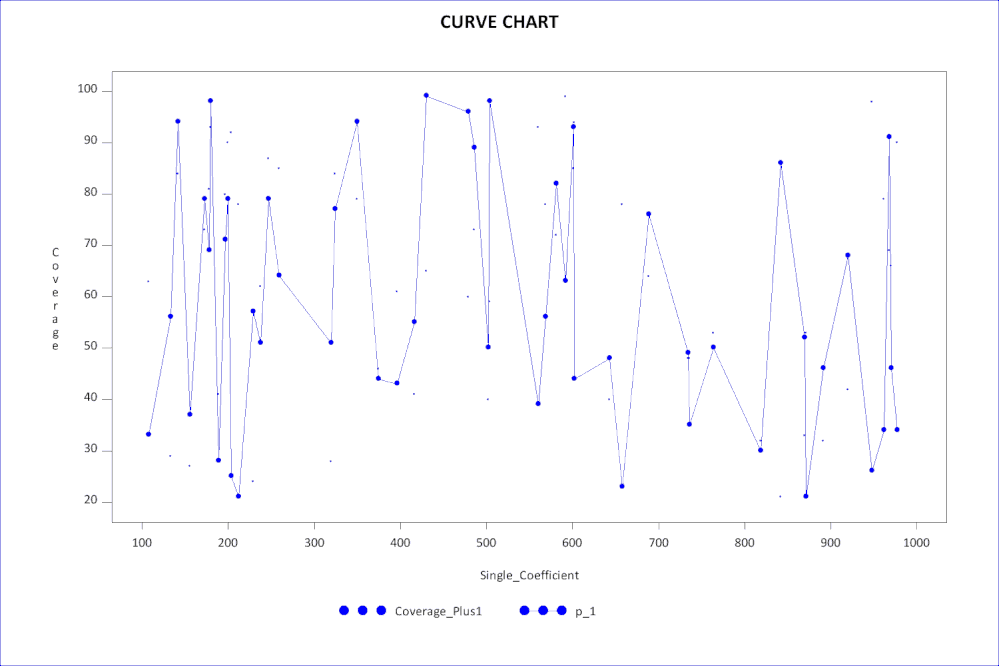
As you can see I am using Overlay option to plot both Coverage_Plus1*Single_Coefficient and p_1*Single_Coefficient plots in a single graph. In the above code I have mentioned Symbol1 as value=dot whereas Symbol2 as Interpol=Join with the intention of plotting Graph 1 as scattered plot and Graph 2 as connected by line. But once I run this code I am getting both as scattered point graphs.
Can anybody help me with this? Thanks in advance for your help.
Thanks & Regards,
Saugata Mukherjee.
Accepted Solutions
- Mark as New
- Bookmark
- Subscribe
- Mute
- RSS Feed
- Permalink
- Report Inappropriate Content
hi ... one of the attributes of a a SYMBOL is COLOR and if you do not specify a color for a symbol, SAS/GRAPH cycles though the color list for a given symbol before using the next symbol
so ... I added a color to your symbol statements
and ... I added a data step to make some fake data in the range of your axis statements and produced the attached plot
and ... I made a few changes to some of your SAS code
#1 not sure why you are using a SAS stroke font (swiss) when TrueType fonts (Calibri, whatever) might be available and look better
#2 raised the pixel count ... looks better in bit-map output (GIF)
#3 used a TrueType font (Wingdings) as the symbol value ... if you have access to TrueType fonts try ...
goptions reset-all;
proc gfont name="wingdings" nibuild showroman;
run;
quit;
character '6c'x is a DOT
#4 added a LEGEND definition to get rid of the default label (PLOT1)
#5 added some "white space" around the chart with the LS option for title/footnote
here's the code and the result is attached ...
data plot_final;
do _n_ = 1 to 50;
Single_Coefficient = 100 + ceil(900*ranuni(1234));
Coverage_Plus1 = 20 + ceil(80*ranuni(1234));
p_1 = 20 + ceil(80*ranuni(1234));
output;
end;
run;
proc sort data=plot_final;
by Single_Coefficient;
run;
filename grafout "z:\chart_new.gif";
goptions reset=global
device=gif gsfname=grafout gsfmode=replace xpixels=1500 ypixels=1000
gunit=pct border
cback=white colors=( blue black)ftitle="calibri/bo" ftext="calibri" htitle=3 htext=2;
axis1 order=(100 to 1000 by 100)
offset=(3,3)
color=black
major=(height=1 width=1)
minor=none
width=1;
axis2 label=(angle=270 rotate=90 height=2 'Coverage')
order=(20 to 100 by 10)
offset=(3,3)
color=black
major=(height=1 width=1)
minor=none
width=1;
legend1 label=none;
symbol1 height=0.5 f="wingdings" value='6c'x c=blue;
symbol2 f="wingdings" value='6c'x interpol=join line=1 height=1.3 c=blue;
title1 'CURVE CHART' ls=2;
title2 a=90 ls=1;
title3 a=-90 ls=1;
footnote1 ls=0.5;
proc gplot data=plot_final;
plot Coverage_Plus1*Single_Coefficient p_1*Single_Coefficient
/overlay haxis=axis1 vaxis=axis2 caxis=black cframe=white legend=legend1;
run;
quit;

- Mark as New
- Bookmark
- Subscribe
- Mute
- RSS Feed
- Permalink
- Report Inappropriate Content
change your plot statement to
Coverage_Plus1*Single_Coefficient=1 p_1*Single_Coefficient=2 to force use of different symbol statements.
- Mark as New
- Bookmark
- Subscribe
- Mute
- RSS Feed
- Permalink
- Report Inappropriate Content
hi ... one of the attributes of a a SYMBOL is COLOR and if you do not specify a color for a symbol, SAS/GRAPH cycles though the color list for a given symbol before using the next symbol
so ... I added a color to your symbol statements
and ... I added a data step to make some fake data in the range of your axis statements and produced the attached plot
and ... I made a few changes to some of your SAS code
#1 not sure why you are using a SAS stroke font (swiss) when TrueType fonts (Calibri, whatever) might be available and look better
#2 raised the pixel count ... looks better in bit-map output (GIF)
#3 used a TrueType font (Wingdings) as the symbol value ... if you have access to TrueType fonts try ...
goptions reset-all;
proc gfont name="wingdings" nibuild showroman;
run;
quit;
character '6c'x is a DOT
#4 added a LEGEND definition to get rid of the default label (PLOT1)
#5 added some "white space" around the chart with the LS option for title/footnote
here's the code and the result is attached ...
data plot_final;
do _n_ = 1 to 50;
Single_Coefficient = 100 + ceil(900*ranuni(1234));
Coverage_Plus1 = 20 + ceil(80*ranuni(1234));
p_1 = 20 + ceil(80*ranuni(1234));
output;
end;
run;
proc sort data=plot_final;
by Single_Coefficient;
run;
filename grafout "z:\chart_new.gif";
goptions reset=global
device=gif gsfname=grafout gsfmode=replace xpixels=1500 ypixels=1000
gunit=pct border
cback=white colors=( blue black)ftitle="calibri/bo" ftext="calibri" htitle=3 htext=2;
axis1 order=(100 to 1000 by 100)
offset=(3,3)
color=black
major=(height=1 width=1)
minor=none
width=1;
axis2 label=(angle=270 rotate=90 height=2 'Coverage')
order=(20 to 100 by 10)
offset=(3,3)
color=black
major=(height=1 width=1)
minor=none
width=1;
legend1 label=none;
symbol1 height=0.5 f="wingdings" value='6c'x c=blue;
symbol2 f="wingdings" value='6c'x interpol=join line=1 height=1.3 c=blue;
title1 'CURVE CHART' ls=2;
title2 a=90 ls=1;
title3 a=-90 ls=1;
footnote1 ls=0.5;
proc gplot data=plot_final;
plot Coverage_Plus1*Single_Coefficient p_1*Single_Coefficient
/overlay haxis=axis1 vaxis=axis2 caxis=black cframe=white legend=legend1;
run;
quit;

- Mark as New
- Bookmark
- Subscribe
- Mute
- RSS Feed
- Permalink
- Report Inappropriate Content
Thanks a lot MikeZdeb. You have just saved my life. ![]()
Catch up on SAS Innovate 2026
Nearly 200 sessions are now available on demand with the SAS Innovate Digital Pass.
Explore Now →Learn the difference between classical and Bayesian statistical approaches and see a few PROC examples to perform Bayesian analysis in this video.
Find more tutorials on the SAS Users YouTube channel.
SAS Training: Just a Click Away
Ready to level-up your skills? Choose your own adventure.


