- Home
- /
- Programming
- /
- SAS Procedures
- /
- Re: PROC gplot
- RSS Feed
- Mark Topic as New
- Mark Topic as Read
- Float this Topic for Current User
- Bookmark
- Subscribe
- Mute
- Printer Friendly Page


- Mark as New
- Bookmark
- Subscribe
- Mute
- RSS Feed
- Permalink
- Report Inappropriate Content
Hi,
I try to plot graph using PROC GPLOT:
PROC GPLOT DATA = lead1;

footnote j=l 'curve'
	j=r 'MAT 4672 Lab 21';
plot iqf*fwtd=3/ frame cframe=beige;;
RUN;
QUIT;
and i got this
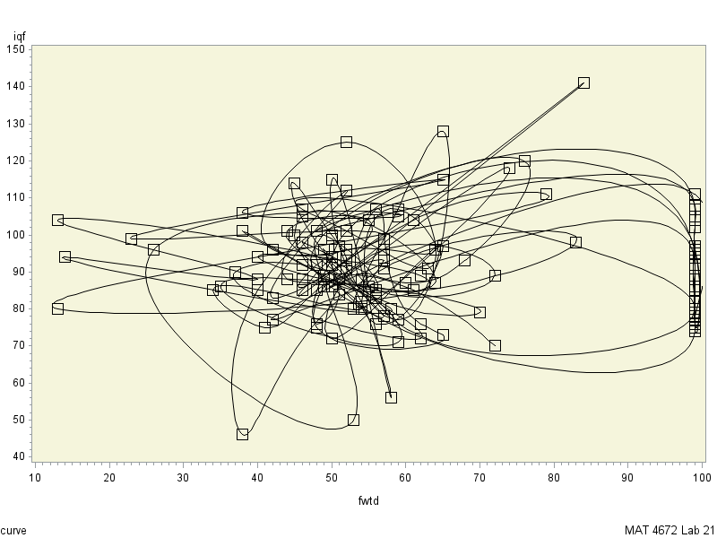
How make it nice and sorted.
P.S
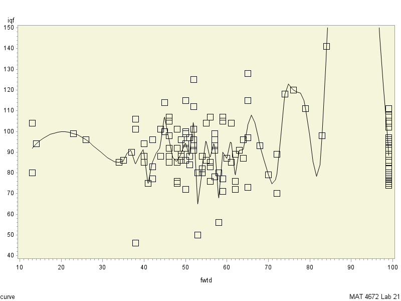
I tried that
PROC SORT data = lead1;
by fwtd;
run;
PROC GPLOT DATA = lead1;

footnote j=l 'curve'
	j=r 'MAT 4672 Lab 21';
plot iqf*fwtd=3/ frame cframe=beige;;
RUN;
QUIT;
and got that:


- Mark as New
- Bookmark
- Subscribe
- Mute
- RSS Feed
- Permalink
- Report Inappropriate Content
What are you expecting to get? And what do you think the = 3 means in your plot statement?
- Mark as New
- Bookmark
- Subscribe
- Mute
- RSS Feed
- Permalink
- Report Inappropriate Content
2) i am expecting graph through all points(squares) and sorted by X axis like
https://encrypted-tbn2.gstatic.com/images?q=tbn:ANd9GcSnEg3_Ebu_DNwEWswUg8aygvFFBKT61C9alWAMhujgcFzP...
- Mark as New
- Bookmark
- Subscribe
- Mute
- RSS Feed
- Permalink
- Report Inappropriate Content
Yeah, I don't think 3 does what you think it does. I can't test it, but I think you want something like this, where you use the symbol statement to define the symbol (square) and the interpol=j to join the points.
symbol1 interpol=j value='square';

PROC GPLOT DATA = lead1;

footnote j=l 'curve'
	j=r 'MAT 4672 Lab 21';
plot iqf*fwtd / frame cframe=beige;;
RUN;
QUIT;
Alternatively you can use the SGPLOT procedures which I find easier to navigate:
proc sgplot data=sashelp.stocks (where=(stock="IBM"));
scatter x=date y=open / markerattrs=(symbol='square' color='beige');
series x=date y=open / lineattrs=(color='beige');
run;quit;
- Mark as New
- Bookmark
- Subscribe
- Mute
- RSS Feed
- Permalink
- Report Inappropriate Content
@bigban777 wrote:
1)3 means squares instead just dots
2) i am expecting graph through all points(squares) and sorted by X axis like
https://encrypted-tbn2.gstatic.com/images?q=tbn:ANd9GcSnEg3_Ebu_DNwEWswUg8aygvFFBKT61C9alWAMhujgcFzP...
3 means to use Symbol3 statement for the display. Yours has some sort of interpolation option (INTERPOL= or I=) other than JOIN to "fit" a curve through the data. I would guess either SM Spline or L.
If you want to connect the points you need I=Join.
- Mark as New
- Bookmark
- Subscribe
- Mute
- RSS Feed
- Permalink
- Report Inappropriate Content
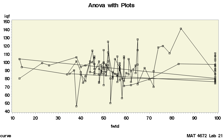
I believe x should be sorted
See attached file
- Mark as New
- Bookmark
- Subscribe
- Mute
- RSS Feed
- Permalink
- Report Inappropriate Content
I don't download attachments.
Post your code/log if it doesn't work in the message, preferably in a code window.


- Mark as New
- Bookmark
- Subscribe
- Mute
- RSS Feed
- Permalink
- Report Inappropriate Content
Hi,
I would suggest 1) move over to sgplot and graph template language, you will find more options/better outputs and 2) check out Sanjay's blog:
http://blogs.sas.com/content/graphicallyspeaking/
Which has many thousands of examples on all kinds of graphs, you will find what you are looking for there.

Call for content now open!
It's your turn to help shape SAS Innovate 2027. Share your expertise and inspire the SAS community.
Learn the difference between classical and Bayesian statistical approaches and see a few PROC examples to perform Bayesian analysis in this video.

Find more tutorials on the SAS Users YouTube channel.
SAS Training: Just a Click Away
Ready to level-up your skills? Choose your own adventure.
-
7 replies
-
05-04-2016 09:09 PM
-
4996 views
-
1 like
-
4 in conversation
-


