- Home
- /
- Programming
- /
- SAS Procedures
- /
- PROC LIFETEST graphics/ODS
- RSS Feed
- Mark Topic as New
- Mark Topic as Read
- Float this Topic for Current User
- Bookmark
- Subscribe
- Mute
- Printer Friendly Page

- Mark as New
- Bookmark
- Subscribe
- Mute
- RSS Feed
- Permalink
- Report Inappropriate Content
I'm generating Kaplan-Meier curves using PROC LIFETEST, with the following code, but have a few questions.
1) How do I avoid getting a log-rank p-value outputted onto the RTF?
2) When I don't use ODS, and instead get a graph in SAS, the color scheme and lines I have specified are adhered to, but in ODS, a completely random set of colors/line patterns is used - why is this and how do I change it?
3) Is it possible to remove the legend?
Thanks so much! Code below.
ods graphics on;
ods rtf file = "\pathway\filename.rtf";
ods noptitle;
ods select survival;
proc lifetest data=agegrp plots=(s) width=1 graphics;
time year*failure(1,2);
strata agegrp;
symbol1 v=none color=red line=1;
symbol2 v=none color=blue line=1;
symbol3 v=none color=green line=1;
symbol4 v=none color=orange line=1;
symbol5 v=none color=red line=2;
symbol6 v=none color=blue line=2;
symbol7 v=none color=green line=2;
symbol8 v=none color=orange line=2;
label year='Year';
title1 "Kaplan-Meier Estimates of Survival Function, By Age Group";
run;
ods rtf close;
ods graphics off;

- Mark as New
- Bookmark
- Subscribe
- Mute
- RSS Feed
- Permalink
- Report Inappropriate Content
Someone else may have to help you with #1 -- I don't know exactly how PROC LIFETEST outputs the p-value -- you may be able to use ODS SELECT to only select the output objects and graph objects that you want -- or use ODS EXCLUDE to exclude the p-value. If the p-value is appearing on the graph and if there is not a PROC LIFETEST way to turn it off, then you might need to alter the graph template to accomplish this.
#2 -- ODS GRAPHICS output does NOT use classic SAS/GRAPH statements such as: SYMBOL, GOPTIONS, AXIS, LEGEND ...etc. Regular SAS/GRAPH output produces GRSEG entries which are controlled by these statements. Typically, ODS GRAPHICS either produces a PNG file or in the case of RTF and PDF, embedded images which are NOT controlled by these "classic" statements. ODS GRAPHICS output is controlled by the STYLE template in use when you created your output. With ODS RTF, the default style is the RTF style. The set of colors and line patterns is not random, but is set in the ODS Style template.
#3 -- if you want to alter the graphs that come out of ODS GRAPHICS with the SAS/STAT procedures, your choices are to 1) control the image using Procedure analytic controls (such as requesting the type of plot you want); 2) use the ODS Graphics Editor to remove or tweak the graph slightly (good for one or two graphs, since the change is not persistent) or 3) alter the Graph Template to remove or change the text you want to change.
If you search the documentation for ODS GRAPHICS and style templates and/or graph templates, you will find a lot of information and examples. If you find that you need more help, you might wish to open a track with Tech Support.
cynthia

- Mark as New
- Bookmark
- Subscribe
- Mute
- RSS Feed
- Permalink
- Report Inappropriate Content
Hi Cynthia,
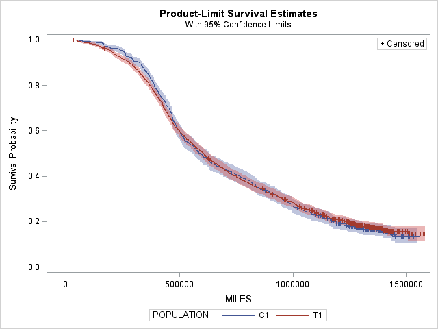
I just created a simple survival charts and would like to change the colorsf from red and blue into something else - like purple & orange.
Below is my code and the chart that I have. Would you please let me know where I did wrong? Thannk you!
Lindsey
--**********
ods graphics on;
proc template;
define style Styles.StatColor;
parent = Styles.HTMLBlue;
style GraphData1 from GraphData1 / contrastcolor = purple;
style GraphData2 from GraphData2 / contrastcolor = orange;
end;
run;
ods listing style=StatColor;
proc lifetest data = sorted_raw_data alpha = 0.05 plots(only) = survival(cl);
time miles * censored(0);
by truck;
strata population;
run;
proc template;
delete Styles.StatColor;
run;
ods graphics off;
--**********

- Mark as New
- Bookmark
- Subscribe
- Mute
- RSS Feed
- Permalink
- Report Inappropriate Content
Off hand you changed the contrast color, which is often used to create the contrast color as in the boundary of a bar in a bar chart and not the primary color used to create the lines or bars themselves. First start would be to use COLOR= instead of CONTRASTCOLOR.
You might also investigate the %modstyle macro in online help.

- Mark as New
- Bookmark
- Subscribe
- Mute
- RSS Feed
- Permalink
- Report Inappropriate Content
I am still struggling with this issue and finding the code to adjust the tick marks on the y-axis without messing up the default templates. I am find saving the adjustments in the SAS work space so when I close out SAS I can still keep the default.
Can someone share code that would allow me to do that. Full code example would be helpful and I am new to this and need some hand holding. lol.
Thanks.
.jpg")
Catch up on SAS Innovate 2026
Nearly 200 sessions are now available on demand in the Innovate Hub.
Watch Now →Learn the difference between classical and Bayesian statistical approaches and see a few PROC examples to perform Bayesian analysis in this video.

Find more tutorials on the SAS Users YouTube channel.
SAS Training: Just a Click Away
Ready to level-up your skills? Choose your own adventure.
-
4 replies
-
02-23-2010 11:03 AM
-
4796 views
-
0 likes
-
5 in conversation
-
