- Home
- /
- Programming
- /
- SAS Procedures
- /
- PROC CHART?
- RSS Feed
- Mark Topic as New
- Mark Topic as Read
- Float this Topic for Current User
- Bookmark
- Subscribe
- Mute
- Printer Friendly Page
- Mark as New
- Bookmark
- Subscribe
- Mute
- RSS Feed
- Permalink
- Report Inappropriate Content
Here's a sample of the data I have:
letter band
A 4
B 3
A 7
C 2
C 7
D 1
F 8
A 10
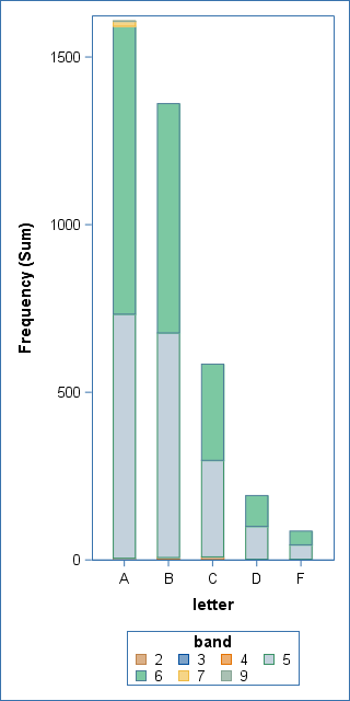
I want 5 vertical stacked bar graphs. Each bar (A,B,C,D,F) will have 10 subcategories (1 - 10) that shows the frequency of each band in each letter category (A - F)
Accepted Solutions
- Mark as New
- Bookmark
- Subscribe
- Mute
- RSS Feed
- Permalink
- Report Inappropriate Content
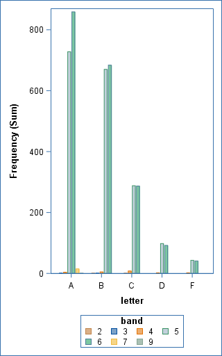
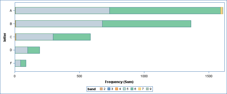
Here are some options for you.
ods graphics / height=1000 width=500;
proc sgplot data=work.comm;
 vbar letter / response=frequency stat=sum group=band
   groupdisplay=stack grouporder=ascending barwidth=.5;
run;

/* cluster instead of stack */
ods graphics / height=800 width=500;
proc sgplot data=work.comm;
 vbar letter / response=frequency stat=sum group=band
   groupdisplay=cluster grouporder=ascending barwidth=.7;
run;

/* Horizontal to go for a wide view */
ods graphics / width=1200 height=500;
proc sgplot data=work.comm;
 hbar letter / response=frequency stat=sum group=band
   groupdisplay=stack grouporder=ascending barwidth=.5;
run;
VBAR example
VBAR with GROUPDISPLAY=CLUSTER
HBAR example, stacked
- Mark as New
- Bookmark
- Subscribe
- Mute
- RSS Feed
- Permalink
- Report Inappropriate Content
I think you want to look at PROC SGPLOT and the VBAR statement. Use Group= and GroupDisplay=Stack. Examples here in this blog post.
- Mark as New
- Bookmark
- Subscribe
- Mute
- RSS Feed
- Permalink
- Report Inappropriate Content
Maybe i'm on the wrong track. I want a visual for the chart below. Letter has 5 values (A B C D F). I want to show that the relative size of each band, i.e. bands 5 and 6 represent the vast majority. (as is the case with the other letters)
| letter | band | Frequency | Percent | Cumulative Frequency |
Cumulative Percent |
|---|---|---|---|---|---|
| A | 3 | 1 | 0.03 | 1 | 0.03 |
| A | 4 | 4 | 0.10 | 5 | 0.13 |
| A | 5 | 728 | 19.00 | 733 | 19.13 |
| A | 6 | 859 | 22.42 | 1592 | 41.56 |
| A | 7 | 15 | 0.39 | 1607 | 41.95 |
| A | 9 | 1 | 0.03 | 1608 | 41.97 |
| B | 2 | 1 | 0.03 | 1609 | 42.00 |
| B | 3 | 1 | 0.03 | 1610 | 42.03 |
| B | 4 | 5 | 0.13 | 1615 | 42.16 |
| B | 5 | 670 | 17.49 | 2285 | 59.65 |
| B | 6 | 684 | 17.85 | 2969 | 77.50 |
| C | 2 | 1 | 0.03 | 2970 | 77.53 |
| C | 4 | 8 | 0.21 | 2978 | 77.73 |
| C | 5 | 288 | 7.52 | 3266 | 85.25 |
| C | 6 | 287 | 7.49 | 3553 | 92.74 |
| D | 4 | 2 | 0.05 | 3555 | 92.80 |
| D | 5 | 98 | 2.56 | 3653 | 95.35 |
| D | 6 | 92 | 2.40 | 3745 | 97.76 |
| F | 4 | 2 | 0.05 | 3747 | 97.81 |
| F | 5 | 43 | 1.12 | 3790 | 98.93 |
| F | 6 | 41 | 1.07 | 3831 | 100.00 |
| Frequency Missing = 809 | |||||
- Mark as New
- Bookmark
- Subscribe
- Mute
- RSS Feed
- Permalink
- Report Inappropriate Content
Here are some options for you.
ods graphics / height=1000 width=500;
proc sgplot data=work.comm;
 vbar letter / response=frequency stat=sum group=band
   groupdisplay=stack grouporder=ascending barwidth=.5;
run;

/* cluster instead of stack */
ods graphics / height=800 width=500;
proc sgplot data=work.comm;
 vbar letter / response=frequency stat=sum group=band
   groupdisplay=cluster grouporder=ascending barwidth=.7;
run;

/* Horizontal to go for a wide view */
ods graphics / width=1200 height=500;
proc sgplot data=work.comm;
 hbar letter / response=frequency stat=sum group=band
   groupdisplay=stack grouporder=ascending barwidth=.5;
run;
VBAR example
VBAR with GROUPDISPLAY=CLUSTER
HBAR example, stacked
- Mark as New
- Bookmark
- Subscribe
- Mute
- RSS Feed
- Permalink
- Report Inappropriate Content
Excellent! Thanks.
Learn the difference between classical and Bayesian statistical approaches and see a few PROC examples to perform Bayesian analysis in this video.
Find more tutorials on the SAS Users YouTube channel.
SAS Training: Just a Click Away
Ready to level-up your skills? Choose your own adventure.


