- Home
- /
- Programming
- /
- SAS Procedures
- /
- Re: How is it possible to add legendlabels to grouped variables using ...
- RSS Feed
- Mark Topic as New
- Mark Topic as Read
- Float this Topic for Current User
- Bookmark
- Subscribe
- Mute
- Printer Friendly Page
- Mark as New
- Bookmark
- Subscribe
- Mute
- RSS Feed
- Permalink
- Report Inappropriate Content
I am trying to add legendlabels to grouped variables using proc sgplot in SAS 9.4. Therefore I considered the keylegend statement as mentioned below.
ods graphics on / labelmax=42100 antialiasmax=42100;
proc sgplot data=data1;
title "QuantReg";
xaxis label="Var1" type=discrete;
yaxis label="Var2";
scatter x=Var1 y=Var2 / markerattrs=(size=3 color=grey);
series x=Var1 y=Var3 / group=quantile legendlabel="Gew" name="G";
series x=Var1 y=Var4 / group=quantile lineattrs=(pattern=dot) legendlabel="OhneGew" name="OG";
keylegend "G" "OG" / location=inside position=topleft title="Quantile" titleattrs=(weight=bold) across=3;
run;
title;
ods graphics off;
But I only get the legend without a description of the quantiles. Is there another way in order to add labels to the grouped variables?
Thanks in advance.
Accepted Solutions
- Mark as New
- Bookmark
- Subscribe
- Mute
- RSS Feed
- Permalink
- Report Inappropriate Content
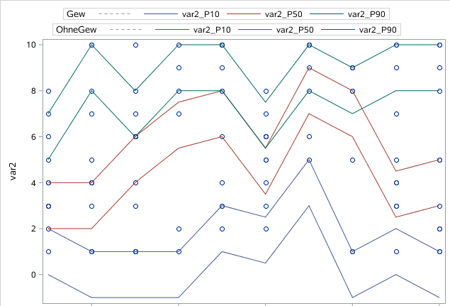
You need make two legend .
data have;
call streaminit(1234);
 do i=1 to 100;
  var1=ceil(10*rand('uniform'));
  var2=ceil(10*rand('uniform'));
  output;
 end;
drop i;
run;
proc summary data=data1 nway;
 class var1;
 var var2;
 output out=per(drop=_:) p10= p50= p90= /autoname;
run;
proc transpose data=per out=temp;
by var1;
var var2_:;
run;
data data1;
 set have temp temp(in=in);
 if in then do;col2=col1-2;col1=.;end;
run;

proc sgplot data=data1;
scatter x=Var1 y=Var2;
series x=Var1 y=col1 / group=_name_  name="G";
series x=Var1 y=col2 / group=_name_  name="OG";
keylegend "G"/title='Gew'  position=top ;
keylegend "OG"/title='OhneGew'  position=top ;
run;
- Mark as New
- Bookmark
- Subscribe
- Mute
- RSS Feed
- Permalink
- Report Inappropriate Content
I don't understand your question. Can you post some data and the picture to show what you want.
Better post it at Forum:
- Mark as New
- Bookmark
- Subscribe
- Mute
- RSS Feed
- Permalink
- Report Inappropriate Content
Thanks for your efforts.
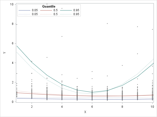
My sgplot looks like the attached one. The corresponding code for this example is:
ods graphics on / labelmax=42100 antialiasmax=42100;
proc sgplot data=data1;
scatter x=Var1 y=Var2;
series x=Var1 y=Var3 / group=quantile legendlabel="Gew" name="G";
series x=Var1 y=Var4 / group=quantile legendlabel="OhneGew" name="OG";
keylegend "G" "OG" / location=inside position=topleft title="Quantile" titleattrs=(weight=bold) across=3;
run;
ods graphics off;
I want to plot the results of two quantile regressions. I a got grouped variable called "quantile" with the 5th, 50th and 95th percentiles. My aim is to label the two outcomes with "Gew" for the three percentiles of the first regression and with "OhneGew" for the three percentiles of the second regression. Therefore I used the keylegend statement along with the legendlabel statement. But as a result, I only get a legend without the description "Gew" and "OhneGew". With respect to the attached sgplot, I want to modify the given legend. The first row of the legend should begin with "Gew" and the second one with "OhneGew".
Many thanks for your help!

- Mark as New
- Bookmark
- Subscribe
- Mute
- RSS Feed
- Permalink
- Report Inappropriate Content
You need make two legend .
data have;
call streaminit(1234);
 do i=1 to 100;
  var1=ceil(10*rand('uniform'));
  var2=ceil(10*rand('uniform'));
  output;
 end;
drop i;
run;
proc summary data=data1 nway;
 class var1;
 var var2;
 output out=per(drop=_:) p10= p50= p90= /autoname;
run;
proc transpose data=per out=temp;
by var1;
var var2_:;
run;
data data1;
 set have temp temp(in=in);
 if in then do;col2=col1-2;col1=.;end;
run;

proc sgplot data=data1;
scatter x=Var1 y=Var2;
series x=Var1 y=col1 / group=_name_  name="G";
series x=Var1 y=col2 / group=_name_  name="OG";
keylegend "G"/title='Gew'  position=top ;
keylegend "OG"/title='OhneGew'  position=top ;
run;
- Mark as New
- Bookmark
- Subscribe
- Mute
- RSS Feed
- Permalink
- Report Inappropriate Content
Thanks for your help. I thought about one legend but this solution is a good compromise.
April 27 – 30 | Gaylord Texan | Grapevine, Texas
Registration is open
Walk in ready to learn. Walk out ready to deliver. This is the data and AI conference you can't afford to miss.
Register now and lock in 2025 pricing—just $495!
Learn the difference between classical and Bayesian statistical approaches and see a few PROC examples to perform Bayesian analysis in this video.
Find more tutorials on the SAS Users YouTube channel.
SAS Training: Just a Click Away
Ready to level-up your skills? Choose your own adventure.


