- Home
- /
- Programming
- /
- SAS Procedures
- /
- Re: Generate Sas scatter plot matrix report with upper triangle with c...
- RSS Feed
- Mark Topic as New
- Mark Topic as Read
- Float this Topic for Current User
- Bookmark
- Subscribe
- Mute
- Printer Friendly Page
- Mark as New
- Bookmark
- Subscribe
- Mute
- RSS Feed
- Permalink
- Report Inappropriate Content
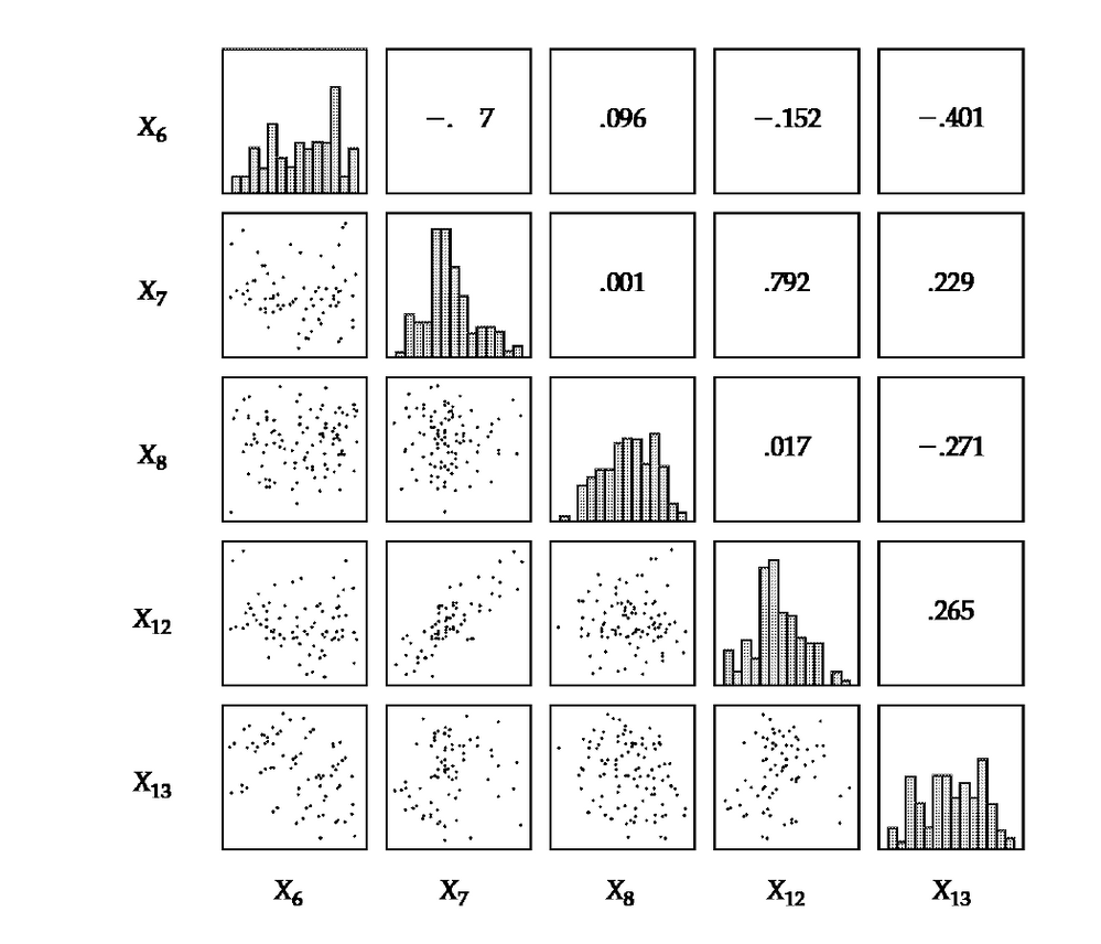
I would like to generate a scatter plot matrix where the upper section of the matrix will have the correlation value as shown below. The figure below is from textbook by Joseph Hair "Multivariate Data Analysis"
Any help on how to do this with proc Corr will be highly appreciated.
Thanks,
Michael
- Mark as New
- Bookmark
- Subscribe
- Mute
- RSS Feed
- Permalink
- Report Inappropriate Content
I cannot see an image. Can you attach the file instead?
- Mark as New
- Bookmark
- Subscribe
- Mute
- RSS Feed
- Permalink
- Report Inappropriate Content
Sorry about that.
Attached is the scatter matrix plot

- Mark as New
- Bookmark
- Subscribe
- Mute
- RSS Feed
- Permalink
- Report Inappropriate Content
I see... You're not going to get anything like that directly out of proc corr. sgscatter gets you close in terms of the lattice layout with the histograms on the diagonal (see http://support.sas.com/documentation/cdl/en/statug/67523/HTML/default/viewer.htm#statug_odsgraph_sec...). The graph you want is doable, but I imagine you're going to have to create a custom template and use proc sgrender to create the graph. If you had an example with code for a similar graph, you could probably use that to get you started. I don't have such an example and I didn't find anything easily (looking here, http://support.sas.com/sassamples/graphgallery/PROC_SGRENDER.html, for example). Another option that might get you started is to use sgscatter to get close to what you want and then use the "TMPLOUT="filename" to output the template code and then use that as your base. This depends on your level of comfort with SAS in general and the SG procs in particular though.
Alternately, you can just wait and see if someone else here has something like this cooked up already. And if you come from the open source world, you might find examples using ggplot or something. And if it is all too overwhelming, you can go with the out of the can results and modify it to show the correlation coefficient in each cell.
- Mark as New
- Bookmark
- Subscribe
- Mute
- RSS Feed
- Permalink
- Report Inappropriate Content
This link http://support.sas.com/kb/39/100.html shows how to start with building a custom upper triangle display. The example has a lot of stuff related to common reference lines you wouldn't want.
It would be up to you to add the histogram charts and the coeffiecients.
BTW I started with that example to build a three level cross comparison of about 30 variables crossed with each each other.
Learn the difference between classical and Bayesian statistical approaches and see a few PROC examples to perform Bayesian analysis in this video.
Find more tutorials on the SAS Users YouTube channel.
SAS Training: Just a Click Away
Ready to level-up your skills? Choose your own adventure.


