- Home
- /
- Programming
- /
- SAS Procedures
- /
- Re: Boxplot for different treatments
- RSS Feed
- Mark Topic as New
- Mark Topic as Read
- Float this Topic for Current User
- Bookmark
- Subscribe
- Mute
- Printer Friendly Page
- Mark as New
- Bookmark
- Subscribe
- Mute
- RSS Feed
- Permalink
- Report Inappropriate Content
Hi all,
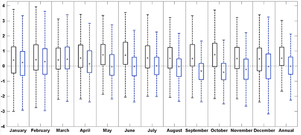
I want to get a boxplot figure like the following:
My dataset include thousands of stations, and for each station it have results for 2 treatments (similar as black and blue in the figure) and 12 months (Jan to Dec) and a total as annual (x-axis has 13 labels).
The variables in my dataset are: station time(Jan-Dec,Ann) Treatment1 Treatment2
Anyone has any idea about how to get the figure?
By the way, I used the following code, but could only do it one treatment by one treatment.
proc sort data = mydata;
  by time;
run;

proc boxplot data = mydata;
  plot treatment1 * time;
run;
- Mark as New
- Bookmark
- Subscribe
- Mute
- RSS Feed
- Permalink
- Report Inappropriate Content
You would need to transpose the data so that each treatment is a single record with a variable to contain a treatment identifier
Try something like:
data plot;
   set my data;
   TreatName='Treatment 1'; Value=Treatment1;output;
   TreatName='Treatment 2'; Value=Treatment2;output;
   drop treatment1 treatment2;
run;
and plot by TreatName *time
- Mark as New
- Bookmark
- Subscribe
- Mute
- RSS Feed
- Permalink
- Report Inappropriate Content
- Mark as New
- Bookmark
- Subscribe
- Mute
- RSS Feed
- Permalink
- Report Inappropriate Content
Try moving to the more updated graphics where you can use numeric or text values for grouping and categorizing:
proc sgplot data=plot;
   vbox value /  category=time group=treatname;
run;
This uses ODS graphics options so if the display is too narrow or what have you the size can be adjusted with Height and Width options:
ODS graphics / height=4in width=8in;
proc sgplot ..
would have a display 8 inches wide and 4 inches tall for example.
- Mark as New
- Bookmark
- Subscribe
- Mute
- RSS Feed
- Permalink
- Report Inappropriate Content
- Mark as New
- Bookmark
- Subscribe
- Mute
- RSS Feed
- Permalink
- Report Inappropriate Content
And after transpose my data by:
data plot;
   set mydata;
   TreatName='Treatment 1'; Value=Treatment1;output;
   TreatName='Treatment 2'; Value=Treatment2;output;
   drop treatment1 treatment2;
run;
I used
proc sgplot data=plot;
   vbox value / category=time group=TreatName;
run;
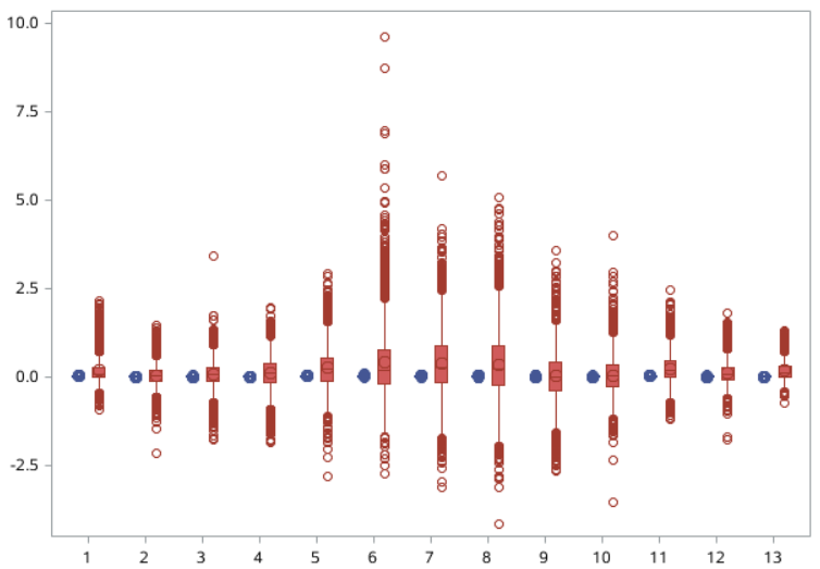
I got the figures 
Also, anyone know how to use two axis instead of only one?
Thanks!
- Mark as New
- Bookmark
- Subscribe
- Mute
- RSS Feed
- Permalink
- Report Inappropriate Content
@hua wrote:
, but I want to have max and min as a line without outliers, and also want to get the line at value 0.
Also, anyone know how to use two axis instead of only one?
Thanks!
You would have to explain HOW you want to use two axis.
There are a fair number of options in the online help for the VBOX statement in SGPLOT.
Such as EXTREME to show max and min lines to the maximum and minimum as an option on the vbox statement
Refline 0 / axis=y; will dray a line at y=0.
I have to say from you graph that the two treatments don't belong in the same graph as the ranges are significantly different;
Perhaps Proc SGPANEL with:
panelby treatname / onepanel rows=2 uniscale=column;
- Mark as New
- Bookmark
- Subscribe
- Mute
- RSS Feed
- Permalink
- Report Inappropriate Content
- Mark as New
- Bookmark
- Subscribe
- Mute
- RSS Feed
- Permalink
- Report Inappropriate Content
@hua wrote:
Thanks! I will check the options online. The ranges are so different, that's why I want to use two y-axises, one for each.
I don't think you'll be happy with the results of any of the 2 axis solutions with the modified data. I recommended modifying the data as that would be needed for the older boxplot for many approaches.
You might go back to the original data and try overlaying two vbox statements as that is one of the big improvements with the SGgraphics. You can't overlay just anything but two vbox should work:
proc sgplot data= mydata;
   vbox treatment1 / category=time
                     extreme

   ;
   vbox treatment2 / category=time
                     extreme
                     y2axis
   ;
   refline 0;
run;
Catch up on SAS Innovate 2026
Nearly 200 sessions are now available on demand with the SAS Innovate Digital Pass.
Explore Now →Learn the difference between classical and Bayesian statistical approaches and see a few PROC examples to perform Bayesian analysis in this video.
Find more tutorials on the SAS Users YouTube channel.
SAS Training: Just a Click Away
Ready to level-up your skills? Choose your own adventure.


