- Home
- /
- Analytics
- /
- Forecasting
- /
- Re: plot nonlinear regression/equation onto a scatter plot
- RSS Feed
- Mark Topic as New
- Mark Topic as Read
- Float this Topic for Current User
- Bookmark
- Subscribe
- Mute
- Printer Friendly Page
- Mark as New
- Bookmark
- Subscribe
- Mute
- RSS Feed
- Permalink
- Report Inappropriate Content
Hi everyone,
I'm a bit embarrassed to ask this, but I'm really not understanding how to plot a nonlinear regression onto a scatter plot.
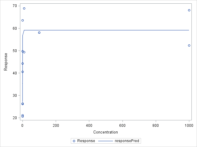
Currently, I've learned how to use the PROC NLIN procedure in SAS and have been able to generate the same output from an online tutorial: http://www.ats.ucla.edu/stat/sas/faq/doseresponse.htm (yay!). However, I'm running into a wall when I'm trying to figure out how well the data fits the parameters predicted by SAS. I want to visually check the predicted variables just in case I need to adjust my starting parameters as indicated in my PARMS procedure.
Here is the following syntax for plotting my data:
PROC IMPORT DATAFILE="C:/Users/jessica/Desktop/SAS/SASUniversityEdition/myfolders/Practice test data.xlsx"
OUT= Work.DoseResp
DBMS=XLSX
REPLACE;
SHEET="DoseResp";
PROC NLIN Data=DoseResp;
PARMS top = 68.875 bottom = 20.575 EC50 = 1 hill = 1;
MODEL response = top + (bottom - top) / (1 + (concentration / EC50)**hill);
data TestNLIN;
x=1;
do i=0 to 1000;
Response = 59.1022 + ( 27.0807 - 59.1022)/(1 + (x/0.8171)**12.4058);
output;
x=x+10;
end;
PROC SGPLOT data = TestNLIN;
scatter x = x y = Response;
yaxis values = (20 to 70 by 10);
xaxis values = (0 to 1000);
PROC SGPLOT data=DoseResp;
Scatter x=Concentration y=response;
yaxis values = (20 to 70 by 10);
xaxis values = (0 to 1000);
RUN;
Does anyone have a better way of plotting a nonlinear regression/plot onto a scatter plot? Or any other means to visually check how well the data fits to the parameters estimated by SAS?
Much appreciated!
Jess
Accepted Solutions
- Mark as New
- Bookmark
- Subscribe
- Mute
- RSS Feed
- Permalink
- Report Inappropriate Content
Thank you PG Stats! That worked perfect!
Just in case someone else runs into the same problem as I did, I thought I would post my syntax.
*Import Excel file*
PROC IMPORT DATAFILE="C:/Users/jessica/Desktop/SAS/SASUniversityEdition/myfolders/Practice test data.xlsx"
OUT= Work.DoseResp
DBMS=XLSX
REPLACE;
SHEET="DoseResp";
*Set Data Set*
DATA pred;
DO concentration = 0 to 1000 by 10;
output;
end;
SET DoseResp;
SET DoseResp pred;
run;
*Use Nonlinear Regression to predict unknow parameters*
PROC NLIN Data=DoseResp;
PARMS top = 68.875 bottom = 20.575 EC50 = 1 hill = 1;
MODEL response = top + (bottom - top) / (1 + (concentration / EC50)**hill);
output out=DRgraph predicted=responsePred;
run;
*Plot data*
proc sort data=DRgraph; by concentration; run;
proc sgplot data=DRgraph;
scatter x=concentration y=response;
series x=concentration y=responsePred;
run;

- Mark as New
- Bookmark
- Subscribe
- Mute
- RSS Feed
- Permalink
- Report Inappropriate Content
Add some data with missing response values before NLIN so that you get predicted values which you can than plot. Here is an outline:
data pred;
do concentration = 0 to 1000 by 10;
	output;
	end;
run;

data DR;
set DoseResp pred;
run;

PROC NLIN Data=DR;
PARMS top = 68.875 bottom = 20.575 EC50 = 1 hill = 1;
MODEL response = top + (bottom - top) / (1 + (concentration / EC50)**hill);
output out=DRgraph predicted=responsePred;
run;

proc sort data=DRgraph; by concentration; run;

proc sgplot data=DRgraph;
scatter x=concentration y=response;
series x=concentration y=responsePred;
run;
(untested)
- Mark as New
- Bookmark
- Subscribe
- Mute
- RSS Feed
- Permalink
- Report Inappropriate Content
Thank you PG Stats! That worked perfect!
Just in case someone else runs into the same problem as I did, I thought I would post my syntax.
*Import Excel file*
PROC IMPORT DATAFILE="C:/Users/jessica/Desktop/SAS/SASUniversityEdition/myfolders/Practice test data.xlsx"
OUT= Work.DoseResp
DBMS=XLSX
REPLACE;
SHEET="DoseResp";
*Set Data Set*
DATA pred;
DO concentration = 0 to 1000 by 10;
output;
end;
SET DoseResp;
SET DoseResp pred;
run;
*Use Nonlinear Regression to predict unknow parameters*
PROC NLIN Data=DoseResp;
PARMS top = 68.875 bottom = 20.575 EC50 = 1 hill = 1;
MODEL response = top + (bottom - top) / (1 + (concentration / EC50)**hill);
output out=DRgraph predicted=responsePred;
run;
*Plot data*
proc sort data=DRgraph; by concentration; run;
proc sgplot data=DRgraph;
scatter x=concentration y=response;
series x=concentration y=responsePred;
run;

- Mark as New
- Bookmark
- Subscribe
- Mute
- RSS Feed
- Permalink
- Report Inappropriate Content
PGStats's solution is a particular case of the general problem of scoring a model on a grid of regularly spaced points. For other options, see "Techniques for scoring a regression model in SAS."
- Ask the Expert - Génération de données synthétiques : innovation et confidentialité | 10-Feb-2026
- Ask the Expert: Implementing a Digital Twin for the Monopoly Board Game Using SAS® Viya® | 12-Feb-2026
- SAS CI360 Tips and Tricks: Quick Wins, Shortcuts and Hidden Features Every Marketer Should Know | 17-Feb-2026
- SAS Bowl LIX, Integrating SAS and Git | 18-Feb-2026
- Ask the Expert: Welcome to SAS® Viya® | 19-Feb-2026
- Ask the Expert: How Can SAS Viya Copilot Help Me Build Better Models? | 24-Feb-2026
- Ask the Expert: Wie steigert SAS Analytik über MCP-Tools die Leistungsfähigkeit Ihrer KI-Teams? | 05-Mar-2026


