- Home
- /
- Programming
- /
- Enterprise Guide
- /
- Re: Map chart help
- RSS Feed
- Mark Topic as New
- Mark Topic as Read
- Float this Topic for Current User
- Bookmark
- Subscribe
- Mute
- Printer Friendly Page

- Mark as New
- Bookmark
- Subscribe
- Mute
- RSS Feed
- Permalink
- Report Inappropriate Content
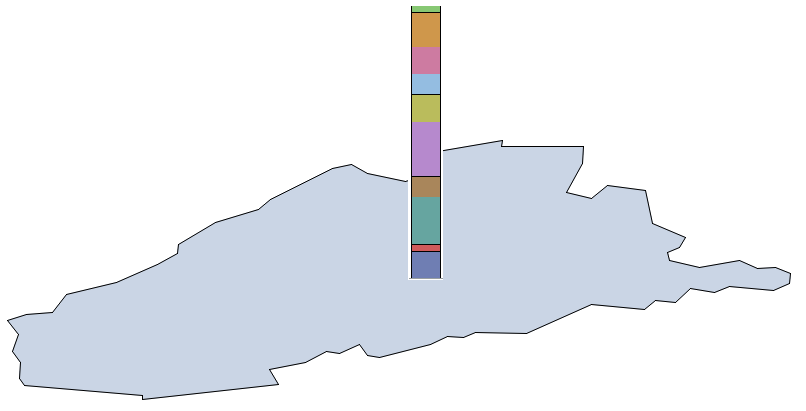
Hi sorry if this is the wrong the place for this type of questions but im new to all things SAS.
I'm just wondering if it is possible to make a Map Chart that represents results the same way that Stacked Bar Graphs do.
It would look like the current Riser Map but with each column broken into sections.
This is an example I made in paint by manually combining the two and I can keep doing it this way if I need to but it would be great if this exists somewhere?

- Mark as New
- Bookmark
- Subscribe
- Mute
- RSS Feed
- Permalink
- Report Inappropriate Content
Have a look through the GMAP examples by .
Or, consider posting your question to the SAS/GRAPH communities forum. An expert there might be able to provide an answer.
Chris

- Mark as New
- Bookmark
- Subscribe
- Mute
- RSS Feed
- Permalink
- Report Inappropriate Content
There's no built-in easy way to do that in Proc Gmap. The only way I can think of is to use annotate to programmatically draw each of the stacked bar segments ... which would be quite cumbersome.
I'll add a comment to the request for R&D to add this feature (S0324260), letting them know you're also interested in it.
.jpg")
Catch up on SAS Innovate 2026
Nearly 200 sessions are now available on demand in the Innovate Hub.
Watch Now →Check out this tutorial series to learn how to build your own steps in SAS Studio.

Find more tutorials on the SAS Users YouTube channel.
SAS Training: Just a Click Away
Ready to level-up your skills? Choose your own adventure.
-
2 replies
-
10-14-2014 01:44 AM
-
2172 views
-
6 likes
-
3 in conversation
-
