- Home
- /
- Programming
- /
- Enterprise Guide
- /
- Issue in Line Plot Graph - Horizontal axis
- RSS Feed
- Mark Topic as New
- Mark Topic as Read
- Float this Topic for Current User
- Bookmark
- Subscribe
- Mute
- Printer Friendly Page
- Mark as New
- Bookmark
- Subscribe
- Mute
- RSS Feed
- Permalink
- Report Inappropriate Content
Hi,
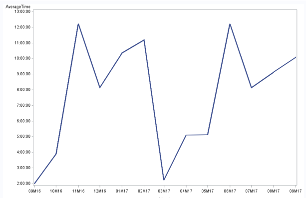
I'm using SAS EG to generate a report from a output of a query. In the Query output, the values are displayed as follows
Job Name : Job_XXXX
Month Average Time
SEP-16 02:00:51
OCT-16 03:54:14
NOV-16 12:12:54
DEC-16 08:08:21
JAN-17 10:21:54
FEB-17 11:12:24
MAR-17 02:14:45
APR-17 05:06:45
MAY-17 05:08:21
JUN-17 12:12:12
JUL-17 08:08:07
AUG-17 09:08:17
SEP-17 10:05:35
While creating a line plot(Mulitple line plot from group column), I have given task roles as
Horizontal(Limit :1) as Month
Vertical(Limit :1) as Average Time
Group(Limit : 1) as Job Name
and given horizontal major tricks as 13 and ran the report.
But from the output , I could not able to see all the months under horizontal axis and also I could see a strange thing that
the values are not properly aligned in the graph.(Eg:) For horizontal axis(Dec-16), it showing Jan - 17 values (i.e 10:21:54). But when I move the cursor in the pointed value of line plot, its showing proper value as a pop - up..
I think, the issue is with horizontal axis displayed in the line plot.
Note : Month is a derived column from the date value and I have used intx function to retrieve that. Im using SAS EG V4.1.
Please help me to resolve the issue. Thnaks in advance.
- Mark as New
- Bookmark
- Subscribe
- Mute
- RSS Feed
- Permalink
- Report Inappropriate Content
I tried to replicate it, and it worked perfectly for me. So, a couple of questions:
Is your "Month" value a SAS date value? I used a date value.
I didn't specity anything for the horizontal axis; I just moved the variable names to the horizontal and vertical roles, and let 'er rip.
Tom
- Mark as New
- Bookmark
- Subscribe
- Mute
- RSS Feed
- Permalink
- Report Inappropriate Content
Show the code for "deriving" your month value. I can see several ways that could be done such that you duplicate the values.
Also showing the actual code for the graph might help.
- Mark as New
- Bookmark
- Subscribe
- Mute
- RSS Feed
- Permalink
- Report Inappropriate Content
Hi,
Thanks for the response.
I have found out the solution for this.
Under Horizontal major ticks , I have given "Specify" as '01SEP16'd to '01SEP17'd by Month and the horizontal month (values) have rotated to 90 degree.
Now the 13 months values gets fitted into the graph and displayed proper graph.
Thanks
April 27 – 30 | Gaylord Texan | Grapevine, Texas
Registration is open
Walk in ready to learn. Walk out ready to deliver. This is the data and AI conference you can't afford to miss.
Register now and save with the early bird rate—just $795!
Check out this tutorial series to learn how to build your own steps in SAS Studio.
Find more tutorials on the SAS Users YouTube channel.
SAS Training: Just a Click Away
Ready to level-up your skills? Choose your own adventure.


