Hi Ken,
I don't think the colors mean anything, they just help you know what to look and where to click. Or at least that is how I use them :smileysilly:
For the example below, you know that Cluster node found you 6 segments or clusters.
Segment 1 has around 60% of customers with low values of savings (between 1-1.5), around 20% of customers with high savings values, and 20% customers in between.
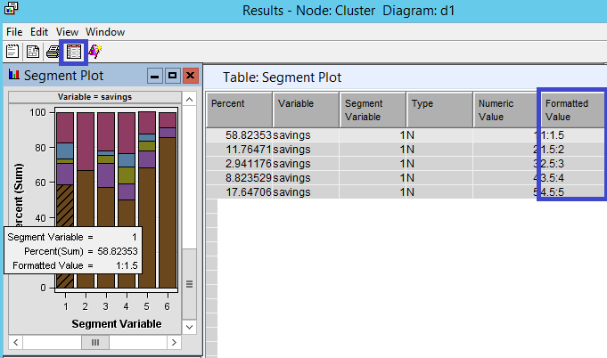
Personally I just use the colors in the bar as a reference to get the mouse-over box (a nice summary), and the default theme has never got me confused I think... But for the most part I use the table that feeds this graph. I click back and forth a lot between the plot and the table when I really want to understand the distribution of a variable within a segment. An alternative is to use the Segment Profile node, but it is not as interactive...
Does this answer your question?
As a follow up, would you find it more useful if there was an option that you can choose to make these colors have a meaning, like for example a gradient legend?
Thanks,
Miguel


.jpg")