Hi all,
I've recently started learning how to develop scorecards using Miner and have much to learn. For my most recent project, I've created a scorecard where the target is whether or not a news website publishes a story based on a limited number of variables.
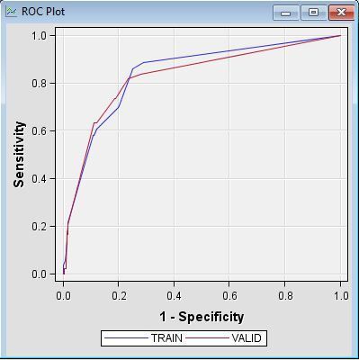
In the Interactive Grouping Node, my variables have information values between 0.7 and 0.9. My Scorecard gives the below fit statistics and charts. From what I can see, the Misclassification Rate, KS, Gini and Area under the ROC look good. However, looking at the KS chart, I'm not sure what to make of it as I'm used to the curve resembling a normal distribution. I'm struggling to interpret this and more importantly to determine the cutoff score I need to use. Finally, I'm not sure if what the Classification Chart shows is normal as it appears the have a high rate of false positives (hope I'm interpreting this correctly).
If someone can assist I'd be most appreciative!


