- Home
- /
- SAS Communities Library
- /
- VA Report Example: Current Month vs Previous Month
- RSS Feed
- Mark as New
- Mark as Read
- Bookmark
- Subscribe
- Printer Friendly Page
- Report Inappropriate Content
VA Report Example: Current Month vs Previous Month
- Article History
- RSS Feed
- Mark as New
- Mark as Read
- Bookmark
- Subscribe
- Printer Friendly Page
- Report Inappropriate Content
Have you been given report requirements to present a Current Month versus Previous Month metric based on user defined selections?
This report requirement recently came to our team and I thought I would share this example solution. This solution takes into account that the customer did not want to transpose their data. The requirement was for the report user to select an Analysis Month and Year then calculate the Previous Month, Difference and Difference Percent.
Parameter Selections
First, I had to determine how to prompt the report user for a month and year. Unfortunately, our parameters do not support date values so I had to use two numeric control objects and two numeric parameter data item. For more background on parameters see my blog here: Using parameters in SAS Visual Analytics.
I chose to use the Slider control objects:
The month selection is stored in a parameter named: 
The year selection is stored in a parameter named: 
Analysis Month Metric
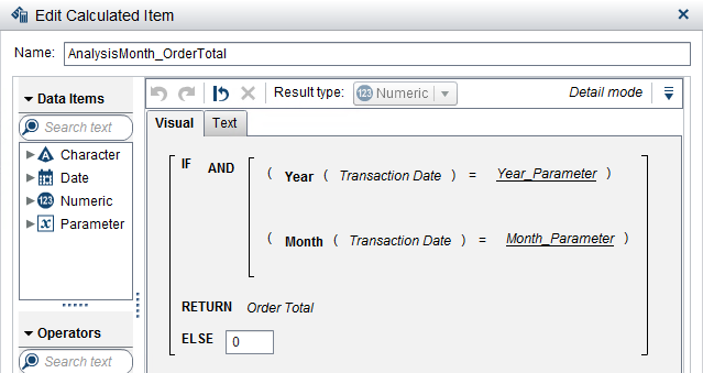
Next, I need to calculate the Analysis Month metric based on the parameter selections. I decided to create a calculated data item so that this value could be used in a number of ways and in a variety of report objects. In this example, I used the Order Total metric from the Insight Toy data.
This logic is straight forward: if the year and month of the transaction date for the row equals the parameter selections then return the Order Total value, otherwise return 0.
Previous Month Metric
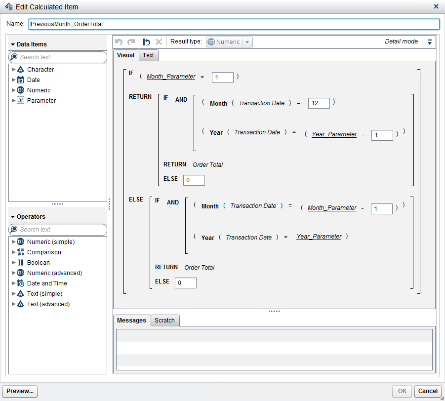
Next, I need to calculate the Previous Month metric based on the parameter selections. Again, I decided to create a calculated data item.
Here, the logic needs to take into account that if the user selects January then you will need to use December of the previous year; otherwise just take the previous month of the current year.
Difference
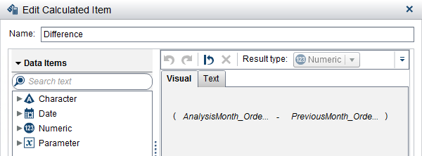
The next customer requirement included calculating the difference between the analysis month and the previous month:
Difference Percent
And the final customer requirement was to calculate the Difference Percent as Difference/Previous Month. Since this calculation included a ratio, the best practice is to use an aggregated measure so that when the Difference Percent is aggregated in report objects you are properly aggregating the ratio.
Verify
Now that we have all of our calculations defined, it is always a good idea to verify we are getting the correct numbers.
To verify the Analysis Month and Previous Month metrics; use a crosstab and add the Year and Month of the transaction date. This is to ensure our logic is correct – be sure to test when the Analysis Month is equal to January!
To verify the Difference and Difference Percent; use a crosstab but aggregate the metrics up to a category other than a date derivative so you can be sure the calculations are correct. 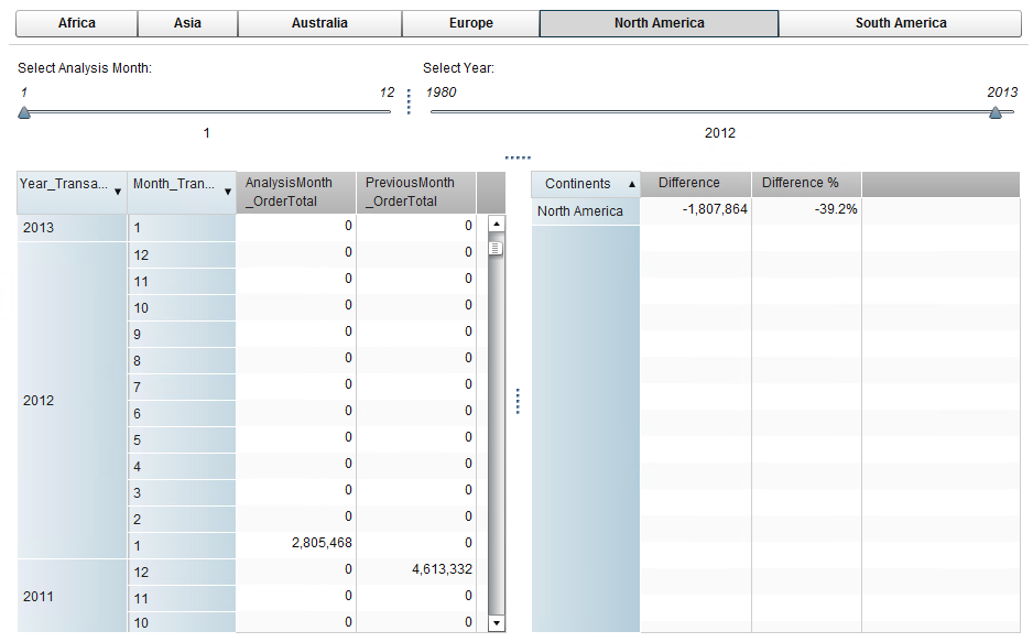
Example Reports
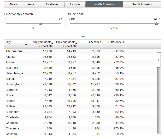
For this customer request, they wanted to create a basic list table:
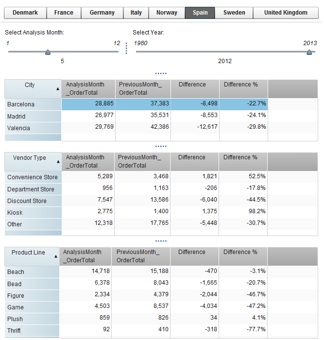
But let’s look at some other ways you can leverage these calculated data items. Here is one report using several crosstab objects stacked together with an interaction from the first crosstab filtering the lower two crosstabs.
This report puts more information on the screen and breaks the same metrics down across disparate group by categories.
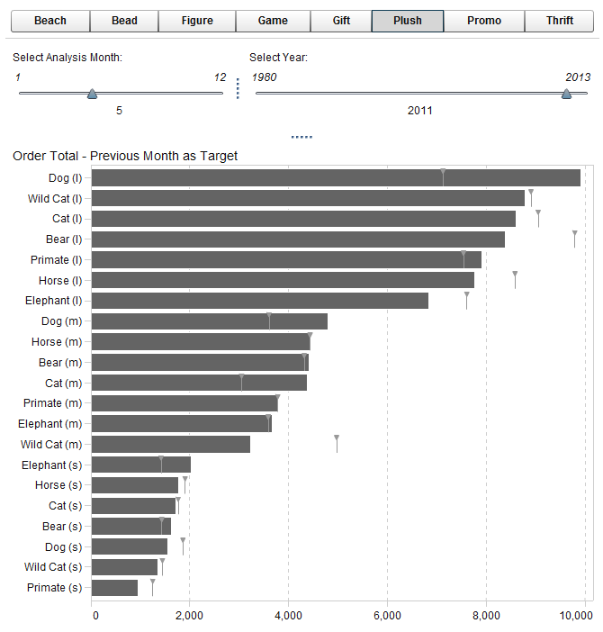
One of my preferred visualizations to use for these two calculated metrics is the targeted bar chart. Many report requirements come in wanting to see how the metric compared to the previous month. For a visual that speaks a thousand words, this is the one to use.
This solution is not without its drawbacks. Since we did not transpose the data and created calculated data items to hold the Analysis Month and Previous Month values, those rows that do not fall into those two months contain zeros. Therefore; these calculated data items do not lend themselves to be used easily in line charts. However, if one of these report examples meets your needs, you now have a way to satisfy those requirements.
- Mark as Read
- Mark as New
- Bookmark
- Permalink
- Report Inappropriate Content
Thanks Teri.
i have two questions for you if I may:
1. if i have multiple metrics to compare, for example Sales, revenue and profit, any faster way to do it?
2. If i did transpose first to flip the month to columns, how i can compare the difference of two months? there are two conditions as follows:
is that the clients can choose any two months to compare, instead of current and previous month, and
- Mark as Read
- Mark as New
- Bookmark
- Permalink
- Report Inappropriate Content
Thanks Teri.
i have two questions for you if I may:
1. if i have multiple metrics to compare, for example Sales, revenue and profit, any faster way to do it?
2. If i did transpose first to flip the month to columns, how i can compare the difference of two months? there are two conditions as follows:
a. clients can choose any two months to compare, instead of current and previous month
b. there are multiple metrics restored in a _name_ columns
any help would be much appreciated!
thank you
Lilian
- Mark as Read
- Mark as New
- Bookmark
- Permalink
- Report Inappropriate Content
Thanks for this post; it is extremely useful.
We would like do something similar (starting with Analysis Quarter), but want to understand the option of transposing the data (which in your case the client was not interested in doing .. ). Using the Insights Toy Data, are you able to elaborate on how you would transpose the data using SAS VA and then creating the report?
As stated above, we would like to start with Analysis Quarter, but then give the option to the user of selecting whether they analyse the data using Year, Quarter or Month.
Regards,
Marie
- Mark as Read
- Mark as New
- Bookmark
- Permalink
- Report Inappropriate Content
In addition to the above, we would ideally like to allow the users to select how many periods back to compare, e.g. if comparing months, then show selected month and the previous X month(s) where X is another parameter. So I wonder if the transposed data method would facilitate this?
- Mark as Read
- Mark as New
- Bookmark
- Permalink
- Report Inappropriate Content
Hi Marie,
Sometimes, for one or two visualizations it can be helpful to transpose the data, such as in this case where the customer was interested in Current Year versus Previous Year for one metric. However, if you have more than two periods you wish you compare, as you describe for your requirements, and at different levels of aggregation, I’m not sure transposing your data would be the way to go.
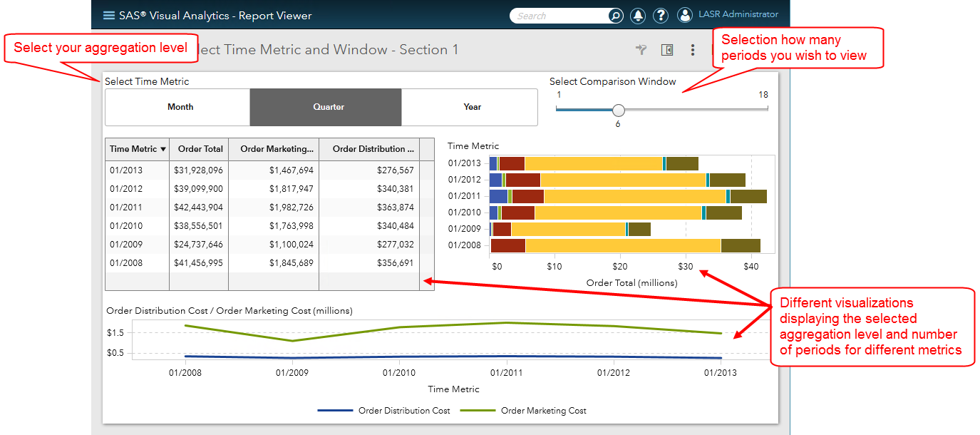
I mocked up an example report based on what you described where the user would select the aggregation for time period: Year, Month or Quarter and then how many periods to display.
I created this report using a combination of blogs which are already available to you with a few minor tweaks for the Time Metric I used in this example, which I will explain below.
- Using Parameters in SAS Visual Analytics (blog and YouTube)
- Use Rank in SAS Visual Analytics to display the last date, month or rolling window (blog)
- Use parameters to pick your metric in Visual Analytics Reports (blog or YouTube)
Parameter Requirements
Here are the required parameters:
Time Metric Requirements
Your data must contain a date. We will use duplicates of this date data item with different formats to use for the different aggregation periods and necessary calculated data items.
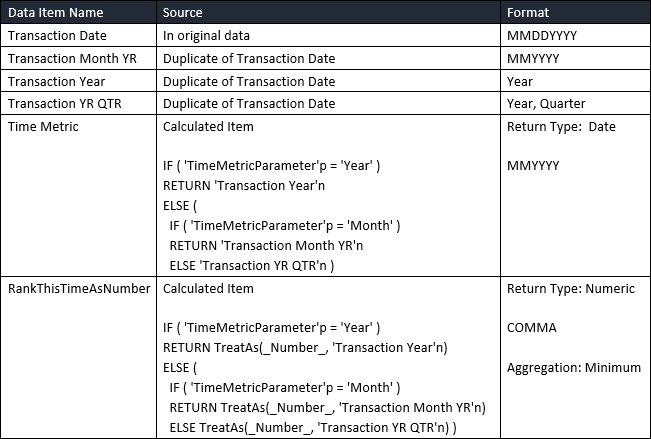
You will have to create two new calculated data items whose value will be determined interactively by the button bar selections. The Time Metric will be the value used in your visualizations. Unfortunately, you cannot dynamically change the formatting of this data item to match the button bar selection: Year, Quarter or Month so I chose to use the MMYYYY format which is descriptive enough for each value.
The RankThisTimeAsNumber is the SAS numeric representation for the time aggregation selected from the button bar. We will then add a rank to each visualization that you want to only show for the comparison window periods. The rank will be based this numeric value; this is why we use a duplicate of the Transaction Date and why we include the Year in each of the below data items.
If you were to take the month numbers 1 through 12. And you want to display the last 18 months then you would have to spend more time on a filter trying to calculate the greatest 18 months in your data.
The same is true for quarters. If you were to take the numeric quarters 1 through 4 you’ve lost the ability to quickly reference the last 6 quarters in your data. Whereas if you had year as part of the data item, you could easily determine the greatest 6 quarters available in your data.
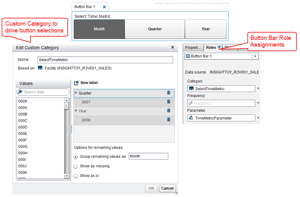
Select Time Metric: Button Bar Control Object
For this object you will follow the blog: Use parameters to pick your metric in Visual Analytics Reports (blog or YouTube)
Create a new Custom Category to create your labels to drive the button bar then be sure to save the selection in the parameter: TimeMetricParameter.
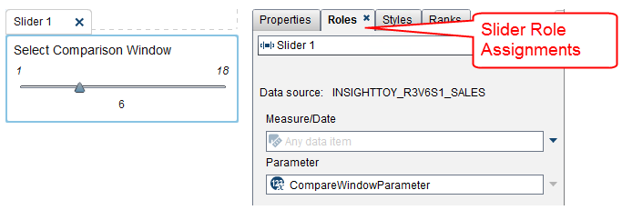
Select Comparison Window: Slider Control Object
For this object, simply select the parameter CompareWindowParameter to the Roles tab and the minimum and maximum values for the slider will be driven by the Parameter’s definition.
Add Rank to your visualizations
For this task, follow this blog: Use Rank in SAS Visual Analytics to display the last date, month or rolling window (blog)
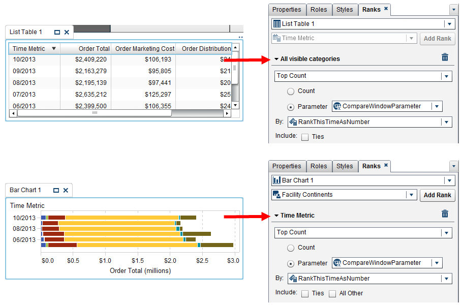
I’ve already outlined the calculated data items you need. The last piece of information is seeing how the rank looks when applied in the Rank tab for the different visualizations.
You can see that we are selecting the Top Count based on the Parameter CompareWindowParameter. This will return the greatest values based on the By RankThisTimeAsNumber.
Now it should all become clear. The Time Metric is the date representation of the time aggregation to be used in the visualizations. The RankThisTimeAsNumber is the numeric representation of the time aggregation that is used to rank the greatest values, i.e. the most recent date values.
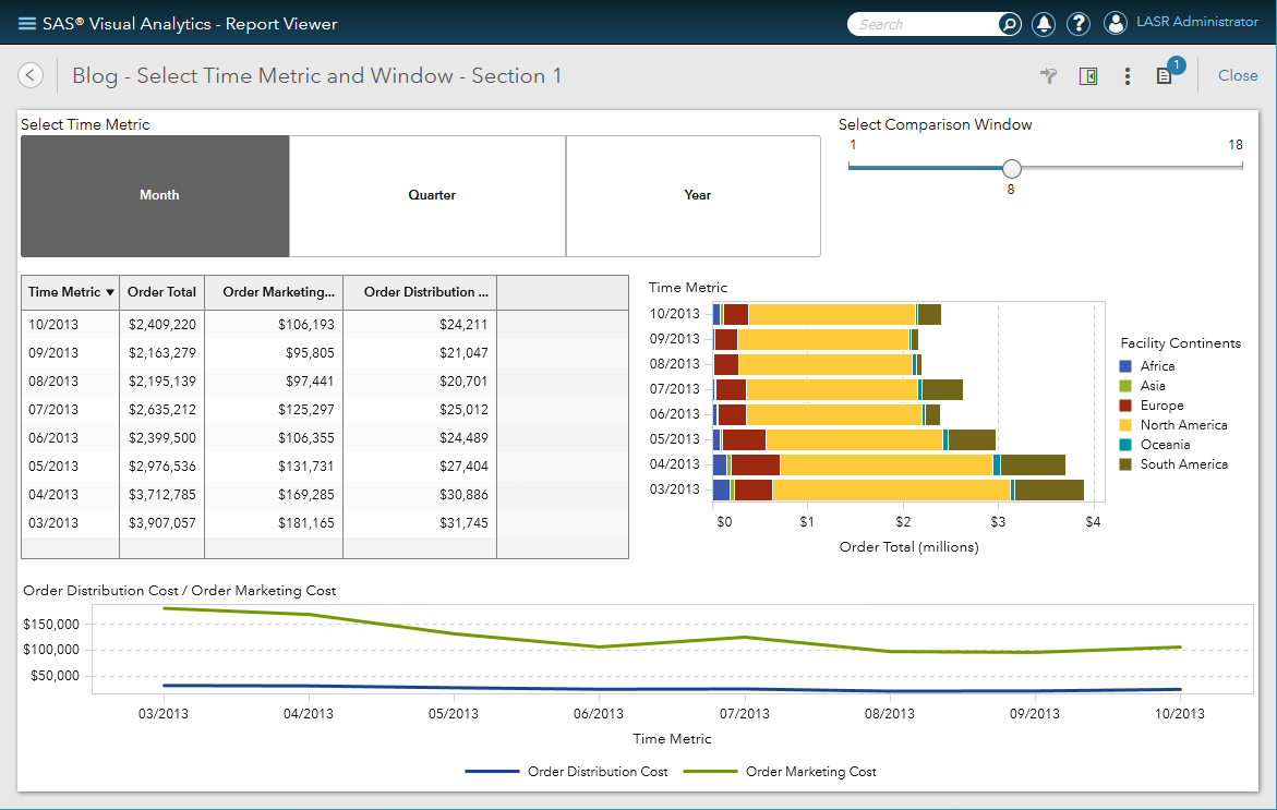
A few more screenshots
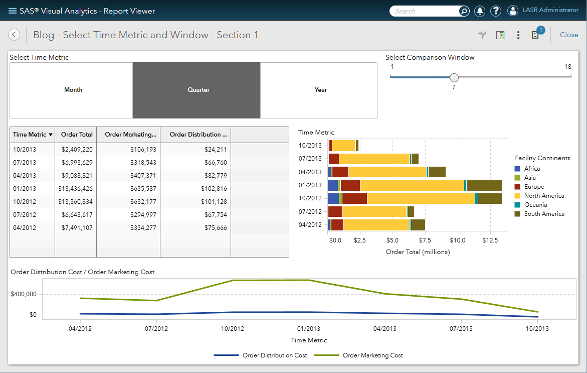
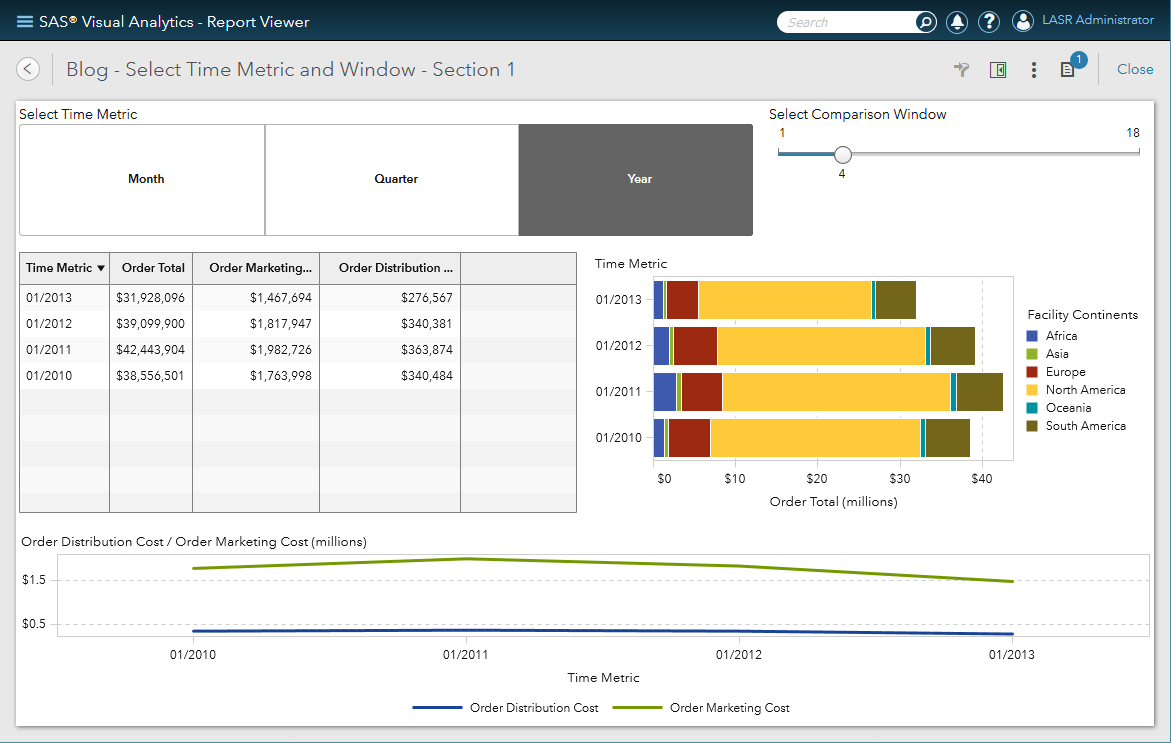
Now you have a report that will return the selected time aggregation for a selected period. Here are a few more screenshots so you can see the visualizations at the different aggregation levels.
- Mark as Read
- Mark as New
- Bookmark
- Permalink
- Report Inappropriate Content
Thanks a lot for this reply ! I found this very clear to follow and was able to replicate the functionality using the toy data set .. now on to the "real report"!
- Mark as Read
- Mark as New
- Bookmark
- Permalink
- Report Inappropriate Content
Thanks Teri, much appreciated your help!
now i have a different question:
| year_month | CONTROL_IND | PROGRAM_FLAG | Total | % base |
| 201705 | N | 1A | 90806 | 7.91% |
| 1B | 53687 | 4.68% | ||
| 1C | 20902 | 1.82% | ||
| 1D | 9580 | 0.83% | ||
| 1E | 12320 | 1.07% | ||
| 2A | 98835 | 8.61% | ||
| 2B | 136771 | 11.91% | ||
| 2C | 5650 | 0.49% | ||
| 2D | 47078 | 4.10% | ||
| 2E | 4326 | 0.38% | ||
| 2F | 33839 | 2.95% | ||
| 3A | 252623 | 22.01% | ||
| 3B | 107777 | 9.39% | ||
| 4A | 45332 | 3.95% | ||
| 5 | 228406 | 19.90% | ||
| N Total | 1147932 | 100.00% |
- Mark as Read
- Mark as New
- Bookmark
- Permalink
- Report Inappropriate Content
Hi lilianmisofi,
Thanks for your question! I recommend that you post it as a "New Message" (see blue button) on the SAS Visual Analytics Community to get perspective from all the VA experts who follow that space. Plus, other community members who have a similar question can benefit from the discussion.
Best,
Anna
SAS AI and Machine Learning Courses
The rapid growth of AI technologies is driving an AI skills gap and demand for AI talent. Ready to grow your AI literacy? SAS offers free ways to get started for beginners, business leaders, and analytics professionals of all skill levels. Your future self will thank you.
- Find more articles tagged with:
- GEL

