- Home
- /
- SAS Communities Library
- /
- Using the GLMSELECT procedure to calculate individual reference values...
- RSS Feed
- Mark as New
- Mark as Read
- Bookmark
- Subscribe
- Printer Friendly Page
- Report Inappropriate Content
Using the GLMSELECT procedure to calculate individual reference values in outlier detection
- Article History
- RSS Feed
- Mark as New
- Mark as Read
- Bookmark
- Subscribe
- Printer Friendly Page
- Report Inappropriate Content
Yes, but in this month we often see higher values.
Yes, but in this segment there are much older customers, therefore the profit ration might be different.
Yes, but ...
You might hear such replies frequently when you present your analytic results to business users. Especially when you highlight outliers, anomalies or suspicious observations that are quite distant form the expected value.
Different from simple one-size-fits-all average values, analytic methods allow to calculate individual reference values that already consider seasonal pattern, trends, and other co-variables of your analysis subjects. Consequently the highlighted observations are not selected because of its absolute value but based on its deviation from their individually expected value.
This article illustrates how you can use the GLMSELECT procedure to calculate an individual reference value per analysis subject. This reference value is based on the value of other variables for this subject and thus considers his individual situation. If the actual value then lies outside the boundaries for this reference value, you know that you get a much more specific alert compared to a comparison against the overall mean.
In some of my data science webinars I have illustrated such examples. You find the links to the videos at the end of this article.
The Available Data
The available data for this demo example are from car insurance. The bluebook value for the car in $ is available, as well as other variables like the car age in months, the car type, the car value, and the average travel time to work.
proc print data=work.carvalue(obs=10);
 var SequenceID policyno bluebook car_type car_use Car_Age_Months travtime;
run;
The Basic Idea of the Analysis
The idea is to calculate stratified values for the bluebook that base on these variables. One example can be seen in the boxplot below, where different bluebook distributions by car type can be seen.
proc sgplot data=work.carvalue;
 vbox bluebook /   category=car_type;
run;
You see from the chart, that it does not make sense to compare different car types against one common reference value for bluebook.
Calculating an Expected Value based on other Variables
You can use the GLMSELECT procedures (and many other procedures in SAS/STAT, SAS/Visual Statistics or SAS/Visual Data Mining and Machine Learning) to build a model that explains the bluebook values and to calculate an expected value for bluebook.
proc glmselect data=CarValue;
 class  car_use car_type ;
 model bluebook = Car_Age_Months car_use car_type travtime / selection = none;
 output out=pred_bluebook p=reference r=residual;
run;
- You use the explanatory variables in the MODEL statement as input variables. Note that if you use a selected subset of variables it might make sense to turn variable selection off, in order to make sure that you stratify by all your desired variables.
- You have to list variables that contain categories in the CLASS statement.
- You use the OUTPUT statement to write the predicted value for bluebook in a new dataset "PRED_BLUEBOOK". This variables is name REFERECE in this example.
You see that the parameter estimates reflect the dependency of the bluebook variable on the input variables.
If you would like to calculate the predicted bluebook values for observations from other datasets ("Fresh Data") you can use the CODE statement to export the datastep code that allows to score new observations.
You can now use variable REFERENCE to compare it with the actual bluebook value per analysis subject and see how far (e.g. in standard deviations) BLUEBOOK apart from the expected value.
Preparing for the comparison
For this comparison you first calculate the mean and the standard deviation for bluebook and also calculate an 3 standard deviation upper boundary based on the overall mean (mean + 3 * standard deviation). You can use PROC SQL for that calculation and use the INTO expression to store the calculated statistics in macro variables.
%let sigma=3;
proc sql;
 select mean(bluebook) as bluebook_mean,
        std(bluebook) as bluebook_std,
        calculated bluebook_mean + calculated bluebook_std*&sigma. as bluebook_3sigma
 into :bluebook_OverallMean,
      :bluebook_OverallStd,
      :bluebook_Overall3sigma
 from CarValue;
quit;
In order to be able to display the analysis subject in ascending order according to their expected value, you sort it with the SORT procedure.
proc sort data=pred_bluebook out=pred_bluebook;
 by reference;
run;
Calculating the individual Upper Limit
Finally you use the output data from the GLMSELECT procedure and calculate variable UpperLimitIndividual based on the individually predicted value (REFERENCE) plus 3 standard deviations.
data pred_bluebook;
 set pred_bluebook;
 SequenceRef = _N_;
 UpperLimitIndividual = reference + &bluebook_OverallStd*&sigma.;
 format Segment $2.;
 Segment = cats(put(bluebook > &bluebook_Overall3sigma,$1.),
                put(bluebook > UpperLimitIndividual,$1.));
run;
Note that this code
- calculates variables SEQUENCEREF based on the ROWID (_N_) of the sorted data.
- creates variables SEGMENT by comparing the BLUEBOOK variable against
- the overall-3-sigma limit (contained in macro variable BLUEBOOK_OVERALL3SIGMA) and
- the individual limit UpperLimitIndividual
Variable SEGMENT is a two-character variables for this two comparisons which is 0 if the limit is not exceeded and 1 otherwise. Here variable SEGMENT is defined as the concatenation (SAS function CATS) of the result of the two comparisons. You could also use IF/THEN/ELSE statements to calculate them, as shown here.
 /***
 if bluebook > upper_indiv then do;
   if bluebook > &bluebook_Upper then Segment = "11";
   else Segment  ="01";
 end;
 else do;
   if bluebook > &bluebook_Upper then Segment = "10";
   else Segment = "00";
 end;
 ***/
Plotting the Results
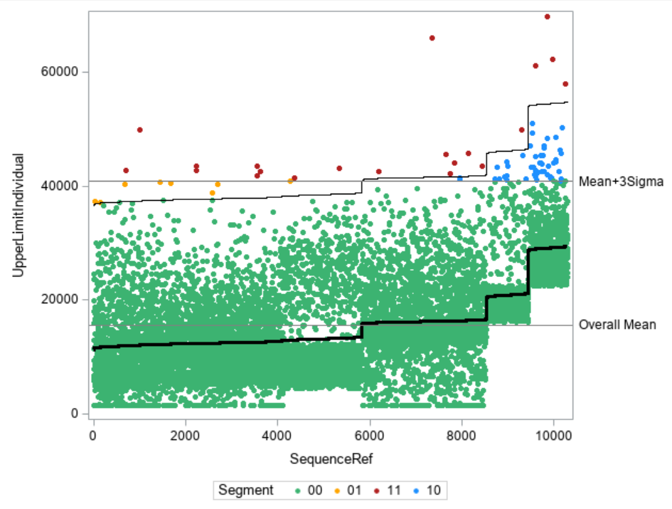
You can now use the SGPLOT procedure to illustrate the datapoints and whether they exceed the individual and/or the overall limits.
First you create an attribute map for the individual colors for the four cases.
data attrmap;
   input id $8. @10 value $2. @20 markercolor $14.;
   datalines;
Segment  00        MediumSeaGreen
Segment  01        orange
Segment  10        DodgerBlue
Segment  11        Firebrick
;
run;
The you use the SPLOT procedure to plot the datapoints in the respective colors as well as the individual and overall reference lines.
proc sgplot data = pred_bluebook dattrmap=attrmap;
 scatter y=bluebook x=SequenceRef / group= segment markerattrs=(size = 5 symbol=circlefilled ) attrid=segment;
 step  y=UpperLimitIndividual x=SequenceRef / lineattrs=(color=Black);
 step  y=reference   x=SequenceRef / lineattrs=(color=Black thickness=3) ;*curvelabel="Reference Value" curvelabelpos=end;
 refline &bluebook_OverallMean  / axis=y lineattrs=(color=grey) label ="Overall Mean";
 refline &bluebook_Overall3sigma / axis=y lineattrs=(color=grey) label="Mean+3Sigma";
run;
- The SCATTER statement plots the data points as filled circles.
- The first STEP statement plots the individual 3-sigma upper reference line.
- The second STEP statement plots the individual reference value.
- The REFLINE statements plot the overall 3-sigma upper reference lines as well as the overall mean.
Interpreting the Graph
In the graph you find on the x-axis the data points for each analysis subject ordered by increasing value of REFERENCE (y-axis). You see how the individual reference values as step lines differ from the "one-size-fits-all" overall means and provide more insight whether a value might be too high or not.
- In GREEN you see data points that are considered to be within in the limits with both methods, overall and individual.
- Data points that look fine in an overall comparison, but lie above its individual value are shown in YELLOW. These are the cases which you would miss when only looking at overall limits.
- Data points that lie within the individual limit but would be classified as "too high" when just comparing with the overall mean are shown in BLUE. These are the cases that you would falsely alert when only looking at overall limits.
- Observations that lie outside of both limits, overall and individual are shown in RED.
Conclusion and Business Applications
This example and the graphical representation show how you can easily calculate and visualize individual reference limits. You also see how you can make much more informed decisions about classifying an observation as "too high" or not.
There are many business applications for this method:
- Outlier detection and data quality: You can verify whether your data points are within certain limits based on individual thresholds.
- Auditing: Based on the individual reference values, you can select those applications that have a value which is above their individually expected value. This also prevents you from looking at many cases that lie above the overall limits because of explainable effects.
Links and References
This example has been taken from my SAS Press book "Data Quality for Analytics Using SAS", see chapter 13.4, page 171
Further books of the author in SAS Press:
Catch up on SAS Innovate 2026
Dive into keynotes, announcements and breakthroughs on demand.
Explore Now →SAS AI and Machine Learning Courses
The rapid growth of AI technologies is driving an AI skills gap and demand for AI talent. Ready to grow your AI literacy? SAS offers free ways to get started for beginners, business leaders, and analytics professionals of all skill levels. Your future self will thank you.


