Have you ever created a bar chart where one or two bars are so long that other bars appear too short to compare or even see? Such a graph may reflect an existing product that’s a cash cow and makes significantly more revenue than a new and rising star product. How can you effectively see the long and short bars in one graph? In this post, I’ll show you two approaches to handle the chart in SAS Visual Analytics. See the attached sample custom graph using the second approach so that you don’t have to start from scratch.
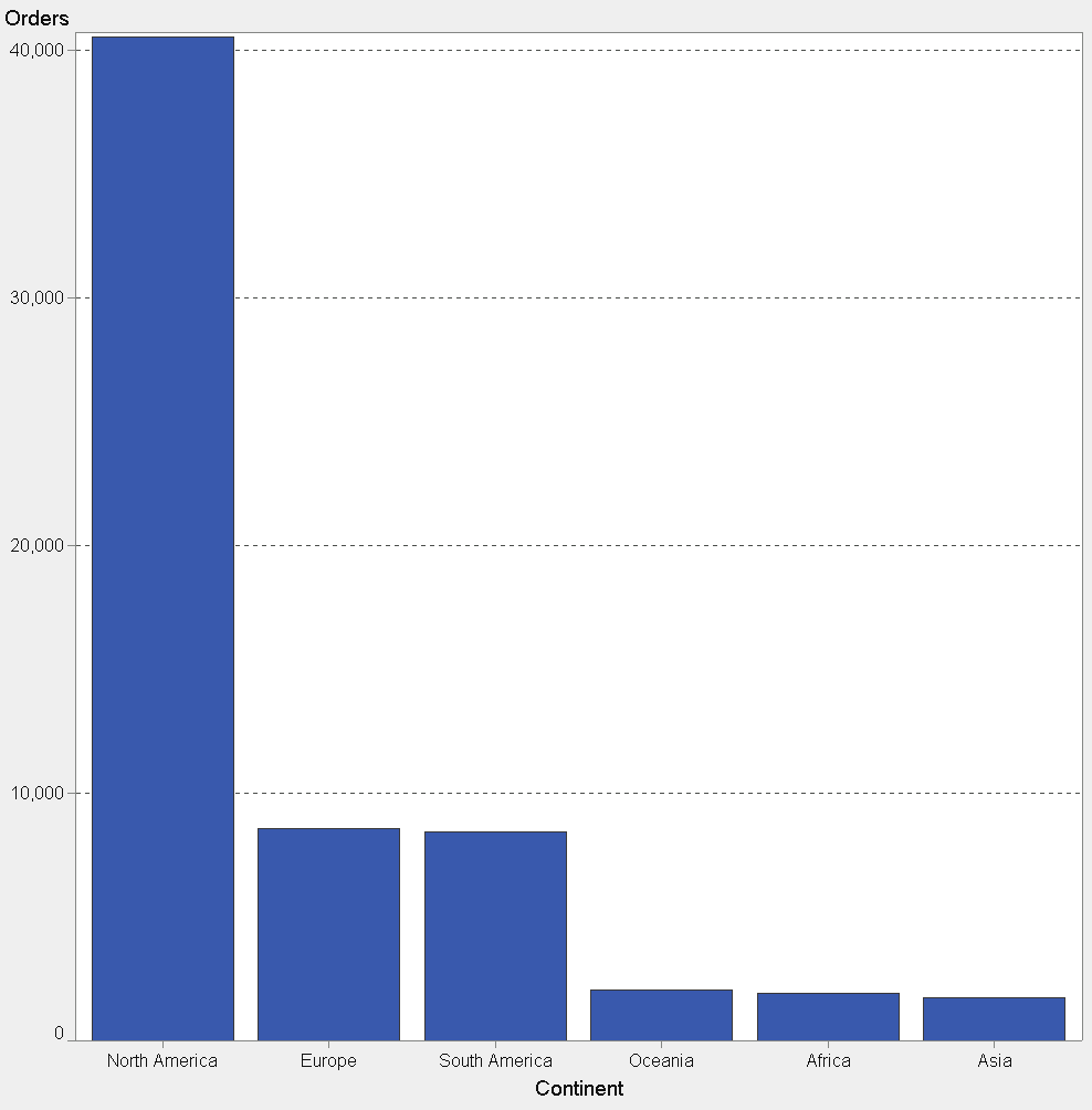
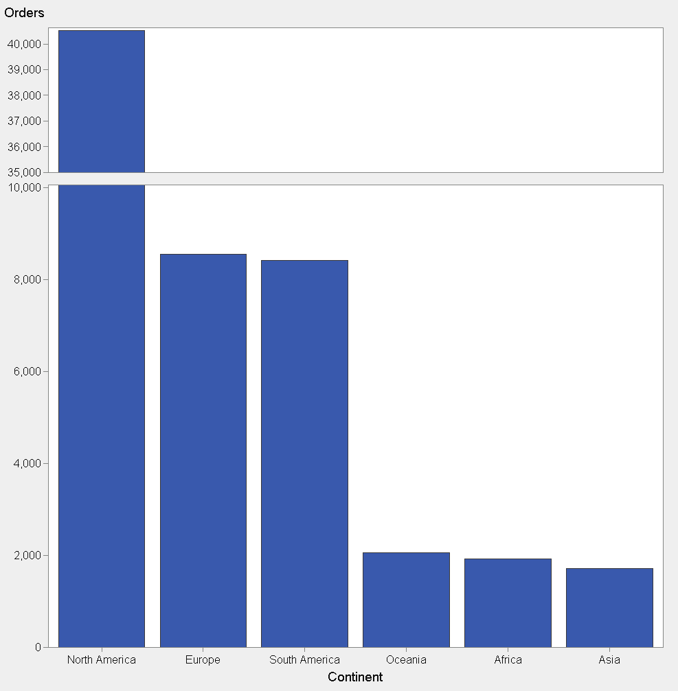
Let’s start with a problem graph. In the example chart below, the large value for North America makes it difficult to compare Asia, Africa, and Oceania.
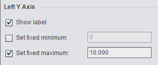
A SAS Visual Analytics customer reported this “shrinking bars challenge” to SAS recently, and they wanted to break or split the Y axis into two ranges while skipping a range of values in the middle of the scale. In this way, the short bars would appear longer. There are a couple ways you can deal with this challenge using SAS Visual Analytics 6.3 or higher. First, you could set a maximum value for your Y axis to truncate the tallest bar so that the shorter bars appear taller and easier to compare.
This approach is fine if the business purpose of your report or dashboard is not concerned with the largest values. Alternatively, if the shorter bars are not relevant, you could set a fixed minimum to some number greater than zero in order to make the shortest bars disappear. However, be careful doing this, because comparing the relative length of remaining bars is only accurate when there is a base of zero on the Y axis.
What’s the business objective?
Business managers are quite often most interested in both the highest and lowest values for a metric. For example, which products are our best and worst sellers? Which sales people are the top and bottom performers? If you set a fixed maximum, you won’t be able to see a corresponding value for your tallest bar based on the Y axis.
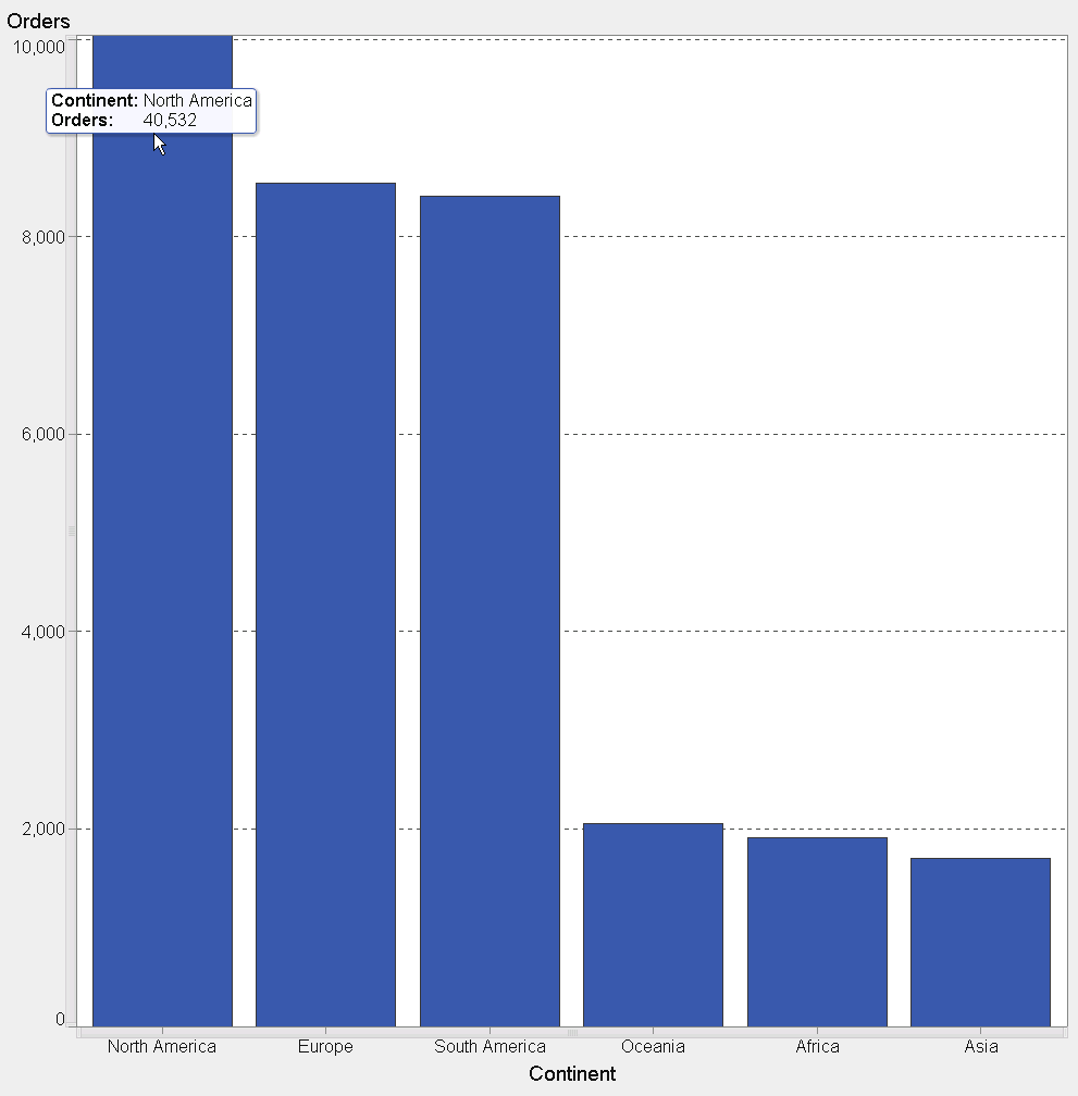
In the example chart below, you can now more easily compare Oceania, Africa, and Asia, but you might conclude at a glance that North America had just over 10,000 orders instead of just over 40,000 (shown in the original chart above and in the mouse-over tip in this example).
Herein lies the dilemma: how can you illustrate both the highest and lowest values in the same chart when the difference between them is so large?
Solution #1: Simulate a split-Y axis in the report designer
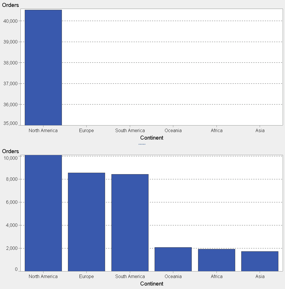
Break the Y axis scale into two parts, eliminating a wide range of values in the middle, by using two bar charts. This allows you to see the tops of the very tall bar and make the shortest bars tall enough to understand and compare their lengths to one another.
You could accomplish this split-Y axis effect by:
- Dragging two bar charts into the report designer workspace.
- Assigning the same data items to both.
- Setting a maximum value for the bottom bar.
- Setting a minimum value for the top bar chart’s Y axis scale.
However, you will have two X axes – one for each bar chart – which will display the same category values on both bar charts. This is redundant and wastes valuable screen real-estate.
Another downside to setting it up this way comes in when report consumers want to sort the bars differently or even drill down. They’d have to perform these actions on both bar charts to keep them consistent. As a report author, you would need to duplicate any filter, brush, or link interactions between the two bars and other graphs, tables, and controls in the report. You could meet the objective with two independent bar charts.
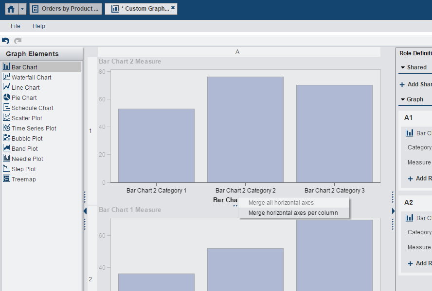
Solution #2: Split-Y axis in SAS Visual Analytics Graph Builder
SAS Visual Analytics Graph Builder, introduced in SAS Visual Analytics 6.3, allows you to combine multiple graph objects, either overlaid or adjacent, to create a new custom graph template that you can reuse and share as a single graph type in the report designer. A custom graph can break the Y axis scale into two parts and eliminate the redundant X axis category values, saving valuable space.
You can set graph style and other properties in Graph Builder as well, and you can merge axes and share data roles if needed to make the multiple graphs appear and behave as one. Please refer to Creating Custom Graph Objects in the Visual Analytics User’s Guide (6.3 or higher) for more details.
In the article Keep your SAS Visual Analytics charts in sync through shared roles, SAS’ Renato Luppi, shows a sample custom graph that uses shared data roles. By combining two bar charts, sharing the data item roles, and setting some properties, you can create a single custom bar chart type in Graph Builder that displays two distinct ranges on the Y axis scale with a shared X axis.
Here is the recipe to create a custom vertical bar chart with a split-Y axis:
- Invoke VA Graph Builder from the right panel in VA Home (look for Custom Graph) or from the object tab in the left panel in VA Designer.

- Drag two bar charts to a blank workspace such that they do not overlay each other. One bar chart should be at the top and the other at the bottom of the workspace. For a horizontal split Y axis, place the two bar charts side-by-side and switch the direction to horizontal. However, the steps that follow are specific to vertical bars.
- Right click on one of the X axes and choose to merge the horizontal axes.
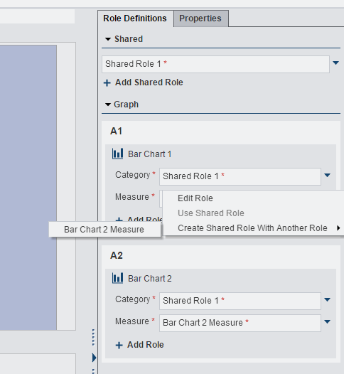
- From the Role Definition tab in the right panel, right click on one of the Y axes roles and choose to merge with another measure. You may want to rename the default names for the share roles (X and Y) to be more meaningful to other report designers that might use this custom graph.
- Resize the two graphs so the bar chart at the bottom is taller than the bar chart at the top. This will bring focus to the shorter bars in the bottom more, so that they are easier to compare.
- Click on the bottom Y axis and set a maximum under properties in the right panel.
- Click on the top Y axis and set a minimum that is greater than the maximum you set in the previous step. The difference between these two values creates the missing range of values.
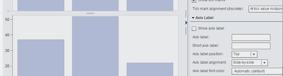
- You can set focus to the bottom Y axis and uncheck the property Show axis label to it, since there will be a label for the Y axis in the top bar chart.
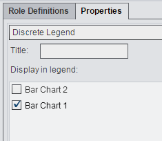
- Display only one of the two legends.
Things to keep in mind when splitting bar charts through Graph Builder
The Y axis minimum and maximum values are saved as part of the graph template, and you cannot change those values when you use the custom graph in the report designer. However, you can modify the custom graph template in Graph Builder to change the min and max values to fit a new situation, and your existing reports that used prior versions of the custom graph will not change.
With this approach, you do lose the ability to see to what magnitude the taller bar above the split is greater than the bars below the split. For instance, the tallest bar might appear 25% taller than the shortest bar, where the largest value might actually be 75% greater. You also might not see the actual top of some bars if they fall within the missing middle range. If middle values are not interesting from a business perspective, then this might not be a concern.
I hope this custom graph example is useful. If you’re interested in trying this yourself, see instruction details below.
Also, feel free to rate it using the “star” rating system below. Also post your thoughts and experience with this kind of graph in the comments section.
Rick Styll
How to make the example work for you
This example was created in SAS Visual Analytics 6.3. Attached is a SAS package file containing the custom graph template, a sample report, and sample data. You will be able to import this package if you have access to the SAS Management Console in 6.3, 6.4, 7.1, and 7.2. Please refer to these instructions.
If you do not have access, contact your SAS Visual Analytics Administrator. Be sure to select the table and check the option labeled include/replace physical table, because this option is unchecked by default.
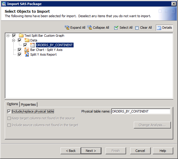
If an administrator is importing the package for you and forgets to check this option, Visual Analytics will inform you that your report is missing data when you try to open it for editing or viewing. If that happens and you are authorized to import data from the Designer, Explorer, or Data Builder, you can simply import the attached file, Orders_by_Country.csv. Under the Advanced options, change the location to be in a folder called Data that is a subfolder directly under the folder where the report is imported, e.g. /Test Split Bar Example/Data.
.jpg")
