- Home
- /
- SAS Communities Library
- /
- SAS Visual Analytics 8.2 Interface Overview
- RSS Feed
- Mark as New
- Mark as Read
- Bookmark
- Subscribe
- Printer Friendly Page
- Report Inappropriate Content
SAS Visual Analytics 8.2 Interface Overview
- Article History
- RSS Feed
- Mark as New
- Mark as Read
- Bookmark
- Subscribe
- Printer Friendly Page
- Report Inappropriate Content
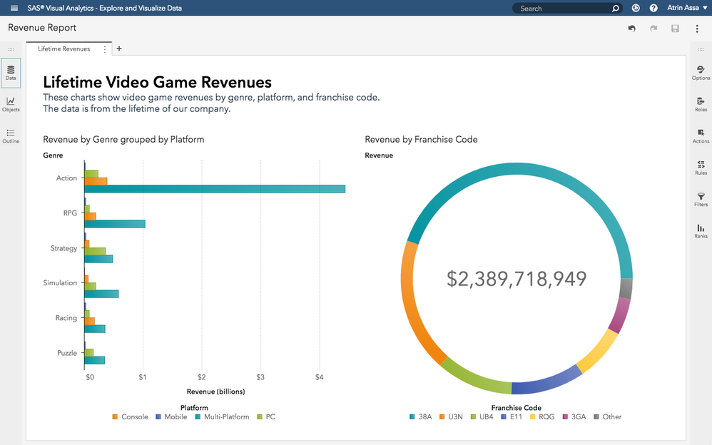
SAS® Visual Analytics on SAS® Viya makes it easy to create, edit, and view reports. If you're coming from previous versions of Visual Analytics, you'll find a much more straightforward, cleaner interface. That means you spend less time fighting with the interface, so, you'll have more time to get meaningful insights and act on them.
To understand SAS Visual Analytics, it helps to divide the screen into five sections:
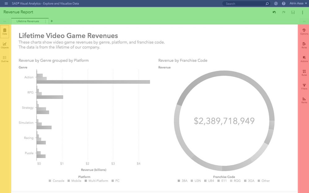
On the left, we have panes that let you drag data and objects to your canvas (yellow). Here, you can even get an interactive outline of your report. On the right, we have panes (red) that let you manipulate properties of the report, pages, or objects you've selected. At the center, you have your report canvas (grey). If you generally understand these five areas, you've got everything you need to get started.
The left panes in detail
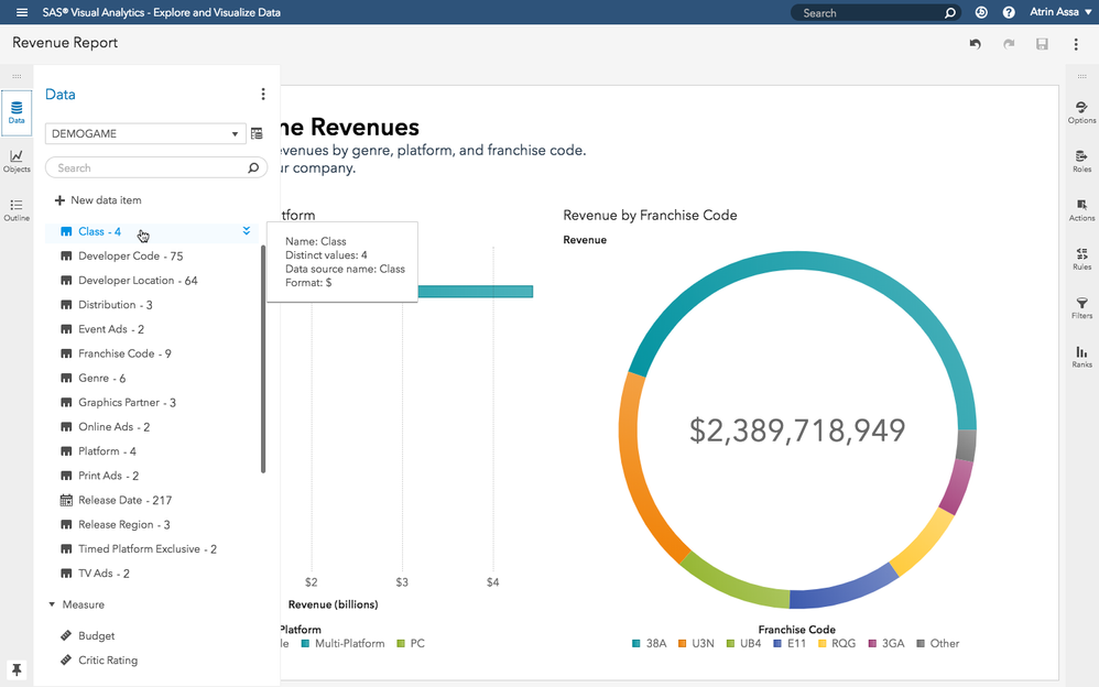
From the Data pane, you can see the columns in data that you've opened. You can drag data columns to the canvas and visualize them. Just drag and drop, and SAS Visual Analytics automatically determines a chart based on the data you've selected.
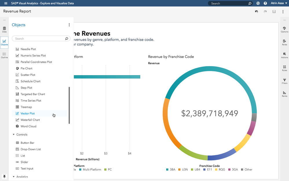
The Objects pane lets you see all the kinds of interactive objects including visualizations and controls you can add to your report. In both the data pane and objects pane, you can filter the data and objects you see. When you find the object you want in your report, just drag it to your page. It's that easy!
 See an overview of your report with the Outline pane on the left.The right panes in detail
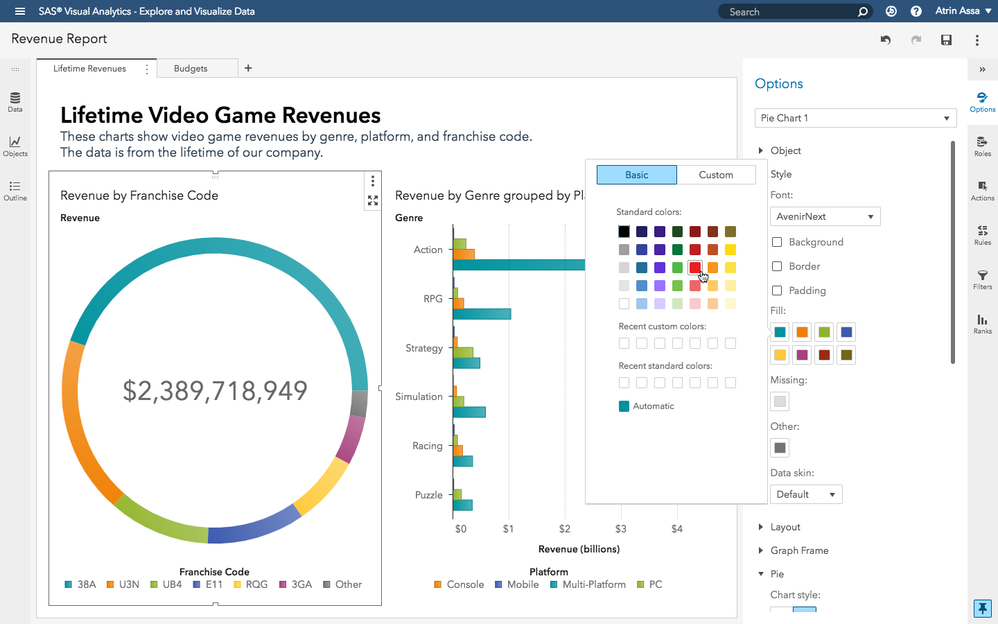
On the Options pane, you can modify the properties of things you've selected. This could be the report itself, a page of the report, or objects on the page. The options pane lets you see properties of the object like the style, layout, legend controls, and so on.
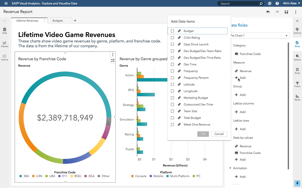
The Roles pane provides a different way to assign data roles to your visualizations and controls. You can click on the plus signs to add objects. Or you can even drag data from the left Data Pane.
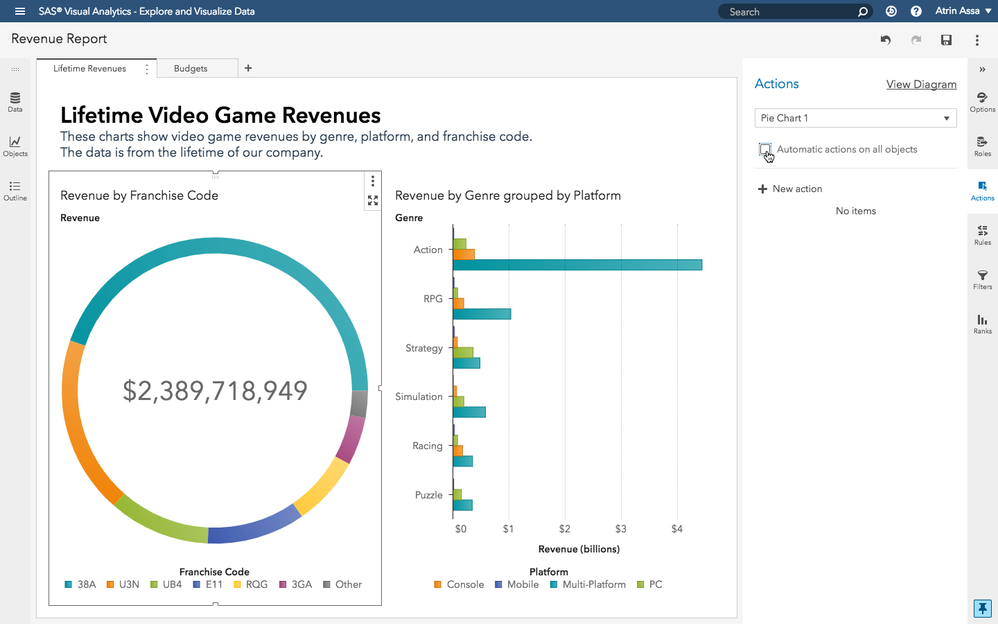
The Actions pane lets you control how objects interact with one another. You can quickly set automatic interactions for the whole page (linked selection, one way, and two-way filtering) with a click. Or you can manually create interactions between specific objects and not others.
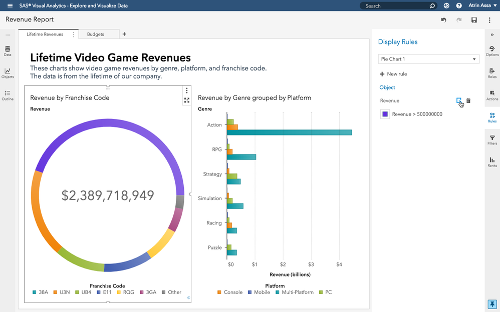
The Rules pane lets you create conditional display rules for your selection. Whether it's for the report, the page, or an individual object, you can quickly set rules that set a particular style when a data condition is met.
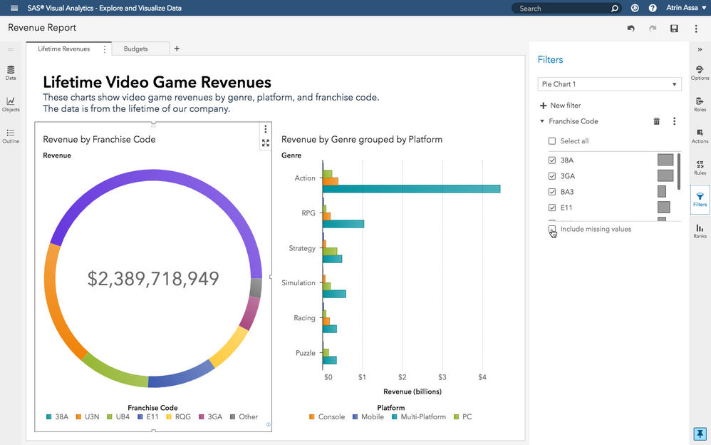
The Filters pane lets you filter the data that an object is using. So, if you've got transactional data that goes back a year and you're interested in the last week, you can set it as a filter here.
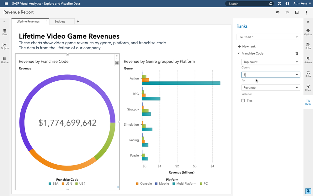
Finally, the Ranks pane makes it easy to look at the top or bottom count or percent of a category. For example, if you want to see your top 5 product categories, or your bottom 20% sales team, you can set a rank in this pane.
That's it. With this simple understanding of the new SAS Visual Analytics interface, you can quickly explore your data and build amazing reports and dashboards.
- Mark as Read
- Mark as New
- Bookmark
- Permalink
- Report Inappropriate Content
Hi there,
Thank you for this insightful post about the new Interface. It seems your R&D team have managed to come up with a well thought out design to make the interaction very smooth and straight forward when designing and editing a Visual Analytics Report.
I was wondering if there has been any thoughts put into the possibility of Embedding VA Reports into another Web page?
There are lots of Interactive Reporting Software packages (Commercial & Open Source) offer this capability/feature in the market place today. How does this product compare to its competitors?
Thanks,
Ahmed
- Mark as Read
- Mark as New
- Bookmark
- Permalink
- Report Inappropriate Content
Ahmed, yes we've added the ability to generate a URL for embedding. You can then use this URL to embed the object or report in a web app or web page. You can even choose if this embedded element is an interactive object/report or an SVG vector image of the object/report.
- Mark as Read
- Mark as New
- Bookmark
- Permalink
- Report Inappropriate Content
@TPGary, here's something that I found interesting. and hello @AhmedAl_Attar from USCGHQ -
sorry, @VAProdMgr but refresh my memory on why we should embed reports in Webpages? Could we have an app for showing them like a quasi-browser, QLIK and Tableau come to mind.
Catch up on SAS Innovate 2026
Nearly 200 sessions are now available on demand with the SAS Innovate Digital Pass.
Explore Now →SAS AI and Machine Learning Courses
The rapid growth of AI technologies is driving an AI skills gap and demand for AI talent. Ready to grow your AI literacy? SAS offers free ways to get started for beginners, business leaders, and analytics professionals of all skill levels. Your future self will thank you.

