- Home
- /
- SAS Communities Library
- /
- SAS Graph Builder: Custom Line Chart with Reference line for Visual An...
- RSS Feed
- Mark as New
- Mark as Read
- Bookmark
- Subscribe
- Printer Friendly Page
- Report Inappropriate Content
SAS Graph Builder: Custom Line Chart with Reference line for Visual Analytics reports
- Article History
- RSS Feed
- Mark as New
- Mark as Read
- Bookmark
- Subscribe
- Printer Friendly Page
- Report Inappropriate Content
SAS Graph Builder is a powerful tool to create custom graph templates to use in SAS Visual Analytics. The intended use for SAS Graph Builder is not the same as object templates. Object templates allow you to save graph options with and without data (the role assignment option became available with SAS Visual Analytics 8.4). These options can include color, axis labels, data labels and other specific graph options such as orientation.
SAS Graph Builder, on the other hand, allows you to create an entirely new object by being able to:
- Layer graph elements
- Define shared data roles
- Design user-defined or data-driven lattice types
- Customize options for axes and colors
SAS Graph Builder offers a gallery of prebuilt templates that you can start from or you can build a template from scratch with the available graph elements.
This post will walk through an example of building a graph template to satisfy the report requirement to display a line chart with dynamic reference line.
In this example, I’ve plotted the winning scores of each Super Bowl game and the dynamic reference line represents the average winning score.
Select any image to see a larger version.
Mobile users: If you do not see this image, scroll to the bottom of the page and select the "Full" version of this post.
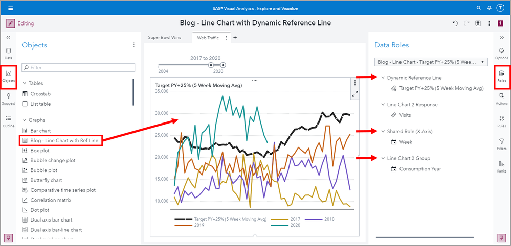
In this second example, I’ve plotted the number of web visits by week then grouped by year. This dynamic reference line displays a bracketed five week moving average of the target which is the previous year’s visits plus 25%. The five point moving average in this case means the two values prior, current value, and two values post to average.
You may be wondering, why not use the standard line chart object? It is because the line chart object does not allow for both multiple measure assignments and a group role assignment.
We can work around this limitation by creating our own graph template that layers two line charts on top of each other where:
- Line chart 1 displays the X Axis and dynamic reference line measure
- Line chart 2 displays the X Axis, the visits measure, and the group role assignment
- Configure the X Axis to be a shared role so that the data values line up as desired
Let’s get started.
Create a new graph template
Open the SAS Graph Builder application by using the side menu and select Build Custom Graphs
Select New Custom Graph
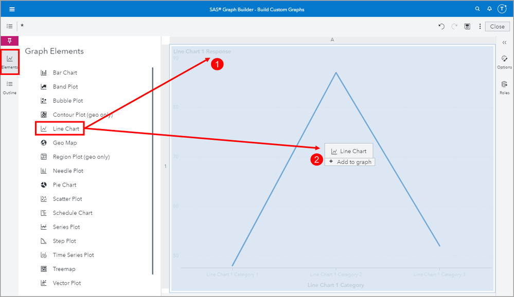
Using the Elements pane on the left side, drag two Line Chart elements on to the canvas, overlaying each other.
Next, we will configure the Roles for each line chart element.
The X Axis was by default configured to use a Shared Role. To assist the report developers, I will rename this role so it is clear to the Role’s purpose.
Use the overflow menu for Shared Role 1 and rename it to Shared Role (X Axis).
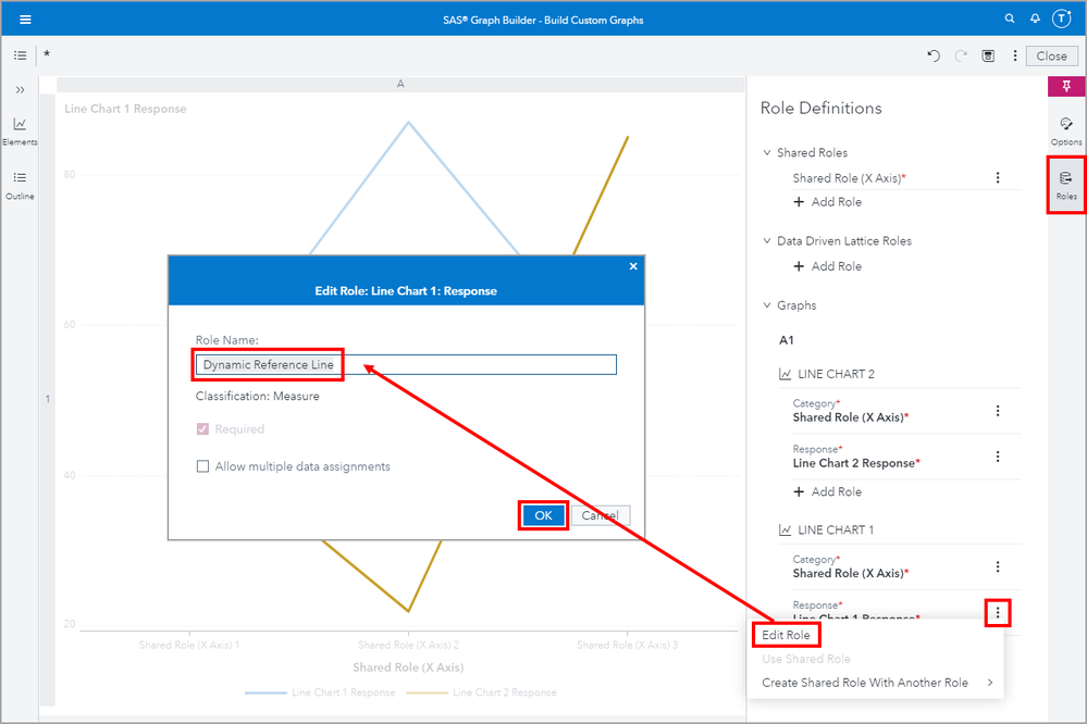
Now I need to decide which line chart element will hold our dynamic reference line. I choose LINE CHART 1 to represent the dynamic reference line. Again, to make it easier for our users, I will rename the measure response role from Line Chart 1 Response to Dynamic Reference Line.
We could be finished here with the roles, but remember we wanted to be able to support a group role assignment, like in the Web Traffic example. Therefore, we will need to add an additional role to our LINE CHART 2 object that will handle the other measure assignments.
Click + Add Role under the LINE CHART 2 grouping and then select the Role Type Group. We don’t need to make it required so that this template can satisfy the simple use case such as the Super Bowl example I demonstrated earlier.
In the event that the user does not want to use a group role but rather assign multiple measures to the LINE CHART 2 we will need to edit the Line Chart 2 Response role to Allow multiple data assignments.
Now we need use the Options pane to style the dynamic reference line to stand out more and make a few other personal preference adjustments for the X Axis.
Use the drop-down menu at the top of the Options pane to navigate the graph template’s properties. First select Line Chart 1 and adjust the line style to your preference. I selected a hashed line, increased the line thickness and selected the color black.
We will leave the Line Chart 2 options to use their default settings.
Next, we will select the X Axis from the drop-down list and deselect Axis label and change the Categorical values overlap handling to Always rotate. Usually the X Axis data role assignment is self-explanatory and I rather have the additional space for the graph.
Save the graph template
Now we need to save the graph template. This is where you would want to store your graph template in a shared location where other users can access it, if you want them to be able to add it to their own Objects pane to use in SAS VA reports and be able to make edits to the custom graph template in SAS Graph Builder.
For my purposes, I’m going to save it to the My Folder location. And don’t worry, even if you do save it to your My Folder location and use a custom graph template in a report that others can access, those users can still view the report without issue. They just wouldn’t be able to add the custom graph template to their Object pane.
Import graph template to use in a SAS Visual Analytics report
Use the side Application Menu and select Explore and Visualize to switch to SAS Visual Analytics.
Now we need to add our custom graph template to the list of available Objects so that we can add it to a SAS VA report.
To do that use the Objects pane’s overflow menu and select Import custom graph…
Next, navigate to where the custom graph template is stored. Select it and click OK.
You can now see the custom graph template in the list of available Objects.
Let's add the new custom graph template object to the report and assign Roles.
Here are the role assignments for the first example, Super Bowl Wins:
And here are the role assignments for the second example, Web Traffic:
Update the graph template
In order to achieve your desired custom graph template, you may need to go through several iterations of changes. This is an expected development process as you discover how certain changes appear once data role assignments are made.
To do this, go back to the SAS Graph Builder to make the desired changes then save your work. Next, toggle back to SAS Visual Analytics and re-add that custom graph template object to the VA report to see those changes reflected.
You will not need to reimport the custom graph, but you will need to add a new instance of the object to the report canvas. With that said, any reports that have already made use of the template will not reflect those changes made. This means that any changes made to the graph templates will not automatically push out to any reports that have already used a previous version of that graph template.
Conclusion
SAS Graph Builder is a powerful report enhancing tool that allows for customization of existing out-of-the-box graph objects as well as the flexibility to design new graph template objects for reuse by the VA reporting designers. This can not only help meet unique reporting requirements but ensure object consistency and can even make role assignments easier if needed.
Demo
I have recorded an accompanying video tutorial for these examples so that you may follow along. Though the video uses SAS Visual Analytics 8.5, similar steps can be used for earlier releases including SAS Visual Analytics 7.5.
- Mark as Read
- Mark as New
- Bookmark
- Permalink
- Report Inappropriate Content
Everything is clear, only one thing:
how do you calculate in a smart way target PY (previous year)? It is hard coded with if ...then else or done in a different way? what measure is the base for the 5 wks moving average? thank you Karolina T
P.S. I think I will read all your blogs.
SAS AI and Machine Learning Courses
The rapid growth of AI technologies is driving an AI skills gap and demand for AI talent. Ready to grow your AI literacy? SAS offers free ways to get started for beginners, business leaders, and analytics professionals of all skill levels. Your future self will thank you.
- Find more articles tagged with:
- GEL


