- Home
- /
- SAS Communities Library
- /
- Kaplan-Meier Survival Plotting Macro %NEWSURV
- RSS Feed
- Mark as New
- Mark as Read
- Bookmark
- Subscribe
- Printer Friendly Page
- Report Inappropriate Content
Kaplan-Meier Survival Plotting Macro %NEWSURV
- Article History
- RSS Feed
- Mark as New
- Mark as Read
- Bookmark
- Subscribe
- Printer Friendly Page
- Report Inappropriate Content
Hello everyone,
Upon learning that sascommunity.org is being decommissioned I decided to move my wiki page to this website as an article to help me continue to share the code. This macro has been around for years and has been constantly evolving to be my pocketknife of survival analysis whether it's graphing or generating tables. I have presented this macro at four separate conferences and have been freely sharing the macro with anyone who is interested.
Abstract
The research areas of pharmaceuticals and oncology clinical trials greatly depend on time-to-event endpoints such as overall survival and progression-free survival. One of the best graphical displays of these analyses is the Kaplan-Meier curve, which can be simple to generate with the LIFETEST procedure but difficult to customize. Journal articles generally prefer that statistics such as median time-to-event, number of patients, and time-point event-free rate estimates be displayed within the graphic itself, and this was previously difficult to do without an external program such as Microsoft Excel. The macro NEWSURV takes advantage of the Graph Template Language (GTL) that was added with the SG graphics engine to create this level of customizability without the need for backend manipulation. Taking this one step further, the macro was improved to be able to generate a lattice of multiple unique Kaplan-Meier curves for side by side comparisons or condensing figures for publications. The following is a paper describing the functionality of the macro and a description of how the key elements of the macro work.
What does the macro do?
Generates a graph
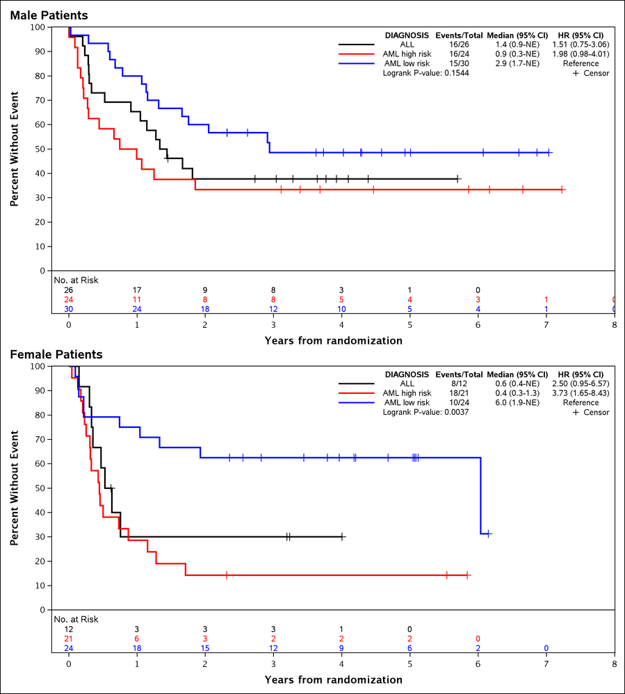
The original purpose of creating the macro was to make a journal quality Kaplan-Meier (KM) curve that included common survival statistics within the curve itself so that I did not have to manually add them to an image post-hoc. Below is an example using the dataset SASHELP.BMT:
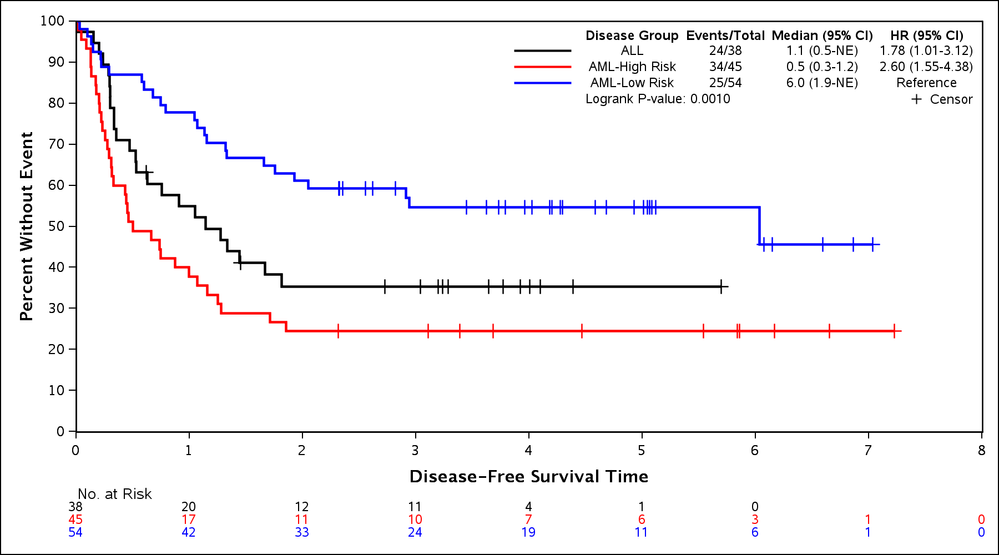
The macro allows for a vast amount of optional customization to fit the user's needs, but also allows for simple macro calls to get the ball rolling.
Generates a table
I added the ability for the macro to take the survival statistics it was calculating and organize them into a clean summary table using the REPORT procedure.
Automatically calculates survival statistics
The macro automatically computes many commonly used survival statistics including the following:
- Kaplan-Meier
- Number of patients/events (PROC LIFETEST)
- Median Time-to-Event w/95% Confidence Bounds (PROC LIFETEST)
- Time-Point Event-Free Rates w/95% Confidence Bounds (PROC LIFETEST)
- Unstratified/Stratified Logrank/Wilcoxon P-value (PROC LIFETEST)
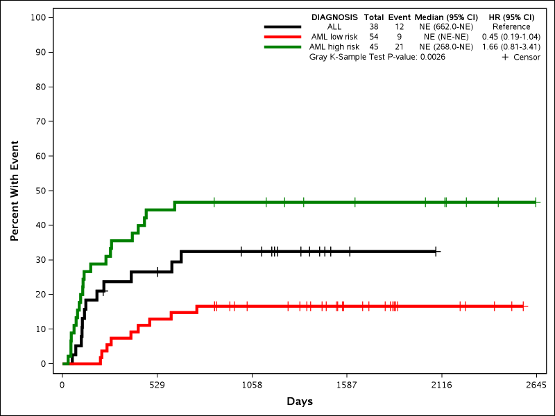
- Cumulative Incidence Analyses:
- The methods used to compute this differ depending on SAS version.
- Prior to SAS 9.4M3:
- The code used to compute cumulative incidence was taken from the SAS autocall macro %CIF. This macro uses PROC IML to do most of the calculations, but since this is an optional add-on for some companies, the DATA STEP with array processing was used as a substitute. In order to calculate the p-value the matrix operations within PROC FCMP was used.
- SAS 9.4M3+: Proc LIFETEST
- Prior to SAS 9.4M3:
- Number of patients/events
- Median Time-to-Event w/95% Confidence Bounds
- Time-Point Event-Free Rates w/95% Confidence Bounds
- Unstratified/Stratified Gray K-sample P-value
- Patients-at-Risk CountsPatients-at-Risk Counts
- The methods used to compute this differ depending on SAS version.
- Cox Proportional Hazards Regression
- Hazards Ratio w/95% Confidence Bounds (PROC PHREG)
- Wald Parameter P-values (PROC PHREG)
- Wald/Score/Likelihood-Ratio Type 3 Test P-values (PROC PHREG)
- Competing Risks (PROC PHREG - SAS 9.4+ Only)
- Concordance index
- This is calculated in data steps using the same code used in the survConcordance R package
There are parameters for customizing the automated analysis, including:
- Stratification
- Categorical and continuous adjusting factors for hazard ratios
- Class variable options
- Reference value
- Order of values
- Cumulative incidence variance calculations
- Ability to subset with a WHERE clause without making a new data set
- Ability to indicate censor or event value
- Method for ties within Cox models
More plot annotations available
- Confidence bounds as lines, color bands, or both
- Reference lines that drop to the x-axis and/or y-axis
- Can show either the median time-to-events or event-free rates
Why use this macro?
There are multitudes of survival based macros out there in the wild. Why should you choose to try this one instead of one of those or an internal macro?
The macro's middle name is customizability
Nearly all parts of the graph are customizable with multiple options.
Step Plot Curves and Confidence Bounds
- Thickness, color, and pattern
- Thickness, color, pattern, fill color, and transparency of band plot
Censor Indicating Scatter Plot
- Size and color
Patients-at-Risk Block Plot
- Size and weight of font
- Location of block plot (Above x-axis or below x-axis)
- Location of block plot labels (Left of block plot, above block plot, none)
- Location and text of header
- Match color to step plot curves
Display Statistics
- Text size and weight
- Statistics column header text
- Which statistics are displayed and their order
- Number of patients and number of events
- Number of patients and number of events separately ###
- Number of events/number of patients ###/###
- Median time-to-event w/95% confidence bounds ###.# (###.#-###.#)
- Hazard ratios w/95% confidence bounds ###.# (###.#-###.#)
- Time-point event-free rates
- Column for time-points (e.g. 60 days, 4 months, etc) which can be disabled
- Column for event-free rates w/95% confidence bounds ###.# (###.#-###.#)
- P-values
- P-value format (#.####), values less than 0.0001 shown as >0.0001
- Column for covariate level Wald p-values
- Section for type 3 p-value of the class variable
- Concordance index w/95% confidence bounds #.## (#.##-#.##)
- Manually entered comments are available with the TABLECOMMENTS parameter
Titles/Footnotes
- Text size and weight
- Overall titles/footnotes for the image as well as individual titles/footnotes for each plot
- Superscripts/subscripts/Unicode available
Axes
- Y-axis can be set to proportions or percentages
- X-axis can be transformed into other time units (days to months, etc.)
- Automatic or manual labels
- Automatic labels will be "Percent/Proportion with Event" for Y-axis and the time variable's label for the X-axis
- Manual labels can be entered to override automatic labels
- Label and tick value text size and weight
- Top and right frames can be disabled
- Axis colors
Image options
- Can output any type of image
- Includes special programming for TIFF files to be smaller file size
- Can output or be included within nearly any ODS tags (RTF, EXCEL, PDF, HTML, POWERPOINT)
- Height, width, dpi, anti aliasing
- Axis colors and font colors
- Background colors and background transparency
The macro runs clean
- The NEWSURV macro is designed to run completely internally and will not change your options, does not have any global macro variables, and cleans up any temporary data sets that it makes
- Includes thorough error checking that not only is designed to stop the macro before it crashes, but gives the user tips on what went wrong
- For example if a macro option is used incorrectly (e.g. a variable doesn't exist) the macro error text will tell this to the user
- If a parameter with multiple options is used incorrectly (invalid value), the macro will tell the user this and list the valid values
- The results, log, and notes are turned off while the macro is running to keep the log, listing and results windows clean
The macro runs multiple models and can create multiple graphs in one image
- Multiple statistical models can be run with one macro call for the statistical table
- Multiple graphs can be created within one image
- Each graph can have different options including time variables, class variables, and methods
- Easy to create a paneled image for manuscripts
The macro is mostly backwards compatible back to SAS 9.2
The macro was written in SAS 9.2 and most of the options and techniques are still compatible with the older versions (9.2/9.3) of SAS. These features include creating multiple graphs, calculating the concordance index, and running cumulative incidence models.
Thoroughly documented
The beginning of a macro has extensive documentation on each parameter including valid values and how to properly use each one.
Examples of Key Parameters
Below are the examples that were included in the sascommunity.org webpage.
Dataset for Examples
Make the dataset with the following code (also in macro documentation)
proc format;
   value grpLabel 1='ALL' 2='AML low risk' 3='AML high risk';
run;

data BMT;
        input DIAGNOSIS Ftime Status Gender@@;
        label Ftime="Days";
        format Diagnosis grpLabel.;
datalines;
1       2081       0       1       1       1602    0       1
1       1496       0       1       1       1462    0       0
1       1433       0       1       1       1377    0       1
1       1330       0       1       1       996     0       1
1       226        0       0       1       1199    0       1
1       1111       0       1       1       530     0       1
1       1182       0       0       1       1167    0       0
1       418        2       1       1       383     1       1
1       276        2       0       1       104     1       1
1       609        1       1       1       172     2       0
1       487        2       1       1       662     1       1
1       194        2       0       1       230     1       0
1       526        2       1       1       122     2       1
1       129        1       0       1       74      1       1
1       122        1       0       1       86      2       1
1       466        2       1       1       192     1       1
1       109        1       1       1       55      1       0
1       1          2       1       1       107     2       1
1       110        1       0       1       332     2       1
2       2569       0       1       2       2506    0       1
2       2409       0       1       2       2218    0       1
2       1857       0       0       2       1829    0       1
2       1562       0       1       2       1470    0       1
2       1363       0       1       2       1030    0       0
2       860        0       0       2       1258    0       0
2       2246       0       0       2       1870    0       0
2       1799       0       1       2       1709    0       0
2       1674       0       1       2       1568    0       1
2       1527       0       0       2       1324    0       1
2       957        0       1       2       932     0       0
2       847        0       1       2       848     0       1
2       1850       0       0       2       1843    0       0
2       1535       0       0       2       1447    0       0
2       1384       0       0       2       414     2       1
2       2204       2       0       2       1063    2       1
2       481        2       1       2       105     2       1
2       641        2       1       2       390     2       1
2       288        2       1       2       421     1       1
2       79         2       0       2       748     1       1
2       486        1       0       2       48      2       0
2       272        1       0       2       1074    2       1
2       381        1       0       2       10      2       1
2       53         2       0       2       80      2       0
2       35         2       0       2       248     1       1
2       704        2       0       2       211     1       1
2       219        1       1       2       606     1       1
3       2640       0       1       3       2430    0       1
3       2252       0       1       3       2140    0       1
3       2133       0       0       3       1238    0       1
3       1631       0       1       3       2024    0       0
3       1345       0       1       3       1136    0       1
3       845        0       0       3       422     1       0
3       162        2       1       3       84      1       0
3       100        1       1       3       2       2       1
3       47         1       1       3       242     1       1
3       456        1       1       3       268     1       0
3       318        2       0       3       32      1       1
3       467        1       0       3       47      1       1
3       390        1       1       3       183     2       0
3       105        2       1       3       115     1       0
3       164        2       0       3       93      1       0
3       120        1       0       3       80      2       1
3       677        2       1       3       64      1       0
3       168        2       0       3       74      2       0
3       16         2       0       3       157     1       0
3       625        1       0       3       48      1       0
3       273        1       1       3       63      2       1
3       76         1       1       3       113     1       0
3       363        2       1
;
run;
Four Variables:
- FTIME: Survival time
- STATUS: Survival status (0=Alive, 1=Death, 2=Other Failure)
- DIAGNOSIS: Type of disease (1='ALL' 2='AML low risk' 3='AML high risk')
- Gender: Patient's gender (0=Female, 1=Male)
Example 1: Basic Macro Call
%newsurv(DATA=bmt, TIME=FTIME, CENS=STATUS, CEN_VL=0, SUMMARY=0);

This is basic macro call using almost only required parameters. The graph is plotted with censor markers and confidence bounds by default, and displays number of patients, number of events, and median time to event within the graph. The following parameters are introduced:
- DATA: The dataset to be used by the macro. This dataset will not be modified by the macro.
- TIME: The variable within DATA that contains the patients time-to-event values. Must be numeric.
- CENS: The variable within DATA that contains the patients event status. Must be numeric.
- CEN_VL: The value of the CENS varaible that contains the censor value. Must be a numeric value.
- SUMMARY: This parameter determines if the table summary is displayed along with the plot. 1 is Yes and 0 is No.
Example 2: Plotting Multiple Curves with a CLASS Parameter
%newsurv(DATA=bmt, TIME=FTIME, CENS=STATUS, CEN_VL=0, SUMMARY=0, CLASS=DIAGNOSIS, CLASSREF=ALL,CLASSORDER=1 3 2);
This example shows how to add a CLASS parameter to produce grouped survival curves. Doing so also adds hazard ratios and a p-value to the plot statistical summary table. The example shows how to use other parameters related to the CLASS variable. The following new parameters are introduced:
- CLASS: Variable used to group the plots. Can be character or numeric.
- CLASSREF: Level of the CLASS variable that is to be used as the reference for the hazard ratios. The value specified must be one of the formatted values of the CLASS variable. If not specified then the last value alphabetically is used.
- CLASSORDER: Reorders the CLASS levels within the plot. The values are sorted alphabetically by formatted values by default. They are reordered by entering a numbered list. In this example 1 3 2 is used which specifies the first, then third, then second alphabetical levels. Ordering by 1 2 3 would match the default.
Example 3: Modifying the Axes and Curves
 %newsurv(DATA=bmt, TIME=FTIME, CENS=STATUS, CEN_VL=0, SUMMARY=0, CLASS=DIAGNOSIS, CLASSREF=ALL,CLASSORDER=1 3 2,
    COLOR=black red green, PATTERN=solid, LINESIZE=3pt, SYMBOLSIZE=10pt,
    XDIVISOR=30.44, XMAX=100, XINCREMENT=10, XLABEL=Months, YTYPE=PPT, YLABEL=Proportion Alive);
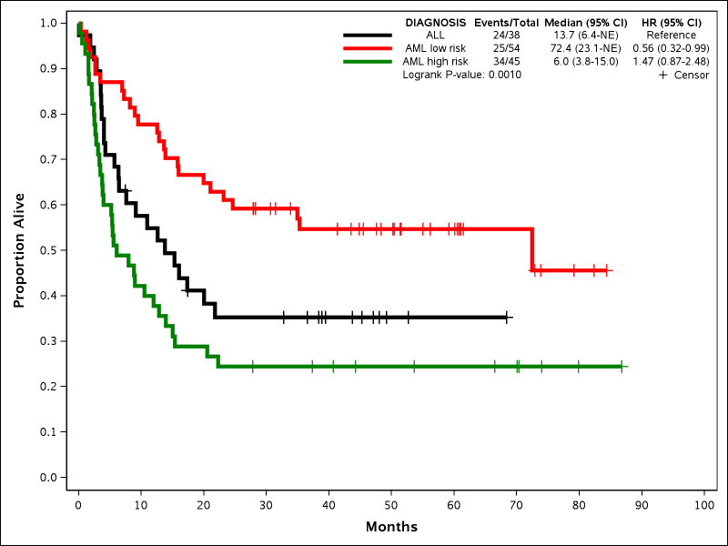
This example shows how to change the X and Y axis scale and labels as well as the attributes of the Kaplan-Meier curves. The x-axis is changed from days to months (this does not affect the original dataset) and the tick values are determined by XMAX and XINCREMENT. The y-axis is changed to proportion using the YTYPE parameter. The Kaplan-Meier curves can have their colors, patterns, thickness, and censor symbols modified. The following new parameters are all introduced:
- COLOR: Provides a list of colors that will be applied to the lines in the order of the CLASS variable. If only one color is provided then that color is used for all lines. Default is black.
- PATTERN: Provides a list of patterns that will be applied to the lines in the order of the CLASS variable. If only one pattern is provided then that pattern is used for all lines. Numbers between 1 and 42 can be used as well as certain keywords like SOLID. The default is AUTO, which makes all lines solid when colors are specified and different patterns when only one color is provided.
- LINESIZE: Provides the thickness of the graph lines. Must be a number followed by pt. Default is 1pt.
- SYMBOLSIZE: Provides the size of the censor symbols. Must be a number followed by pt. Default is 3pt.
- XDIVISOR: Converts the time variable to other units by dividing by a scalar value. Does not affect the original dataset.
- XMAX: Determines the maximum value of the x-axis based on final converted units. Computed automatically by default.
- XINCREMENT: Determines the tick value increment of the x-axis of final converted units. Computed automatically by default.
- XLABEL: Determines the label of the X-axis. Default is the time variable label.
- YTYPE: Determines if the Y-axis is in percentages or proportions. Default is PPT (Percent).
- YLABEL: Determines the label of the Y-axis. Default is either Percentage with Event or Proportion with Event.
Example 4: Modifying the Statistics Table and Showing Event-free Rates
 %newsurv(DATA=bmt, TIME=FTIME, CENS=STATUS, CEN_VL=0, SUMMARY=0, CLASS=DIAGNOSIS, CLASSREF=ALL,CLASSORDER=1 3 2,
    COLOR=black red green, PATTERN=solid, LINESIZE=3pt, SYMBOLSIZE=10pt,
    XDIVISOR=30.44, XMAX=100, XINCREMENT=10, XLABEL=Months, YTYPE=PPT, YLABEL=Proportion Alive,
    TIMELIST=20 40,TIMEDX=months,DISPLAY=legend timelist);
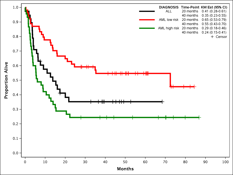
This example demonstrates changing which statistics are shown within the plot table and how to display Kaplan-Meier time-point event-free rates. One or more event-free rates can be specified, and they will be displayed vertically. The column that shows the time-point can be disabled when displaying only one time-point. The following new parameters are all introduced:
- DISPLAY: Controls which statistics are displayed within the plot summary table. Items are displayed in the same order that they are listed within the macro variable. The default changes depending on what kind of plot is being displayed.
- TIMELIST: Enter list of one or more time-points in the final X-axis units to calculate time-point event-free rates. Can be a simple list of numbers (xx xx xx xx) or a list in loop format (xx to xx by xx).
- TIMEDX: This parameter will be used to display the units within the time-point estimates. For example, entering Months will add the text Months after each time-point number within the plot.
Example 5: Adding Patients-at-Risk
 %newsurv(DATA=bmt, TIME=FTIME, CENS=STATUS, CEN_VL=0, SUMMARY=0, CLASS=DIAGNOSIS, CLASSREF=ALL,CLASSORDER=1 3 2,
    COLOR=black red green, PATTERN=solid, LINESIZE=3pt, SYMBOLSIZE=10pt,
    XDIVISOR=30.44, XMAX=100, XINCREMENT=10, XLABEL=Months, YTYPE=PPT, YLABEL=Proportion Alive,
    RISKLIST=0 to 100 by 10,RISKLOCATION=BOTTOM,RISKCOLOR=1);
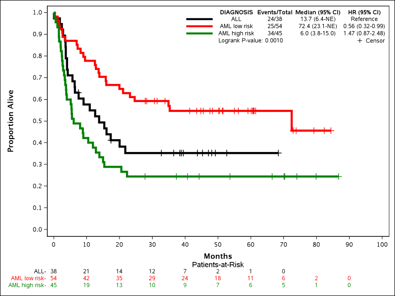
This example gives a basic demonstration of adding the patients-at-risk counts to the bottom of the plot. There are many options to customize the location of the labels, headers, where the table is printed, and even what type of numbers are shown. The following new parameters are all introduced:
- RISKLIST: Enter list of one or more time-points in the final X-axis units to display the current patients-at-risk. Can be a simple list of numbers (xx xx xx) or a list in loop format (xx to xx by xx). Does not have to be the same as TIMELIST and does not have to match X-axis tick marks.
- RISKLOCATION: Determines where the patients-at-risk will be drawn. Default is BOTTOM, which displays the numbers below the X-axis. Specifying INSIDE would put the numbers under the curve above the X-axis.
- RISKCOLOR: Determines if the patients-at-risk numbers are colored to match the Kaplan-Meier curves. Default is 0 (no). Specifying 1 will color the numbers, and can potentially make matching the numbers to the curves visually easier.
Other useful options:
- PARHEADER: Determines the header used above the patients-at-risk table. If left blank then will not be drawn.
- PARHEADERALIGN: Determines where the header will be drawn. Options are LEFT, CENTER, RIGHT, and LABELS. Specifying LABELS will place the header above the labels to the left of the numbers.
- RISKLABELLOCATION: Determines where the labels for the numbers are drawn. Options are LEFT, ABOVE and null. Specifying LEFT draws the labels to the left. Specifying ABOVE draws the labels above the numbers in their own row which is useful for long labels. Specifying nothing will cause the labels to not be drawn. This can be useful when pairing with RISKCOLOR.
- PARDISPLAY (New): Determines what numbers are shown in the patients-at-risk table. One or more items can be listed. Options are PAR (Patients-at-risk), NCENS (Number of cumulative censors), and NEVENTS (Number of cumulative events). Two combinations, PAR_NCENS and PAR_NEVENTS are also allowed.
Example 6: Cumulative Incidence
 %newsurv(DATA=bmt, TIME=FTIME, CENS=STATUS, CEN_VL=0, SUMMARY=0, CLASS=DIAGNOSIS, CLASSREF=ALL,CLASSORDER=1 3 2,
    COLOR=black red green, PATTERN=solid, LINESIZE=3pt, SYMBOLSIZE=10pt,
     METHOD=CIF, EV_VL=1);
This example shows how to plot cumulative incidence instead of Kaplan-Meier curves. The following new parameters are all introduced:
- METHOD: Determines which method is used to generate the curves. Options are KM (Kaplan-Meier) or CIF (Cumulative Incidence Function).
- EV_VL: Determines which value of the status variable is the event of interest. Non-event and non-censor values are considered other events.
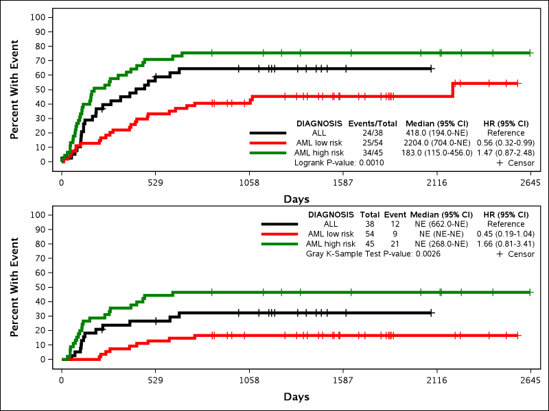
Example 7: Multiple Plots
 %newsurv(DATA=bmt, TIME=FTIME, CENS=STATUS, CEN_VL=0, SUMMARY=0, CLASS=DIAGNOSIS, CLASSREF=ALL,CLASSORDER=1 3 2,
    COLOR=black red green, PATTERN=solid, LINESIZE=3pt, SYMBOLSIZE=10pt,
    METHOD=KM|CIF, EV_VL=1, SREVERSE=1|0, NMODELS=2, ROWS=2, AUTOALIGN=BOTTOMRIGHT|TOPRIGHT);
This example shows how to produce multiple plots in a lattice diagram. Any options that will be different between plots have the | (capital \) delimiter to designate different settings per option. Any options without a | delimiter will keep the same settings across all models. This example also demonstrates the difference when plotting CIF versus 1-Survival. The following new parameters are all introduced:
- SREVERSE: Determines if Survival or 1-Survival is plotted. 1-Survival is not the same as CIF. Default is 0 (Survival) and 1 indicates 1-Survival.
- NMODELS: Determines how many models will be run. Default is 1.
- ROWS: Determines how many rows will be in the graph lattice. Default is 1.
- AUTOALIGN: Determines where the statistical summary table is shown within the plot. Default is TOPRIGHT. Can be anchored to any of the 9 primary points of the plot (TOPRIGHT, TOP, TOPLEFT, LEFT, CENTER, RIGHT, BOTTOMRIGHT
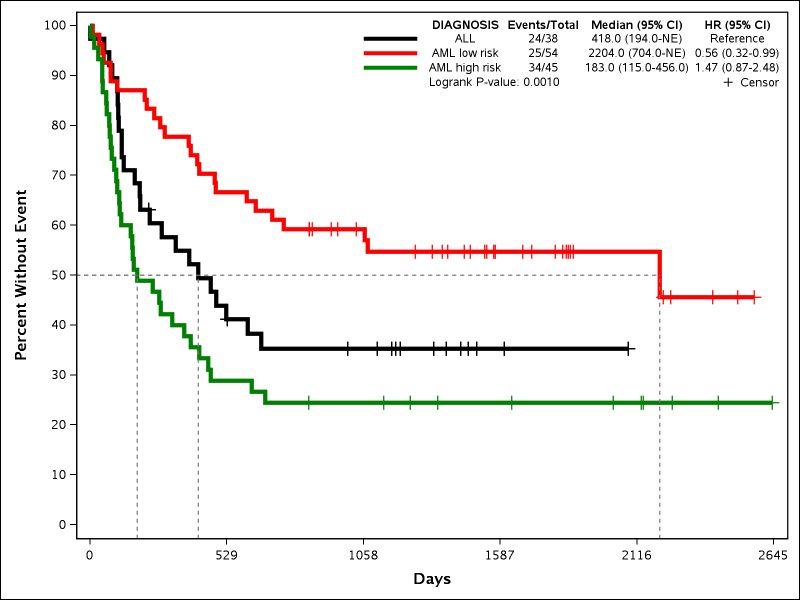
Example 8: Reference Lines
 %newsurv(DATA=bmt, TIME=FTIME, CENS=STATUS, CEN_VL=0, SUMMARY=0, CLASS=DIAGNOSIS, CLASSREF=ALL,CLASSORDER=1 3 2,
    COLOR=black red green, PATTERN=solid, LINESIZE=3pt, SYMBOLSIZE=10pt,
    REFLINES=medians,REFLINEAXIS=both);
This example shows how to add reference lines. Reference lines can highlight two different items: medians and time-point estimates. The reference lines can be dropped to either axis. The following new parameters are all introduced:
- REFLINES: Determines which statistic is used for the reference lines. Either MEDIANS or TIMEPOINTS are allowed. If TIMEPOINTS is specified then all time-points in TIMELIST are shown.
- REFLINEAXIS: Determines which axis the reference lines are drawn to. Options are X, Y or Both.
Other options:
- REFLINEMETHOD: Determines if reference lines are drawn from the KM curves or across the whole plot. Default is DROP. Options are DROP and FULL.
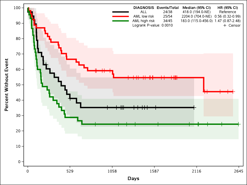
Example 9: Confidence Intervals
 %newsurv(DATA=bmt, TIME=FTIME, CENS=STATUS, CEN_VL=0, SUMMARY=0, CLASS=DIAGNOSIS, CLASSREF=ALL,CLASSORDER=1 3 2,
    COLOR=black red green, PATTERN=solid, LINESIZE=3pt, SYMBOLSIZE=10pt,
    PLOTCI=1);
This example shows how to add confidence intervals. Confidence intervals are automatically added for graphs with no CLASS variable. Confidence intervals can be added as a filled background, as lines, or both. By default only a filled background is used similar to the LIFETEST procedure. The following new parameters are all introduced:
- PLOTCI: Determines if confidence intervals are drawn. Default is 2, which makes confidence intervals if no CLASS variable is provided, but no confidence intervals if a CLASS variable is provided. Options are 1 to force confidence interval and 0 to disable confidence interval.
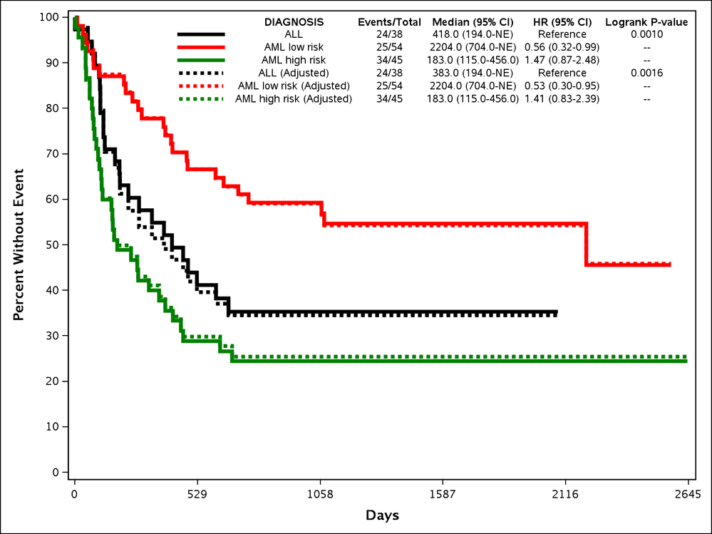
Expansion Macros
Adjusted Survival
Multivariate models are often necessary in survival analysis in order to account for confounding factors. Adjusting for other factors can dramatically change outcomes such as hazard ratio. When outcomes are dramatically changed in a multivariate model it can be inappropriate to plot the unadjusted curves. There are numerous methods available for creating adjusted survival curves, and none are the correct method for all situations. Thus there was a need to have a series of macros that could create the high quality plots of NEWSURV, but with the appropriate methodologies for adjusted survival curves. These macros were designed to adjust survival curves using either the direct adjustment or inverse weights methodologies. A third macro, NEWSURV_DATA, allows the user to pre-calculate their own survival curves and then plot them with the customization of NEWSURV.
NEWSURV_ADJ_DIRECT
The NEWSURV_ADJ_DIRECT macro calculates the adjusted survival curves based off of the predicted survival curves created by the PHREG procedure. This is described in more detail in the PharmaSUG 2017 paper.
NEWSURV_ADJ_INVWTS
The NEWSURV_ADJ_INVWTS macro calculates weights from the LOGISTIC procedure that it then supplies to the LIFETEST procedure WEIGHTS statement.This is described in more detail in the PharmaSUG 2017 paper.
NEWSURV_DATA
The NEWSURV_DATA macro allows the user to specify their own dataset with time and survival variables that have been previously calculated in order to produce a highly customizable journal quality image. This allows the user to use their own adjustment or calculation method not available in the NEWSURV macros.
Example 10: Adjusted Survival Curves
 %newsurv_adj_invwts(DATA=bmt, TIME=FTIME, CENS=STATUS, CEN_VL=0, SUMMARY=0,
    CLASS=DIAGNOSIS, CLASSREF=ALL,CLASSORDER=1 3 2,
    COLOR=black red green,LINESIZE=3pt, SYMBOLSIZE=10pt, CLASSCOV=gender);
This example shows how to make adjusted survival curves using the inverse weights methods. The macro parameters are mainly similar to NEWSURV. The following new parameters are all introduced:
- CLASSCOV: Specifies discrete covariates to adjust the survival curves, hazard ratios, and p-values by. This is also available in NEWSURV, but will not adjust the actual curves.
Other options:
- CONTCOV: Specifies continuous covariates to adjust the survival curves, hazard ratios and p-values by. This is also available in NEWSURV, but will not adjust the actual curves.
- PLOT_UNADJUST: Determines if the unadjusted survival curves are drawn. Default is 1 (Yes).
Macros and options provided by SAS
Editor's note: we added this mention of SAS-provided macros/options for completeness.
In addition to the thorough options provided here and documented in @JeffMeyers papers, SAS also provides guidance and code for customizing the Kaplan Meier survival plot.
- See the special chapter in the SAS/STAT User's Guide.
- Download the source code for SAS macros
Note that these options/macros work only with the more recent versions of SAS.
- Mark as Read
- Mark as New
- Bookmark
- Permalink
- Report Inappropriate Content
Hi Jeff,
I have been using your %newsurv macro for generating the cumulative incidence curves. Thank you so much for creating the macro! However I have two questions:
1. How do I accommodate "Patients at Risk" numbers cleanly without getting crowded or overlapped? My data have 6 millions subjects and 16 years follow-up, so patients at risk for each year are million to few hundred thousand, so when I generate the CIF curves with patients at risk at the bottom, my year 1 numbers are overlapping year 2, year 2 numbers are overlapping Year 3, etc. How do I space them out by the X-axis years of follow-up.
%newsurv(DATA=bmt, TIME=FTIME, CENS=STATUS, CEN_VL=0, SUMMARY=0, CLASS=DIAGNOSIS, CLASSREF=ALL,CLASSORDER=1 3 2,
COLOR=black red green, PATTERN=solid, LINESIZE=3pt, SYMBOLSIZE=10pt,
RISKLIST=0 to 15 by 1,RISKLOCATION=BOTTOM, METHOD=CIF, EV_VL=1);
2. I also want to generate survival curves (proportion alive) for the same data for 6 million patients and follow-up period of 16 years. I am getting errors saying max is 2 million. Using the code below.
%newsurv(DATA=bmt, TIME=FTIME, CENS=STATUS, CEN_VL=0, SUMMARY=0, CLASS=DIAGNOSIS, CLASSREF=ALL,CLASSORDER=1 3 2,
COLOR=black red green, PATTERN=solid, LINESIZE=3pt, SYMBOLSIZE=10pt,
XDIVISOR=30.44, XMAX=100, XINCREMENT=10, XLABEL=Months, YTYPE=PPT, YLABEL=Proportion Alive,
RISKLIST=0 to 100 by 10,RISKLOCATION=BOTTOM,RISKCOLOR=1);
Thank you
- Mark as Read
- Mark as New
- Bookmark
- Permalink
- Report Inappropriate Content
Hello @sms1891
For your first question there are a few options you can do for more space. You can either increase the width of your graph (WIDTH), increase the interval listed in your RISKLIST, or decrease the fontsize of the numbers with PTABSIZE (set to the font size that you want).
For the second question the largest data I ever interacted with was only in the 10's of thousands, so I'm not sure what options are out there for larger datasets. I don't have anything in the macro that I've set as far as I know to limit the size of the data. I'm sorry I can't be more help here.
- Mark as Read
- Mark as New
- Bookmark
- Permalink
- Report Inappropriate Content
@JeffMeyers What parameter in the macro controls the X-axis minor tick marks?
- Mark as Read
- Mark as New
- Bookmark
- Permalink
- Report Inappropriate Content
Hi @JeffMeyers
I want to plot the Cumulative Incidence curve but I do not want the Hazard ratios (95%CI) and Median (95%ci) for my class variable in the plot.
Is there a way to do this.
Thank you
Yuba
- Mark as Read
- Mark as New
- Bookmark
- Permalink
- Report Inappropriate Content
Hello @yubaraj ,
You can specify which statistics you want to show and their order with the DISPLAY option in the macro call. For example if all you want is the legend you can specify DISPLAY=legend. Look up the documentation in the program to see all the available options for statistics.
- Mark as Read
- Mark as New
- Bookmark
- Permalink
- Report Inappropriate Content
Great Thanks @JeffMeyers , it was an easy fix. I should have looked at the documentation more closely.
I was wondering if it is possible to show faint horizontal gridlines along the Y-axis in the plot.
Thanks
- Mark as Read
- Mark as New
- Bookmark
- Permalink
- Report Inappropriate Content
Hello Jeff,
Apologies but my knowledge in terms of your weighted macros for NEW surv is limited. I have done an inverse weight propensity score model and now want to generate publication quality survival curves incorporating the PS weight. I can generate this in Proc lifetest however I cannot get beautiful graphs or a p-value for a comparison at 3 years survival. I was wondering if this is the kind of situation where i can use your NEWSURV_ADJ_INVWTS or NEWSURV_ADJ_DIRECT macros?
My categorical variable for stratification does have 3 levels.
Thank you,
- Mark as Read
- Mark as New
- Bookmark
- Permalink
- Report Inappropriate Content
Hi @JeffMeyers
Thanks for this very useful macro.
I am trying to customize my x axis for the cumulative incidence curve. My cohort is a fixed cohort with a same start (Nov 24 2017) and end of follow up date (May 23 2018) for all participants.
Instead of showing "number of days of follow up " along x-axis we wanted to show end date and middle date of each month.
In other words, we wanted to have Nov 24 2017 (beginning), Nov 30 2017. Dec 15 2017, Dec 31 2017, Jan 15 2018 and so on in the x-axis time markers.
I was hoping TIMEDX option will be helpful. please let me know.
- Mark as Read
- Mark as New
- Bookmark
- Permalink
- Report Inappropriate Content
Hi @JeffMeyers
thanks for this very useful macro.
I am trying to customize 2 graphs in one graph. Example on BMT data :
%newsurv(DATA=bmt, TIME=FTIME, CENS=STATUS, CEN_VL=0, SUMMARY=0, CLASS=DIAGNOSIS, CLASSREF=ALL,CLASSORDER=1 3 2,
COLOR=black red green, PATTERN=solid, LINESIZE=3pt, SYMBOLSIZE=10pt,NMODELS=2, ROWS=2,WHERE=gender=0|gender=1,
XDIVISOR=30.44, XMAX=100, XINCREMENT=10, XLABEL=Months, YTYPE=PPT, YLABEL=Proportion Alive,
RISKLIST=0 to 100 by 10,RISKLOCATION=BOTTOM,RISKCOLOR=1);
I obtain one graph with twice the same curve and datas. Have you an idea of the problem ? I am using SAS 9.4 Level 1M7 (Windows).
thanks for your help.
- Mark as Read
- Mark as New
- Bookmark
- Permalink
- Report Inappropriate Content
Hello @BGuyomarch ,
Could you e-mail me at jpmeyers.spa@gmail.com with your question and send me a de-identified example of what you're experiencing? I think this will be easier to figure out that way.
- Mark as Read
- Mark as New
- Bookmark
- Permalink
- Report Inappropriate Content
Hello @yubaraj ,
At this time I don't have an option to add a format to the x-axis, but if you search through the macro for XAXISOPTS and you should be able to add a format that you want with the TICKVALUEFORMAT option in the LINEAROPTS parentheses. You could set it up where day 1 is Nov 24 2017 and the days correspond to the months you're looking for. You could also save a version that uses time axes instead of linear. I'm sorry I don't have an easier solution right now.
- Mark as Read
- Mark as New
- Bookmark
- Permalink
- Report Inappropriate Content
Hi @JeffMeyers,
Long-time fan of your macro. I am trying to create a figure with lines by groups with a patients-at-risk table. But, my patients-at-risk table is showing a decimal point and/or empty parentheses behind the first two groups' first number (pic attached for reference). This problem does not happen if I do not use the groups options and it happens for every version of the patients-at-risk table. I have not had this problem with other datasets and this current dataset does not appear to be any different than previous sets in terms of structure or having missing data. Am I missing something?
I really appreciate any input!
Using SAS 9.4 on windows.
%newsurv(DATA=a.set, TIME=time_published, CENS=published, CEN_VL=0, SUMMARY=0,
CLASS=design, CLASSORDER=1 2 3, COLOR=green blue red,
PATTERN=solid, LINESIZE=2pt, CENSORMARKERS=0, METHOD=CIF, EV_VL=1,
YLABEL=Probability of Publication, XLABEL=Months, DISPLAY=legend, AUTOALIGN=TOPLEFT,
XMAX=60, XINCREMENT=6, XTICKVALSIZE=12pt, YTICKVALSIZE=12pt, LSIZE=12pt, PTABSIZE=8pt, TABLEDATASIZE=8pt,
PARSIZE=12pt, RISKLIST=0 to 60 by 6, RISKLOCATION=BOTTOM, RISKCOLOR=1, PARDISPLAY=PAR_NEVENTS, PARHEADER=Number Eligible, PARALIGN=LABELS, riskrowweights=0.04,
WIDTH=10in, DPI=300, PLOTTYPE=jpeg, GPATH=&path, plotname=time_to_pub_design_ncumulative)- Mark as Read
- Mark as New
- Bookmark
- Permalink
- Report Inappropriate Content
Hi @JeffMeyers,
Thank you so much for creating such a helpful macro! Is there a way to stratify the survival curves within one graph? I am trying to generate four curves with two hazard ratios (two SOC arms and two intervention arms, one per strata).
I would prefer to not recode into one four-level class variable since that would necessitate running HRs separately and it's very nice to have them automatically embedded in the figure, but if it can't be avoided I can definitely just do it this way.
Appreciate any advice you're able to give!
- Mark as Read
- Mark as New
- Bookmark
- Permalink
- Report Inappropriate Content
Hello @ColeG
I have a version that can do this. E mail me at jpmeyers.spa@gmail.com and I can send you the version.
- Mark as Read
- Mark as New
- Bookmark
- Permalink
- Report Inappropriate Content
Hello @alwestb
can you email me at jpmeyers.spa@gmail.com with this issue? It will be easier to test if we discuss more offline
- Mark as Read
- Mark as New
- Bookmark
- Permalink
- Report Inappropriate Content
Hi @JeffMeyers,
Thanks for this amazing Macro. I want to make a CIF graph using this Macro but when I ran the code a blank graph was created and I got this error in the log "'&' is not a valid unit or graphics option. It will be ignored." Can you please guide me on how to get past this error?
This is my code:
: %newsurv(DATA=source.bigdata, TIME=time, CENS=event, CEN_VL=0, SUMMARY=0, CLASS=class, CLASSREF=NN, CLASSORDER=4 2 3 1,
COLOR=black red green blue, PATTERN=solid, LINESIZE=3pt, SYMBOLSIZE=10pt,
XMAX=13, XINCREMENT=3, XLABEL=Years, YTYPE=PPT, YMAX=0.4, YLABEL=Cumulative Incidence;
METHOD=CIF, EV_VL=1);
I wanted to modify the maximum value on the Yaxis, so I changed YMAX to 0.4, because the maximum cumulative incidence was less the 0.3. If this is what's caused the error is there another way to shorten the Y axis?
Thanks for your help.
- Mark as Read
- Mark as New
- Bookmark
- Permalink
- Report Inappropriate Content
Hi @JeffMeyers,
Thank you for this wonderful macro, it has helped us to make beautiful KM curves.
Could you please guide us what does NE stands for in the median column ( top right hand side of the attached image; highlighted for your reference)
Thanks for your help!
- Mark as Read
- Mark as New
- Bookmark
- Permalink
- Report Inappropriate Content
Hi @Saba_Zaki
NE stands for "not estimable". As you can see, less that 50% of the participants in the AML low risk group had the event of interest, so you can not estimate the median and its 90% CI.
- Mark as Read
- Mark as New
- Bookmark
- Permalink
- Report Inappropriate Content
Hi @JeffMeyers
I really appreciate this great MACRO. It helps me a lot.
May I ask you for help:
1. Can I close the legend of the plot?
2. Can I change the symbol of censor?
I would like to have the plot like following. As you can see in the plot, it does not show the legend and the symbol of censor is half of |, not +.
Thanks
- Mark as Read
- Mark as New
- Bookmark
- Permalink
- Report Inappropriate Content
I made some update to change the symbol of censor, using symbolchar option.
I added symbolchar name=U007C char='007C'x/voffset=.35; in define statgraph _km; block. and change symbol=plus to symbol=U007C.
Here the '007C'x is the unicode of |. and U007C is the user defined name of the symbol.
- Mark as Read
- Mark as New
- Bookmark
- Permalink
- Report Inappropriate Content
Hello @3fatty , Sorry for the delayed response. I haven't had as much time lately to peruse the communities page. That's an interesting solution for the censor symbol. You can remove the legend by putting LEGEND=%str( ) I believe. You can remove just the legend of the censors by setting CENSORMARKERS=0.
- Mark as Read
- Mark as New
- Bookmark
- Permalink
- Report Inappropriate Content
Hi Jeff,
Thank you for this useful macro !
I have the following problems :
- When I do subgroup analyses, I can not change the labels for "GROUP" and "KRAS".
- the number at risk overlap.
- Is it possible to remove straight line from the legend (remove the column "GROUP")
Do you have a solution for this ?
Thank you.
- Mark as Read
- Mark as New
- Bookmark
- Permalink
- Report Inappropriate Content
@JeffMeyers Hi Jeff, can you please direct me as to where I can find the NEWSURV_ADJ_DIRECT macro?
Thank you!
- Mark as Read
- Mark as New
- Bookmark
- Permalink
- Report Inappropriate Content
@JeffMeyers Hi Jeff, Thanks for writing this wonderful macro. I am having difficulty in italicizing the P of "Logrank P-value" in the figure. Could you please guide me?
- Mark as Read
- Mark as New
- Bookmark
- Permalink
- Report Inappropriate Content
Hello @MJAIN . This would be a bit tricky. The p-value is written using an ENTRY statement in GTL. In order to italicize just the P in p-value you would need the entry statement to look something like:
ENTRY textattrs=(style=italic) "p" textattrs=(style=normal) "-value:" ....;
The parameter PVALHEADER is meant to be placed in directly as text in the ENTRY statement, but this can be used to our advantage to manipulate the ENTRY statement:
%newsurv(data=sashelp.bmt,time=t,cens=status,class=group,
    pvalheader=Logrank" textattrs=(style=italic) " p" textattrs=(style=normal) "-value:)
By using the double quotes in the parameter it will close off the text part of the ENTRY statement allowing for the textattrs to be applied to different pieces leading to the desired result:
- Mark as Read
- Mark as New
- Bookmark
- Permalink
- Report Inappropriate Content
hello@JeffMeyers
This macro code is absolutely wonderful, but in the process of using, I want to show the HR of cox regression adjusting covariates, how to modify it, secondly, I need to modify the coordinate label to Chinese, the situation of character garble, in addition, the exported emf format picture is very blurred after magnification, may I ask if there is a solution to these three problems.
- « Previous
-
- 1
- 2
- Next »

Register Today!
Join us for SAS Innovate 2025, our biggest and most exciting global event of the year, in Orlando, FL, from May 6-9. Sign up by March 14 for just $795.
Free course: Data Literacy Essentials
Data Literacy is for all, even absolute beginners. Jump on board with this free e-learning and boost your career prospects.
Get Started
- Find more articles tagged with:
- sasCommunity.org

