- Home
- /
- SAS Communities Library
- /
- How to Control Map Display Area with PROC SGMAP
- RSS Feed
- Mark as New
- Mark as Read
- Bookmark
- Subscribe
- Printer Friendly Page
- Report Inappropriate Content
How to Control Map Display Area with PROC SGMAP
- Article History
- RSS Feed
- Mark as New
- Mark as Read
- Bookmark
- Subscribe
- Printer Friendly Page
- Report Inappropriate Content
The new PROC SGMAP procedure allows you to overlay your mapping data on Open Street Map or ESRI base maps downloaded from a map server. The procedure will download those map tiles needed to display your data, but sometimes you may want to increase the area shown in your map in order for you to make it more meaningful. This article shows you one way that you can easily do that and gain greater control over what your maps actually look like.
In order to demonstrate the problem, I downloaded data on non-ferrous metal mines in the US from the US Department of Homeland Security Foundation-Level Data web site https://hifld-geoplatform.opendata.arcgis.com and extracted data on gold mines in the state of Nevada. I then mapped this using a simple OpenstreetMap statement in PROC SGMAP.
filename minefile '/folders/myshortcuts/Dropbox/Articles/
Exploring Open GIS Data - Gold Mines/Nonferrous_Metal_Mines.csv';

proc import datafile=minefile
	dbms=csv
	out=mines replace;
	getnames=yes;
run;

proc sql;
	create table nevada_gold
	as select latitude, longitude, site_name, state, plant_mine
	from mines
	where commodity="Gold" and plant_mine in ("M" "M/P") and state="Nevada";
quit;

proc sgmap plotdata=nevada_gold;
     openstreetmap;
     scatter x=longitude y=latitude / markerattrs=(symbol=star color=red size=10 PX);
run;
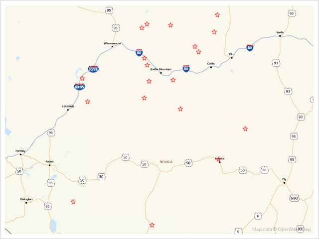
Here’s the result of the PROC SGMAP statement:
As you can see it contains the plotted data but as the mines are all clustered together it doesn’t really give me any sense of what part of Nevada these mines are in. Ideally, I’d like to see the whole of the state in the map so how can I achieve this? The answer lies in creating a second, dummy series, which will consist of data points placed in such a position as to force the downloading of enough map tiles to display Nevada in its entirety.
The question now is – how can I get latitude and longitude values for a series which give me the geographical box which I require? The answer lies with Google Maps. If you follow these steps you will get the values we require:
-
Open Google Maps in your browser;
- Search for Nevada using the Google Maps search box;
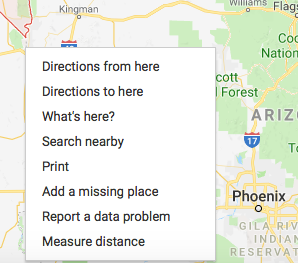
- Right click on a point slightly north of the most northerly point in Nevada;
- A context menu will open, one of the options being “What’s here?”;
- Left click on that menu item and a box will appear at the bottom of the browser window with the place name and latitude and longitude values you require;
- Copy and paste those values somewhere safe;
- Repeat the procedure for a point slightly south of the most southerly point in Nevada
There are two further points to be made about this process:
-
Because PROC SGMAP will always give you a rectangular map image and Nevada is longer on its North/South axis than along its East/West axis you only need North and South points and not East and West points;
- You do not need to worry about being terribly precise when you select your points – you will normally get slightly more map data than you need.
Here are two screenshots – the first showing the right click context menu and the second showing what the “What’s here?” option displays.
Now that I have latitude and longitude values for my dummy series I create a new file to hold it and append it to the data set which holds my real data.
data dummy;
	length latitude2 8. longitude2 8.;
	input latitude2 longitude2;
	infile datalines dlm=",";
	datalines;
42.099412,-117.079201
34.876111,-114.669659
;
run;

data combined;
	set nevada_gold dummy;
run;
I can then rerun PROC SGMAP using this code with a second scatter plot series (the dummy series)
proc sgmap plotdata=combined;
     openstreetmap;
     scatter x=longitude y=latitude / markerattrs=(symbol=star color=red size=10 PX);
     scatter x=longitude2 y=latitude2 / markerattrs=(symbol=star color=blue size=15 PX);
run;
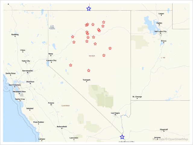
Here’s the result of the Proc SGMap statement
This gives me a new map showing the whole of Nevada. Unfortunately, it also shows points for the dummy series which I do not want to actually be displayed. The secret to hiding these is to alter the value of the transparency attribute of the data markers for that series. The transparency attribute is set on a scale from 0 (the default – totally solid) to 1 (totally transparent).
So finally I rerun my PROC SGMAP statement but this time with a transparency value of 1 for the dummy series (plus a header and footer added).
title 'Location of Gold Mines in Nevada';
footnote j=l 'Data from https://hifld-geoplatform.opendata.arcgis.com/datasets/nonferrous-metal-mines';


proc sgmap plotdata=combined;
     openstreetmap;
     scatter x=longitude y=latitude / markerattrs=(symbol=star color=red size=10 PX);
     scatter x=longitude2 y=latitude2 / markerattrs=(symbol=star color=blue size=15 PX) transparency=1;
run;
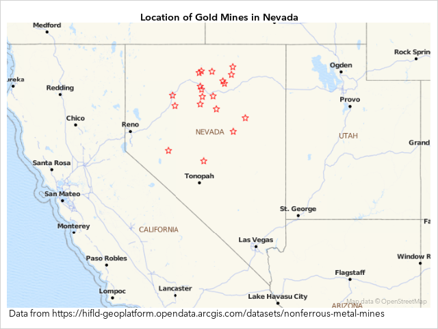
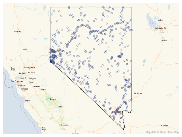
Here’s the result of the final Proc SGMap statement
Now I have the larger map area I wanted which gives me a better sense of where in Nevada the gold mines are, plus I no longer have the dummy series visible (although it’s still there forcing the larger map area to be downloaded from Open Street Map). The same technique also works using ESRI maps supplied from an ESRI Map Server.
So, we've seen how you can effectively use dummy series along with marker attributes to increase the area shown to produce a much more informative map than you would get simply by using the mapping data alone.
- Mark as Read
- Mark as New
- Bookmark
- Permalink
- Report Inappropriate Content
This is a great article @ChrisBrooks
- Mark as Read
- Mark as New
- Bookmark
- Permalink
- Report Inappropriate Content
If it is possible to use Esri maps, I would much like more functionality like Esri ArcGIS online so setting scale/ mapping boundaries wouldn't need a workaround.
I am new to SAS, and an oldschool Esri addict so don't take me wrong please 😉
- Mark as Read
- Mark as New
- Bookmark
- Permalink
- Report Inappropriate Content
Hi @Hans_vanderBent - if you have both ESRI and the SAS Bridge for ESRI licensed then you can link SAS in a more direct way with ESRI maps. Proc SGMap is itself quite a new procedure (only released within the last year) and I would expect that SAS will continue to develop its functionality. It may be that in time this workaround will no longer be necessary but until then I think it offers quite a quick and easy way to alter the size of the geographic region to be displayed.
- Mark as Read
- Mark as New
- Bookmark
- Permalink
- Report Inappropriate Content
Having driven the road between Wells and Ely quite a few times I didn't have much problem with the smaller map. 🙂
- Mark as Read
- Mark as New
- Bookmark
- Permalink
- Report Inappropriate Content
That's the graphical power of SAS 9.4!
Your code is very simple and neat I wonder if it also works when the state is replaced with county or smaller geographical area like self-defined group of zip codes.
Ethan
- Mark as Read
- Mark as New
- Bookmark
- Permalink
- Report Inappropriate Content
Hi @t75wez1 - yes there's no reason it shouldn't work with any geographical area as long as as the coordinates for the dummy series are slightly outside the area you require. Of course you should apply some common sense here - if all your data points are in say, Maine, then creating a dummy series to display the whole of the continental US makes little sense but otherwise just give it a try!
- Mark as Read
- Mark as New
- Bookmark
- Permalink
- Report Inappropriate Content
Here's an alternative approach that's available now ...
Rather than using dummy points (which you would have to manually determine), and plotting them as invisible scatter markers, you can plot an empty choropleth polygon for the state outline. It's easier to code, and I think the state border adds value to the map 🙂
data nevada_cities; set mapsgfk.uscity (where=(statecode='NV'));
run;
data nevada_border; set mapsgfk.us_states (where=(statecode='NV'));
run;
proc sgmap plotdata=nevada_cities mapdata=nevada_border noautolegend;
openstreetmap;
scatter x=long y=lat / group=pop_type;
choromap / mapid=statecode;
run;
Catch up on SAS Innovate 2026
Nearly 200 sessions are now available on demand with the SAS Innovate Digital Pass.
Explore Now →SAS AI and Machine Learning Courses
The rapid growth of AI technologies is driving an AI skills gap and demand for AI talent. Ready to grow your AI literacy? SAS offers free ways to get started for beginners, business leaders, and analytics professionals of all skill levels. Your future self will thank you.
