- Home
- /
- Programming
- /
- ODS Reports
- /
- Re: sub-headings or rather sub-columns in proc report
- RSS Feed
- Mark Topic as New
- Mark Topic as Read
- Float this Topic for Current User
- Bookmark
- Subscribe
- Mute
- Printer Friendly Page

- Mark as New
- Bookmark
- Subscribe
- Mute
- RSS Feed
- Permalink
- Report Inappropriate Content
Hello all-
I have another burning question that I hope can be resolved-
What I am looking to do is essentially create sub columns that branch across other columns for the purposes of highlighting and specifying date information so that for example you have columns defined as:
columns ('PROCESS A', A1 A2 A3) ('PROCESS B' B1 B2 B3)
But under each A1, A2,A3...B3 I need to put down the month or QTR (by a macro)
so that final report:
PROCESS A | Process B
A1 A2 A3 B1 B2 B3
JAN12 JAN12 JAN12 2012Q1 JAN12 JAN12
Hopefully I have clarified my intent here-
I have no code per se as I am unsure on how to begin.
Another option is to simply define a column, for example-
Define A1/"A1/&MONTH" I realize but I need to change the color with an escape character. If there is a way to highlight that component alone then that would suffice as well.
Thanks again.
Lawrence
Accepted Solutions

- Mark as New
- Bookmark
- Subscribe
- Mute
- RSS Feed
- Permalink
- Report Inappropriate Content
OK...so let's see if I have it. "Process A" and "Process B" are just spanning headers in the COLUMN statement or are they ACROSS items? What are A1, A2, A3 and B1, B2, B3 -- are they just regular columns or are they also ACROSS items? (Brings me back to the structure of your data, which you didn't describe -- Is your table a summary table or a just a simple detail listing of an existing "pre-calculated" dataset?) Who is calculating the percent #'s -- PROC REPORT??? Or some other process?
I don't see much color coding here -- just the yellow across the "time" headers. What you want to do is possible, it just means that you need to add some "extra" variables to the dataset in order to get that extra "row" of headers. Basically, you'll sort of fake out PROC REPORT, by making a dummy ACROSS item for every variable. I am showing data that is all ready to go -- presummarized with just the report rows that you want to show. In order to keep all the columns from collapsing or summarizing, I use ORDVAR as a NOPRINT item to make the first column. Then each variable has a "T" equivalent -- so 'A1' has 'TA1' and B1 has 'TB1' etc -- this is the fake out part. Basically, every value of TA1 is the same and every value of TB1 is the same. This will allow you to make a set of headers above the labels for the "real" A1, A2, A3, B1, B2, B3 columns.
Look at the screenshot and run the code. As I said, the structure of your data is going to make a difference here, but it should not be too troublesome to "presummarize" and massage the data before sending it to PROC REPORT.
cynthia
data fakedata;
infile datalines dlm=',' dsd;
input ordvar a1 a2 a3 b1 b2 b3;
** make "extra" variables to be ACROSS variables;
** which will be the column headers in black and white;
** with the variable names;
ta1 = 'A1';
ta2 = 'A2';
ta3 = 'A3';
tb1 = 'B1';
tb2 = 'B2';
tb3 = 'B3';
return;
datalines;
1,0.36945,0.33337,0.0035,0.265,0.11084,0.4451
2,0.23820,0.21761,0.0020,0.200,0.07146,0.2778
3,0.26990,0.24647,0.0024,0.200,0.08097,0.3230
4,0.33195,0.30299,0.0032,0.270,0.09959,0.3575
5,0.43755,0.39014,0.0035,0.225,0.13127,0.3880
;
run;
ods listing close;
title; footnote;
** now, use the a1-a3 and b1-b3 variables for the "yellow" rows;
** and assign the label for each column based on macro vars;
%let time1 = 2012Q1;
%let time2 = JAN12;
ods pdf file='c:\temp\spanhdr_fakedata.pdf';
proc report data=fakedata nowd
style(header)={background=white};
columns ordvar ('Process A' ta1,a1 ta2,a2 ta3,a3)
('Process B' tb1,b1 tb2,b2 tb3,b3);
define ordvar / group noprint;
define ta1/across ' ';
define a1 /sum "&time1" f=percent8.2
style(header)={background=yellow};
define ta2/across ' ';
define a2 / sum "&time2" f=percent8.2
style(header)={background=yellow};
define ta3/across ' ';
define a3 / sum "&time2" f=percent8.2
style(header)={background=yellow};
define tb1/across ' ';
define b1 /sum "&time2" f=percent8.2
style(header)={background=yellow};
define tb2/across ' ';
define b2 / sum "&time2" f=percent8.2
style(header)={background=yellow};
define tb3/across ' ';
define b3 / sum "&time2" f=percent8.2
style(header)={background=yellow};
run;
ods _all_ close;

- Mark as New
- Bookmark
- Subscribe
- Mute
- RSS Feed
- Permalink
- Report Inappropriate Content
Hi:
I'm reading the words, but having trouble with some of them-- just can't visualize what you want when you say things like:
"sub-columns that branch across other columns" but in your "picture" you show a separate string (like JAN12 or 2012Q1) underneath each variable name -- not "branching" or "crossing" other columns.
and then you describe
"But under each A1, A2,A3...B3 I need to put down the month or QTR (by a macro)" -- do you mean that A1, A2, A3 represent quarter 1 and b1, b2, b3, represent quarter 2???? OR???? One reason why I'm having trouble is that it is also not clear is why B1 shows 2012Q1, but the other columns all show JAN12 underneath the main header. And, what does macro have to do with it??? You have generic variables named A1, A2, A3 and for each run, those variable names represent different months???
Also can't understand what you mean when you say:
"Define A1/"A1/&MONTH" I realize but I need to change the color with an escape character. If there is a way to highlight that component alone then that would suffice as well."
when you say "highlight that component alone" -- what "component" do you mean? The HEADER cell, the DATA cell. Using ESCAPECHAR implies that you want to highlight a part of a string -- which part of the string do you want to highlight.
And, what is your destination of choice??? Still ODS PDF??
PROC REPORT does spanning ABOVE headers, not underneath headers. So if you run the code below, you will see LOTS of spanning headers before the "regular" headers. But PROC REPORT really doesn't put anything under each header...except data or output from LINE statements. See screenshot.
Maybe you could mock up what you want your headers to look like in a Word table??? Also important to how PROC REPORT will create headers is whether you are going to have any ACROSS items in your report (how is your data structured)?
cynthia
ods pdf file='c:\temp\spanhdr.pdf';
proc report data=sashelp.cars(obs=10) nowd;
columns ('1 Span All'('2 And More to Say'
('3 Span Two Stuffs'('5 Stuff' make model type origin)
('6 More stuff' drivetrain msrp invoice enginesize))
('4 Span Even More'('7 Even More Stuff' cylinders horsepower weight)
)));
compute before / style={just=l color=purple};
line 'This is a LINE before data starts displaying';
endcomp;
compute before _page_ /style={just=c color=blue font_weight=bold};
line 'This is a LINE before _PAGE_';
endcomp;
run;
ods _all_ close;

- Mark as New
- Bookmark
- Subscribe
- Mute
- RSS Feed
- Permalink
- Report Inappropriate Content
Cynthia;
Thank you for your example-Sorry that I couldn't be more..obtuse in my description-
In essence the code you gave goes away towards what I want but I essentially need it inverted-By the code and what you said I am not sure if this is feasible
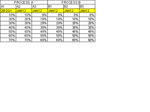
I have attached a photo made essentially made in Excel-But yes the final output would be in ODS PDF
I have spanned processes A & B into two groups with the individual data metrics below in a percent format.
Below each individual metric header, I have the time frame. Some of these metrics are monthly and some are quarterly- hence the difference on occasion-
In this scenario I would simply insert a stored value under each metric of either the month or quarter as necessary.
I can get away with defining a process with the metric and time period using the escape character so instead of two separate headings below (A1, 2012Q1) it would be the same in that it would still read
A1
2012Q1
However I could not color code the headers accordingly.
I hope this helps some.
Thanks again for your assistance.
Lawrence
- Mark as New
- Bookmark
- Subscribe
- Mute
- RSS Feed
- Permalink
- Report Inappropriate Content
OK...so let's see if I have it. "Process A" and "Process B" are just spanning headers in the COLUMN statement or are they ACROSS items? What are A1, A2, A3 and B1, B2, B3 -- are they just regular columns or are they also ACROSS items? (Brings me back to the structure of your data, which you didn't describe -- Is your table a summary table or a just a simple detail listing of an existing "pre-calculated" dataset?) Who is calculating the percent #'s -- PROC REPORT??? Or some other process?
I don't see much color coding here -- just the yellow across the "time" headers. What you want to do is possible, it just means that you need to add some "extra" variables to the dataset in order to get that extra "row" of headers. Basically, you'll sort of fake out PROC REPORT, by making a dummy ACROSS item for every variable. I am showing data that is all ready to go -- presummarized with just the report rows that you want to show. In order to keep all the columns from collapsing or summarizing, I use ORDVAR as a NOPRINT item to make the first column. Then each variable has a "T" equivalent -- so 'A1' has 'TA1' and B1 has 'TB1' etc -- this is the fake out part. Basically, every value of TA1 is the same and every value of TB1 is the same. This will allow you to make a set of headers above the labels for the "real" A1, A2, A3, B1, B2, B3 columns.
Look at the screenshot and run the code. As I said, the structure of your data is going to make a difference here, but it should not be too troublesome to "presummarize" and massage the data before sending it to PROC REPORT.
cynthia
data fakedata;
infile datalines dlm=',' dsd;
input ordvar a1 a2 a3 b1 b2 b3;
** make "extra" variables to be ACROSS variables;
** which will be the column headers in black and white;
** with the variable names;
ta1 = 'A1';
ta2 = 'A2';
ta3 = 'A3';
tb1 = 'B1';
tb2 = 'B2';
tb3 = 'B3';
return;
datalines;
1,0.36945,0.33337,0.0035,0.265,0.11084,0.4451
2,0.23820,0.21761,0.0020,0.200,0.07146,0.2778
3,0.26990,0.24647,0.0024,0.200,0.08097,0.3230
4,0.33195,0.30299,0.0032,0.270,0.09959,0.3575
5,0.43755,0.39014,0.0035,0.225,0.13127,0.3880
;
run;
ods listing close;
title; footnote;
** now, use the a1-a3 and b1-b3 variables for the "yellow" rows;
** and assign the label for each column based on macro vars;
%let time1 = 2012Q1;
%let time2 = JAN12;
ods pdf file='c:\temp\spanhdr_fakedata.pdf';
proc report data=fakedata nowd
style(header)={background=white};
columns ordvar ('Process A' ta1,a1 ta2,a2 ta3,a3)
('Process B' tb1,b1 tb2,b2 tb3,b3);
define ordvar / group noprint;
define ta1/across ' ';
define a1 /sum "&time1" f=percent8.2
style(header)={background=yellow};
define ta2/across ' ';
define a2 / sum "&time2" f=percent8.2
style(header)={background=yellow};
define ta3/across ' ';
define a3 / sum "&time2" f=percent8.2
style(header)={background=yellow};
define tb1/across ' ';
define b1 /sum "&time2" f=percent8.2
style(header)={background=yellow};
define tb2/across ' ';
define b2 / sum "&time2" f=percent8.2
style(header)={background=yellow};
define tb3/across ' ';
define b3 / sum "&time2" f=percent8.2
style(header)={background=yellow};
run;
ods _all_ close;
- Mark as New
- Bookmark
- Subscribe
- Mute
- RSS Feed
- Permalink
- Report Inappropriate Content
Cynthia-
Very ingenious-
In response to your question-
"Process A" and "Process B" are spanning headers and columns A1-B3 are indeed regular columns.
The percents are being calculated by proc report by means of formats. There is alot of other color coding going on-I did not include it to make it neater-I have traffic lighting that changes depending on compliance scores.
This should allow me to keep that formatting. My other solution was to add in the "fake" data by using proc sql to first add in the date info and then have to change everything to character and then have to deal with a lot of compute blocks. It would be messy and ugly. This method is much cleaner-Thank you again.
Lawrence
.jpg")
Catch up on SAS Innovate 2026
Nearly 200 sessions are now available on demand with the SAS Innovate Digital Pass.
Explore Now →Learn how use the CAT functions in SAS to join values from multiple variables into a single value.

Find more tutorials on the SAS Users YouTube channel.
SAS Training: Just a Click Away
Ready to level-up your skills? Choose your own adventure.
-
4 replies
-
04-10-2012 01:45 PM
-
17641 views
-
0 likes
-
2 in conversation
-
